What are some popular colors for a traditional coastal living room?
When designing a conventional coastal living room, color plays a crucial role in capturing the serene and breezy essence of seaside living. The right palette can instantly evoke the calming feeling of ocean waves, sandy shores, and bright sunny skies, creating a welcoming space that feels both timeless and refreshing. In this article, we’ll explore some of the most popular colors used in traditional coastal living rooms, helping you bring a touch of coastal charm and classic elegance into your home.
Popular Coastal Color Palettes That Evoke the Beachfront Vibe
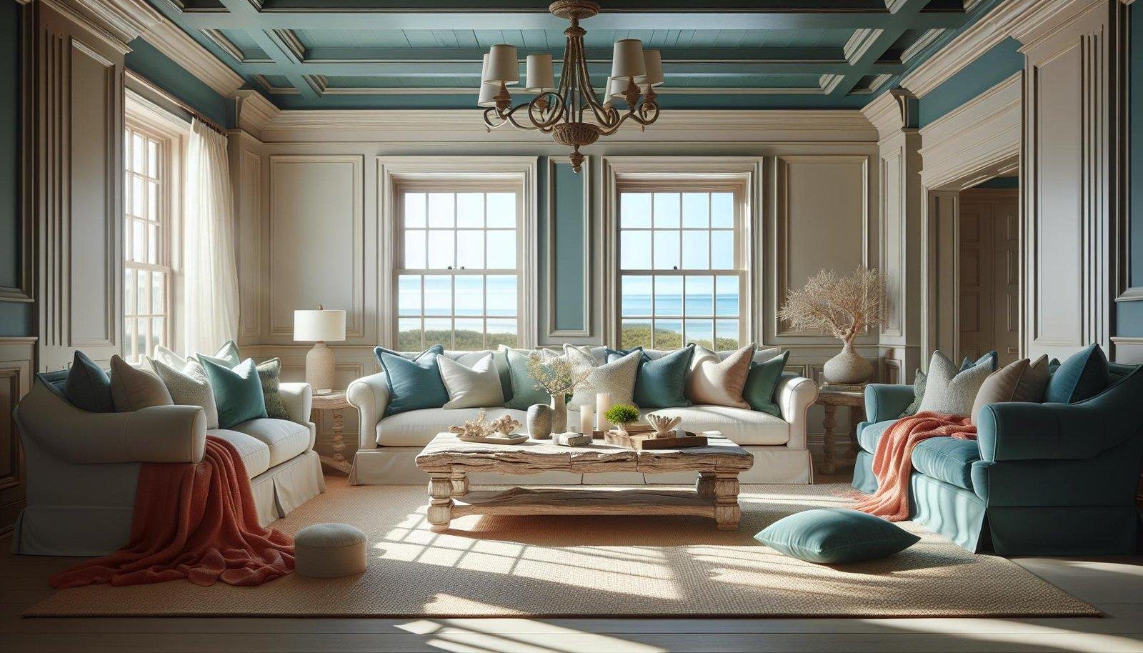
When designing a coastal living room, colors that echo the natural seaside landscape create the perfect atmosphere.Shades of crisp white and airy beige provide a calming, neutral backdrop reminiscent of sandy shores. To capture the essence of the ocean, incorporate soft blues, from pale sky to muted turquoise, which introduce a tranquil vibe. Accents of seafoam green and coral add playful pops of color that bring life and freshness to the space without overwhelming the serene base tones.
For an easy reference, here’s a simple breakdown of popular coastal hues and their typical associations:
| Color | Vibe | Usage |
|---|---|---|
| Soft White | Clean, airy | Walls, ceilings |
| Beige Sand | Warm, grounding | Rugs, upholstery |
| sky Blue | Calm, refreshing | Pillows, curtains |
| Seafoam Green | Fresh, natural | Accent walls, décor |
| Coral | Vibrant, energetic | Accessories, artwork |
Layering these colors through textiles, decorative accents, and furniture finishes harmonizes the coastal aesthetic while ensuring the space feels inviting and sophisticated. Embracing this palette will effortlessly evoke the gentle rhythm of the coastline, making every day feel like a beach getaway.
how Soft Blues and Sandy Neutrals Create a Relaxing Atmosphere
Soft blues evoke the calming essence of the sea and sky, effortlessly bringing a sense of tranquility into your living space. When paired wiht sandy neutrals, such as warm beiges or muted taupes, these colors create a harmonious balance that mimics the natural coastal environment. This combination not only reflects the coastal setting but also promotes a feeling of serenity and openness, making the room feel airy and inviting.
To further enhance the relaxing atmosphere, incorporate natural textures and subtle accents that complement these hues. Consider the following ideas to enrich the palette:
- Light wood furniture that adds organic warmth.
- Woven baskets and rugs that introduce tactile interest.
- Sheer white curtains that softly diffuse sunlight.
| Color | Mood | Recommended Use |
|---|---|---|
| Soft Blue | Calm & Refreshing | Walls & Accessories |
| Sandy Beige | Warm & Grounding | Furniture & Rugs |
| Off-White | Airy & Clean | trim & Curtains |
Incorporating Ocean-Inspired Greens and Aquas for Freshness
To evoke the serene beauty of the ocean within a coastal living room, integrating ocean-inspired greens and aquas is a timeless choice. These colors mimic the ever-changing hues of the sea,from the deep teal of ocean depths to the soft minty greens of sea grass. Incorporating these shades can refresh and invigorate the space, providing a natural connection to coastal landscapes. Whether through accent walls, cushions, or statement furniture pieces, these colors bring depth and vibrancy without overwhelming the calming aesthetic typical of traditional coastal design.
Emphasizing natural textures alongside these colors creates a harmonious environment.Pairing woven rattan, driftwood accents, and linen fabrics with oceanic tones seamlessly ties the décor theme together. Here’s a simple guide to pairing ocean-inspired shades effectively:
- Soft Aqua – Ideal for walls or larger pieces to create an airy backdrop
- Seafoam Green – Perfect for upholstery or decorative pillows to add subtle warmth
- Deep Teal – Works well as an accent color in rugs or curtains, adding richness and contrast
- White and Sand Tones - Balances the palette and maintains brightness
Tips for Balancing Bold Nautical Hues with Light and Airy Tones
When incorporating bold nautical hues like deep navy or crimson, it’s essential to soften the space with light and airy tones that bring balance and breathability. consider pairing strong colors with soothing neutrals such as crisp whites, sandy beiges, or pale grays. This contrast not only highlights the depth of the bold shades but also keeps the room feeling open and inviting. Use light colors on larger surfaces like walls or ceilings to create an expansive backdrop, while reserving rich nautical colors for accent pieces like cushions, rugs, or artwork.
To achieve harmony, try incorporating the following layering techniques:
- Soft Fabrics: Linen curtains and cotton throws in light shades cushion the intensity of darker accents.
- Natural Elements: Driftwood frames and woven baskets introduce texture while maintaining a fresh coastal vibe.
- Metallic Touches: Brass or brushed nickel hardware subtly elevates the palette and adds a nautical flair without overpowering.
The Conclusion
Incorporating popular colors like soft blues, sandy beiges, crisp whites, and gentle seafoam greens can truly capture the essence of a traditional coastal living room. These hues not only evoke the calming spirit of the shore but also create an inviting and serene space perfect for relaxation. Whether you’re refreshing your current decor or starting from scratch, embracing these timeless coastal colors will help you bring a touch of the beach into your home all year round.