How can I use color to define different areas within my living room?

When it comes to designing a living room, color is one of the most powerful tools at your disposal. Not only does it set the mood and style of the space, but it can also help define different areas within your living room without the need for physical dividers. Whether you want to create a cozy reading nook, a vibrant entertainment zone, or a calm conversation corner, using color strategically can make your living space feel organized, dynamic, and inviting. In this article, we’ll explore practical tips and creative ideas for using color to clearly define and enhance different areas within your living room.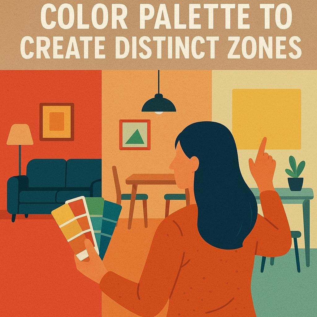
Choosing the Right Color Palette to Create Distinct Zones
When selecting colors to mark distinct zones within your living room, its essential to think beyond just aesthetics. Use color psychology to influence how each area feels and functions. as an example, warm tones like reds and oranges can create inviting, energetic spaces suitable for socializing, while cooler shades such as blues or greens encourage calmness, perfect for reading nooks or relaxation zones. Combining thes thoughtfully chosen hues will help ensure that each zone serves its intended purpose while maintaining a harmonious overall flow.
Consider experimenting with different color intensities and contrasts to establish clear boundaries without physical dividers. A practical approach is to use accent walls,rugs,or furniture upholstery in complementary colors. Here’s a simple guide to balance your palette effectively:
| Zone Type | Suggested Colors | Visual Effect |
|---|---|---|
| Conversation Area | Warm reds, burnt orange | Energetic and welcoming |
| Reading Corner | Soft blues, muted greens | Calming and focused |
| Entertainment Spot | Neutral grays, deep purples | Cozy and immersive |
- Use lighter hues to make small zones appear more spacious.
- Introduce texture along with color to deepen visual distinction.
- Maintain a unifying color element to tie the zones together seamlessly.

using Color Contrast to highlight Functional Areas
Utilizing color contrast effectively can transform a living room by visually separating distinct functional zones, such as seating, reading, or dining areas. By choosing complementary or opposite colors on the color wheel, you can create a vibrant visual distinction that naturally directs attention to each area without physical barriers. as a notable example,a deep navy accent wall behind the sofa can anchor the lounge space,while a lighter,warmer tone like a soft coral can define the reading nook. This method not only enhances the room’s layout but also adds depth and personality, making each zone feel intentional and inviting.
When applying color contrasts, consider incorporating these simple strategies:
- Contrast intensity: Pair bold, saturated colors with muted neutrals to create a balanced dynamic.
- Texture and material: Use contrasting paint finishes (matte vs. glossy) or combine painted walls with colorful rugs or cushions.
- Lighting effects: Adjust lighting to emphasize differences, such as spotlighting a radiant accent area while keeping others soft-lit.
| Area | Preferred Color Contrast | Effect |
|---|---|---|
| Seating | Deep Blue vs. Soft Cream | Coziness and focus |
| Dining | Warm Terracotta vs. Cool Gray | Inviting and defined |
| Reading Nook | Rich Green vs. Pale Yellow | Calmness and brightness |
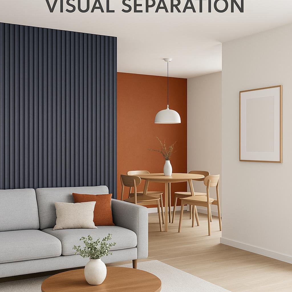
Incorporating Accent Walls for Visual Separation
Utilizing a bold or contrasting color on a single wall is a powerful way to create distinct zones within your living room without physical barriers. This technique works especially well in open-plan spaces where defining areas for lounging, dining, or working can be challenging. Choose a color that complements the overall palette but stands out enough to draw the eye. For instance, a deep navy or rich emerald wall behind a sofa can anchor the seating area while signaling a separate function from the rest of the room.
To maximize impact, consider pairing your accent wall with strategic decor choices:
- Furniture placement: Align key pieces like sofas or shelves to the accent wall to reinforce the division.
- Lighting: Use wall sconces or spotlights to highlight the accent color and add depth.
- Textures and patterns: Incorporate cushions, rugs, or curtains that echo the accent hue for cohesion.
This approach not only defines zones visually but also adds personality and warmth, making your living room feel thoughtfully designed and inviting.

Tips for Balancing bold and Neutral Shades in Shared Spaces
Striking the perfect harmony between bold and neutral tones is key when creating distinct zones within your living room without overwhelming the senses. Start by selecting a dominant neutral base-such as warm beige, soft gray, or creamy white-that provides a calming backdrop for your space. This base will act as a cohesive thread throughout the room. Then, introduce bold hues selectively-whether through an accent wall, vibrant rugs, or statement cushions-to visually anchor each defined area, such as a reading nook or entertainment corner. This contrast naturally draws the eye, helping different zones stand apart while maintaining overall balance.
To make this approach practical,consider the following techniques:
- Use Color Blocking: Paint one wall in a bold color behind a sectional sofa to define the lounge area,while keeping surrounding walls neutral for spaciousness.
- Layer with Textiles: Incorporate patterned pillows or throws in bold shades on neutral furniture to mark activity zones subtly.
- Incorporate Lighting: Coordinate lampshades or pendant lights with accent colors to emphasize focal points.
In Summary
Incorporating color to define different areas within your living room is a simple yet effective way to create a cohesive and visually appealing space. Whether you choose bold accent walls, complementary hues, or subtle variations in shade, thoughtful use of color can help delineate zones for relaxing, entertaining, or working without the need for physical barriers. By experimenting with color palettes that reflect your personal style and the room’s natural flow, you can transform your living room into a multifunctional and inviting environment. Remember, the key is to balance creativity with harmony, ensuring each area feels distinct yet part of a unified whole. With these tips in mind, you’re well on your way to designing a living room that truly works for you.