How can I incorporate pops of color into a neutral living room palette?
Creating a serene and inviting living room often starts with a neutral color palette-think soft beiges, calming grays, and creamy whites. These tones provide a timeless backdrop that feels calm and cohesive, but sometimes, you might want to add a little extra personality and vibrancy to the space. Incorporating pops of color into a neutral living room is an excellent way to brighten the room, express your style, and create visual interest without overwhelming the calm atmosphere.In this article, we’ll explore practical and creative ways to introduce bursts of color that enhance your neutral palette and bring your living room to life.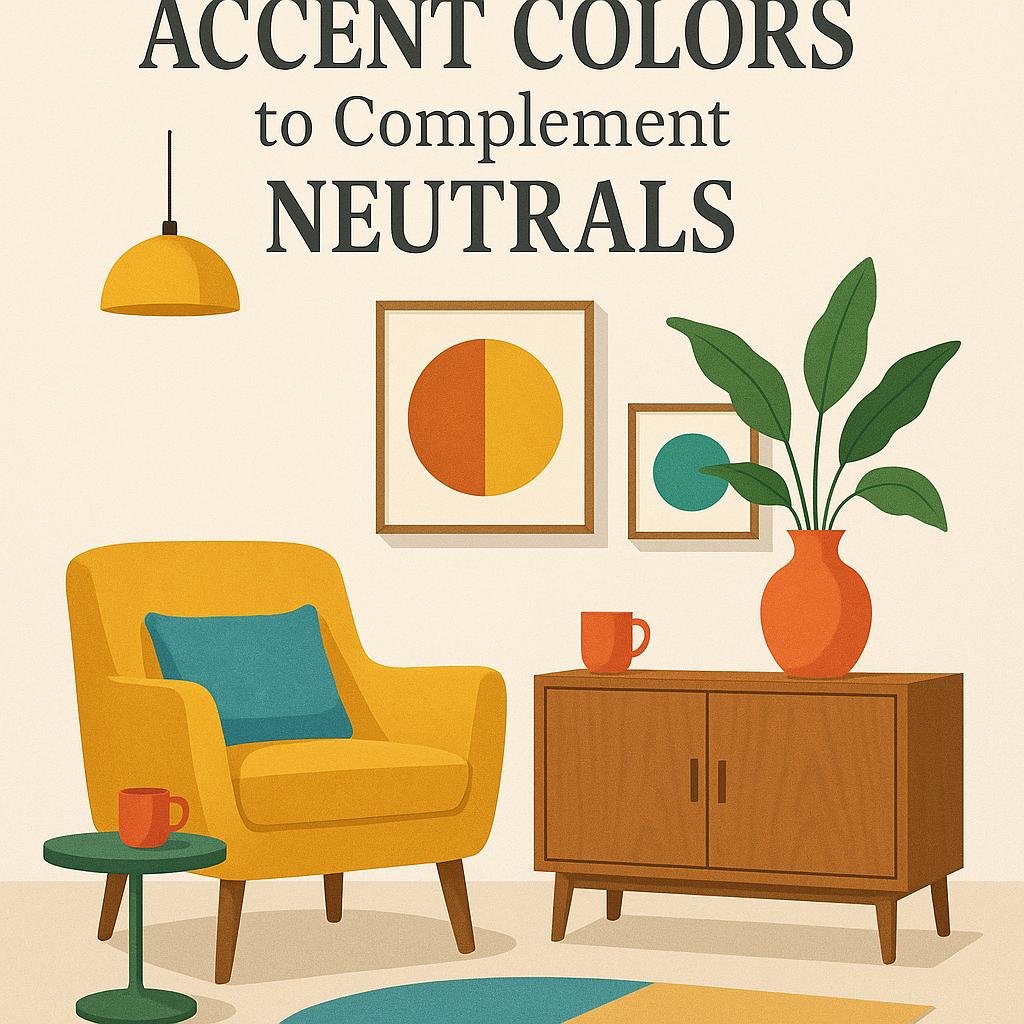
Choosing the Right accent Colors to Complement Neutrals
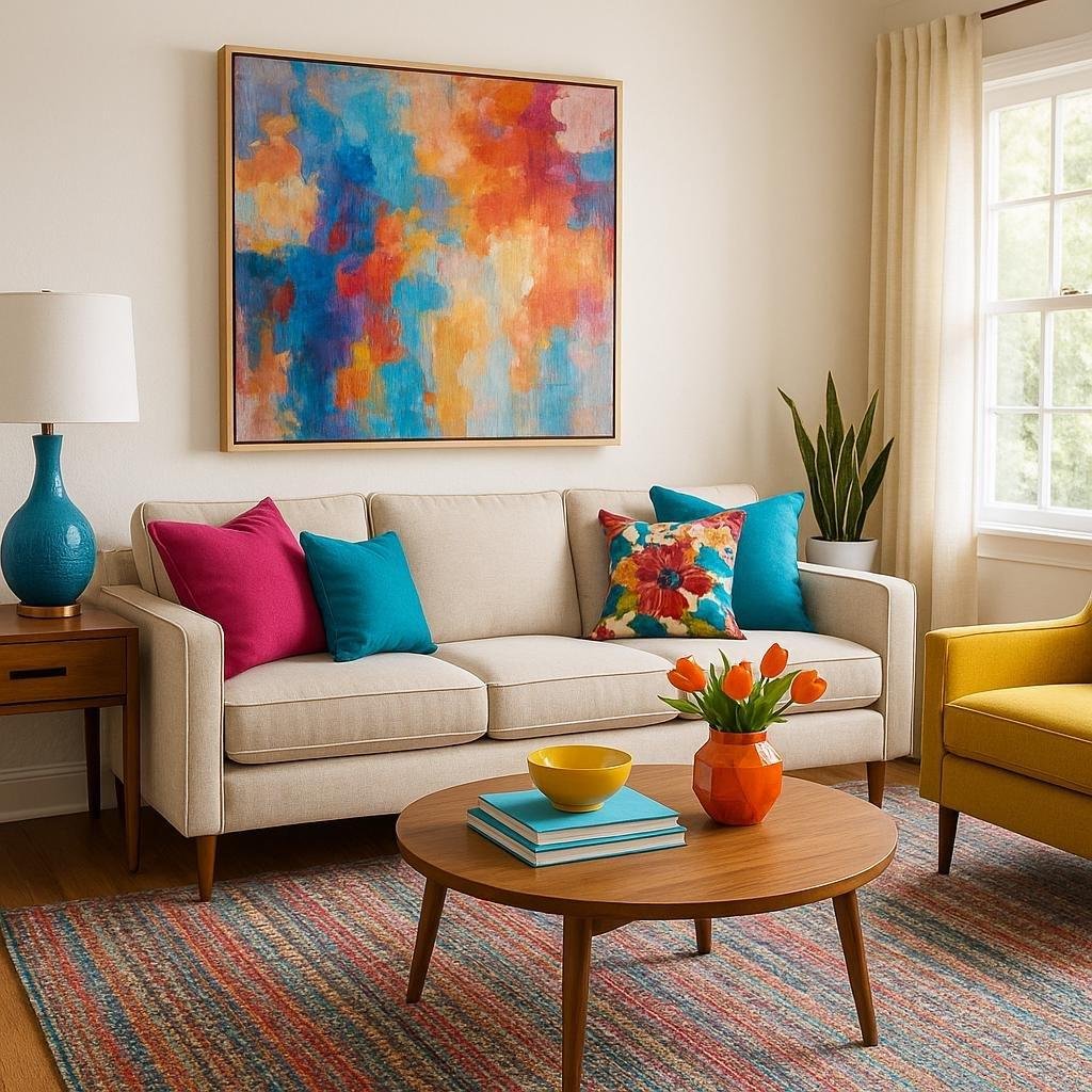
When infusing color into a neutral living room, it’s essential to select accent hues that enhance without overwhelming. Start by considering the undertones of your base palette-cool neutrals like greys and blues pair beautifully with crisp jewel tones, while warm neutrals such as beiges and taupes look stunning with earthy, muted shades. Incorporate accent colors through smaller decor elements like throw pillows, vases, or artwork to maintain balance and ease transitions between tones. Pro tip: use an accent color to create focal points,drawing the eye strategically around the room.
- Soft pastels: Offer a subtle, calming contrast perfect for airy spaces.
- bold hues: Infuse energy and personality, ideal for modern or eclectic styles.
- Metallic accents: Bring warmth and texture without clashing with neutrals.
To help visualize your options, here’s a simple guide illustrating how different accent colors complement popular neutral tones:
| Neutral Base | Recommended Accent | Effect |
|---|---|---|
| Warm Beige | Terracotta, Olive Green | Cozy and grounded vibe |
| Cool Gray | teal, Mustard Yellow | Modern and vibrant |
| Soft white | Blush Pink, Navy Blue | Elegant and inviting |
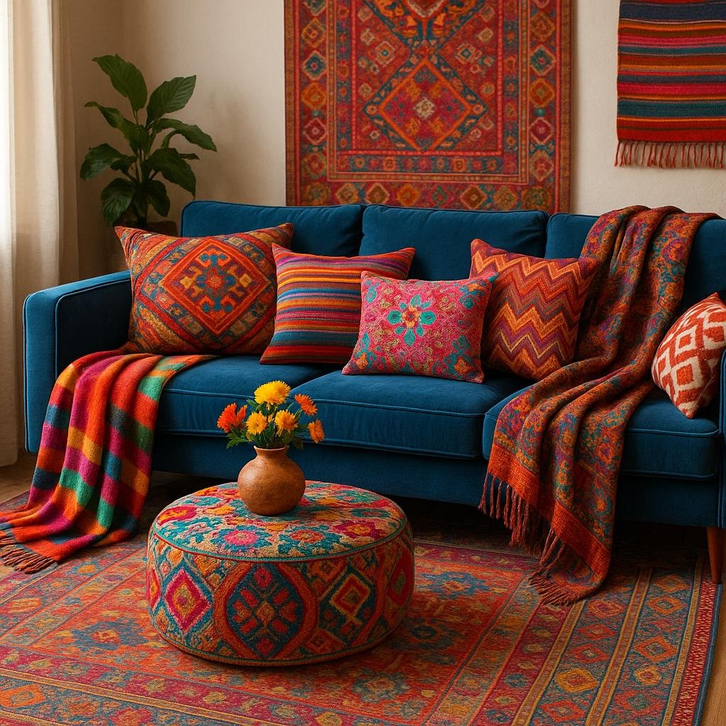
incorporating Colorful Textiles for Instant Visual Interest
One of the most effective ways to enliven a neutral living space is through the strategic use of vibrant textiles. Incorporating throws,cushions,and curtains in bold patterns or rich hues can create focal points that immediately draw the eye and break up monotony. Don’t hesitate to mix and match textures-smooth silks with chunky knits or embroidered fabrics-to add depth and tactile interest. These bursts of color work effortlessly to transform an understated room into a lively, inviting environment while allowing you to swap styles seasonally without undergoing a complete overhaul.
When selecting textiles,consider the following creative ideas to balance color with sophistication:
- Accent Pillows: Choose cushions in jewel tones such as emerald,sapphire,or ruby for a luxurious touch.
- Area Rugs: Opt for patterns with pops of color that complement your neutral foundation to anchor the room.
- Throws and Blankets: Drape colorful throws over sofas or chairs for instant warmth and visual intrigue.
- Window Treatments: Use curtains with subtle prints or bright borders to frame natural light beautifully.
| Textile Element | Color Suggestions | Effect |
|---|---|---|
| Cushions | Mustard Yellow, Coral | Creates cozy focal points |
| Throws | Turquoise, Magenta | Adds warmth and contrast |
| Rugs | Navy Blue, Burnt Orange | Defines the space dynamically |
| Curtains | Olive Green, Soft Pink | Frames the room elegantly |

Using Art and Decor to Make Bold Statements
Bold,vibrant art pieces can transform a neutral living room from bland to breathtaking in an instant. Consider large-scale abstract paintings or colorful prints that capture your personality and energize the space. Hanging a statement piece above the sofa or fireplace instantly draws the eye and anchors the room with a splash of color. Mixing in smaller artworks with complementary hues throughout the room helps maintain balance while keeping the eye engaged. Remember, the key is to select art that contrasts with your neutral tones – think fiery reds, deep blues, or sunny yellows - to create captivating focal points.
Beyond the walls,decorative accents offer versatile ways to infuse color without overwhelming the calm aesthetic. Accessories like vibrant cushions, patterned rugs, and sculptural vases turn the neutral backdrop into a dynamic canvas. Here are some creative decor ideas to add pops of color with impact:
- Throw Pillows: Mix different textures and shades to add depth and warmth.
- Accent Rugs: Choose bold patterns to define seating areas and introduce geometric interest.
- Decorative Objects: Use colorful ceramics, glassware, or bookshelves styled with bright items.
- Statement Lighting: lamps or pendant lights in unusual shapes with colorful finishes become conversation starters.
| Decor Element | Color Ideas | Placement Tips |
|---|---|---|
| Artwork | Teal, Coral, Mustard | Above sofa or entry wall |
| Pillows | Blush, Navy, Lime Green | Layered on neutral couch |
| Rugs | Turquoise, Tangerine | Center of seating area |
| Vases & objects | Emerald, Magenta | On coffee or side tables |
Balancing Bright accessories with Subtle Neutrals for Harmony
Integrating bright accessories into a neutral living room demands a thoughtful approach to maintain a sense of balance and cohesion.Begin by selecting a color palette for your pops of color that complements the neutral base-think jewel tones like emerald green or sapphire blue, which add richness without overpowering. Incorporate these hues through smaller décor elements such as throw pillows, vases, or artwork. Placing these items strategically around the room prevents any single area from drawing too much attention, allowing the bright accents to breathe and harmonize with the overall simplicity.
To achieve a polished look,consider the following tips for pairing vivid accents with calming neutrals:
- Texture plays a role: Soft,woven throws or velvet cushions can make bright colors feel cozy rather than stark.
- Balance the distribution: Spread colorful accessories evenly to create visual rhythm.
- Use natural elements: Plants like succulents or flowers in colorful pots add life while connecting with neutral tones.
| Accessory | Color Ideas | Placement |
|---|---|---|
| Throw Pillows | Mustard Yellow, Coral | Sofa, Armchairs |
| Decorative Vases | Turquoise, Ruby Red | Side Tables, Bookshelves |
| Wall Art | Multicolored Abstracts | Above Fireplace, Entryway |
To conclude
Incorporating pops of color into a neutral living room palette is an easy and effective way to add personality and vibrancy to your space without overwhelming the calming base. Whether you choose bold accessories, vibrant artwork, or colorful textiles, these small bursts of color can transform your room into a lively and inviting environment. Remember, the key is to balance your pops of color thoughtfully to maintain the serene and sophisticated feel of your neutral backdrop.With a little creativity and experimentation, your living room can become a perfect blend of subtle elegance and dynamic charm.