Are neutral color palettes popular for living room design?
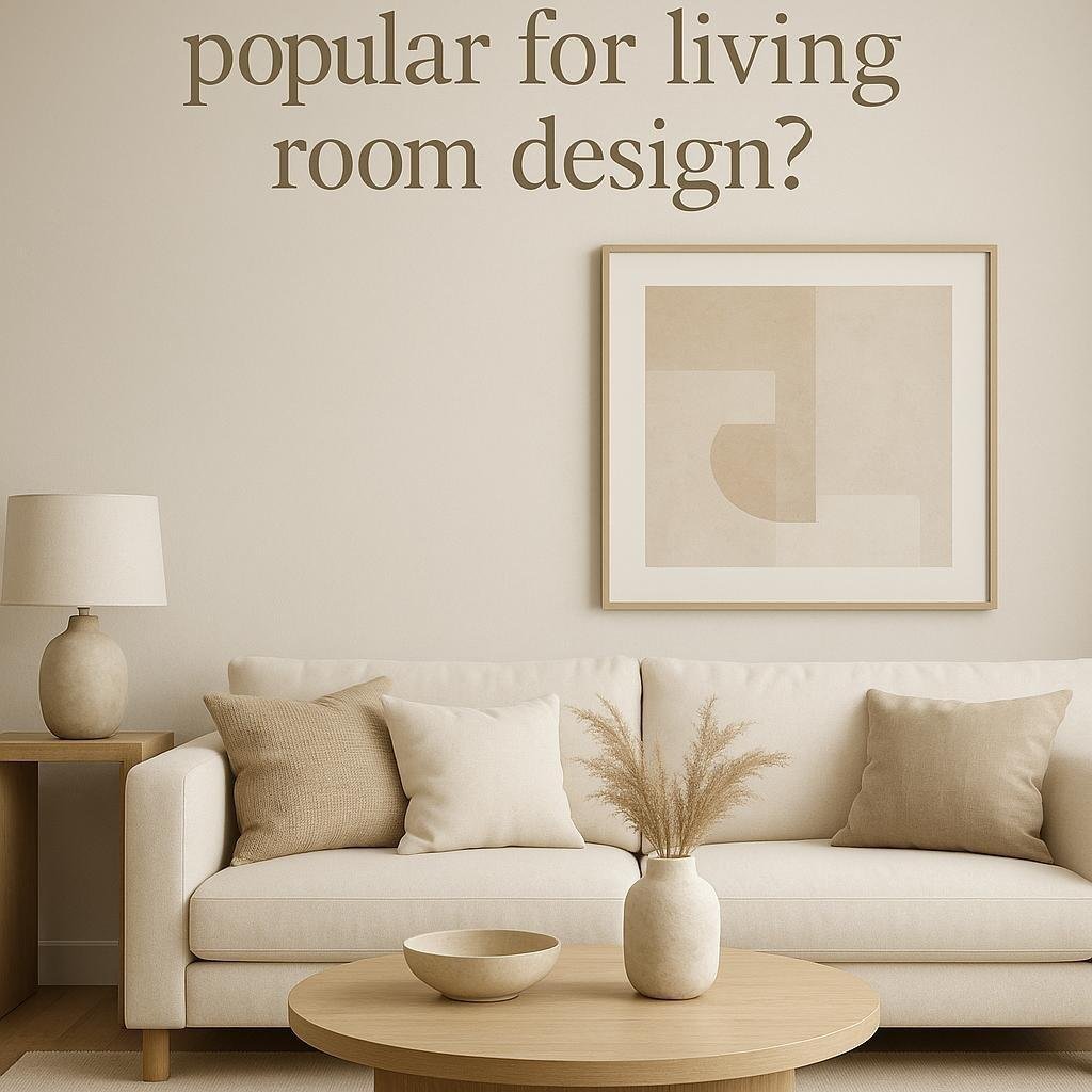
When it comes to designing a living room,choosing teh right color palette plays a notable role in setting the mood and style of the space. In recent years, neutral color palettes have gained considerable popularity among homeowners and interior designers alike. But what makes these understated hues so appealing, and are they truly the go-to choice for modern living room design? In this article, we’ll explore the rising trend of neutral color schemes, why they work so well, and how they can transform your living area into a warm, inviting, and timeless space. Whether you’re planning a full redesign or just looking for some inspiration, understanding the appeal of neutral tones is a great place to start.
Benefits of Using Neutral Color Palettes in Living Rooms
Incorporating neutral colors in living room designs offers a timeless elegance that easily adapts to evolving styles. These palettes create a serene backdrop, allowing other design elements like furniture, art, and textiles to shine without overwhelming the space. Their versatility makes it simple to refresh or completely transform a room’s look by swapping accent pieces rather than repainting walls or replacing major décor components.
Beyond aesthetics, neutral tones contribute to a calming atmosphere, which is ideal for spaces meant for relaxation and socializing. They also maximize natural light, making rooms feel more spacious and inviting. Some of the key advantages include:
- Versatility: Neutral shades pair effortlessly with a variety of colors and styles.
- Timelessness: Less prone to going out of style, helping maintain a fresh appearance.
- Enhanced Texture: They highlight textures and materials, adding depth without clashing hues.
- Easy Coordination: Simplifies matching furniture and décor for a cohesive look.
| Benefit | Impact on Living Room |
|---|---|
| Versatility | Adapts to any design trend or personal taste |
| Light Reflection | Makes spaces feel larger and brighter |
| Ease of Updating | Quickly changes mood by adding colorful accessories |
| Neutral Comfort | Creates a peaceful, stress-free environment |
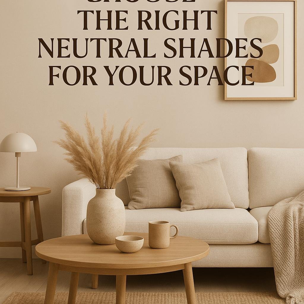
How to Choose the Right Neutral Shades for Your Space
Selecting the perfect neutral shade involves more than just picking a color that blends into the background. Consider the natural lighting in your room—warmer neutrals like soft beige or creamy taupe can enhance spaces bathed in sunlight, creating a cozy and inviting atmosphere. Cooler neutrals such as greys and muted blues work beautifully in rooms with less natural light, imparting a calming and modern vibe. Paying attention to undertones is key here; subtle pink or yellow undertones can dramatically affect how a shade appears throughout the day.
When narrowing down your options, keep functionality and style in mind. Are you aiming for a more conventional look or a sleek, contemporary feel? Neutral palettes offer versatility but pairing them intentionally makes all the difference. Here’s a speedy guide to help you decide:
- Soft White: Brightens small spaces and acts as a perfect backdrop for colorful accents.
- Greige (Gray + Beige): A trendy choice that balances warmth and cool sophistication.
- Warm Taupe: Adds depth and warmth without overwhelming the room.
- Muted Sage: Brings a touch of nature while keeping the palette subtle.
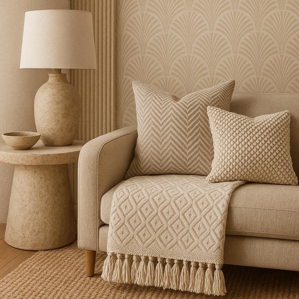
Incorporating Texture and Patterns to enhance Neutral Designs
In neutral color schemes, adding texture and patterns is essential to prevent the space from feeling flat or monotonous. Soft tactile elements like plush rugs, knitted throws, and woven baskets bring warmth and depth, inviting touch and comfort. incorporating varied materials such as linen, velvet, or natural fibers can subtly highlight features without overpowering the calm ambiance that neutral tones provide. This approach ensures every surface contributes to a layered, dynamic aesthetic rather than a one-dimensional look.
Patterns introduce personality and visual interest, especially when selected thoughtfully to complement rather than compete with the overall palette. Neutral designs shine when patterns are understated—think delicate herringbone, muted geometrics, or organic motifs in shades of beige, gray, or cream. Utilizing these patterns in small doses, like on accent pillows, curtains, or wallpaper, elevates the design subtly. The table below outlines some popular texture and pattern pairings that work beautifully in neutral living rooms:
| Texture | Pattern | Ideal Use |
|---|---|---|
| Linen | Soft herringbone | Cushions & curtains |
| Wool | Subtle geometrics | Area rugs |
| Jute | Organic stripes | Wall accents & baskets |
| Cotton velvet | Tonal floral | Upholstery |
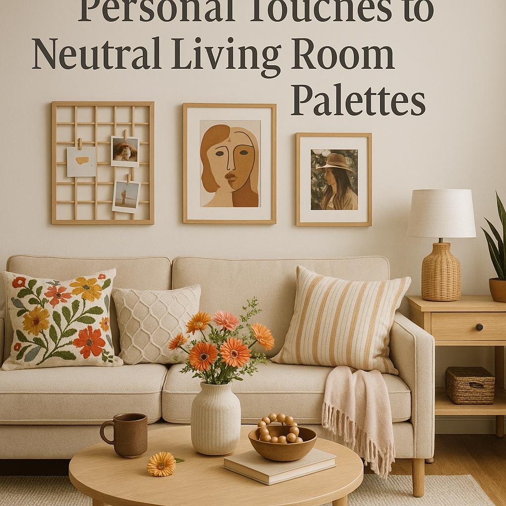
Tips for Adding Personal Touches to Neutral Living Room Palettes
Infusing personality into a neutral living room begins with layering texture and patterns. Soft throws,woven baskets,and velvet cushions add depth without disrupting the calming affect of a muted palette. Consider incorporating natural elements like wood, stone, or plants, which introduce organic warmth and an inviting atmosphere. These subtle details not only create visual interest but also express your individual style in a sophisticated way.
another effective strategy is to select accent pieces that tell your story. This could be as simple as displaying cherished books, framing meaningful artwork, or showcasing unique collectibles. use pops of color sparingly with accessories such as vases, rugs, or lamps that complement the neutrals rather than overpower them. here’s a quick guide to balance personalization within a neutral scheme:
| Personal Touch | Why it Works | How to Add It |
|---|---|---|
| Textured Soft Furnishings | Creates coziness and dimension | Choose knit pillows or faux fur throws |
| Natural Accents | Introduces warmth and freshness | Incorporate wooden bowls or leafy plants |
| Personal Mementos | Tells your unique story | Display framed photos or heirlooms |
| Subtle Color Highlights | provides visual interest | add colorful vases or art pieces |
The Way Forward
neutral color palettes continue to be a popular choice for living room design due to their versatility,timeless appeal,and ability to create a calm and inviting atmosphere. Whether you prefer minimalist modern styles or cozy, layered looks, neutrals provide a perfect foundation that allows you to easily update accents and décor over time.as trends evolve, these subtle tones remain a reliable and stylish option for anyone looking to create a balanced and welcoming living space.