Are there any rules for mixing different patterns in living room decor?

Mixing different patterns in living room decor can be an exciting way to add personality and visual interest to your space. However, it can also feel daunting if you’re unsure where to start or worried about creating a chaotic look. The good news is that there are some handy guidelines to help you combine patterns seamlessly, ensuring your living room feels cohesive and stylish. In this article, we’ll explore the basic principles and practical tips for mixing patterns effectively, so you can confidently create a vibrant and inviting living area that reflects your unique taste.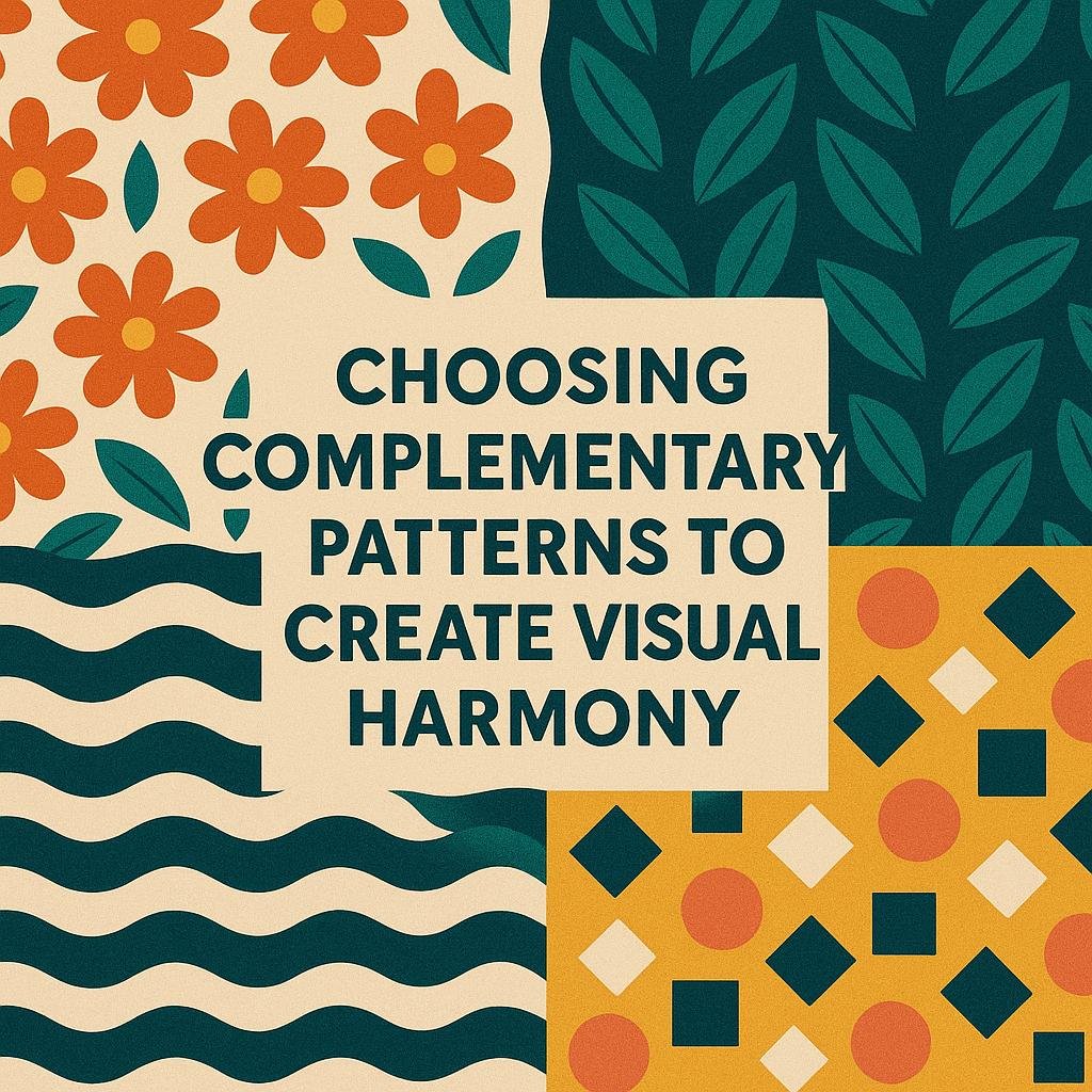
Choosing Complementary Patterns to Create visual Harmony
When mixing different patterns in your living room, finding patterns that complement each other is key to achieving a balanced and inviting space. Start by focusing on a common element such as color palette or scale. For instance,pairing a large floral print with a smaller geometric design in similar hues can create a harmonious look without overwhelming the senses. Remember, consistency in color tones acts as the visual thread that ties disparate prints together.
Incorporate these tips for a cohesive pattern blend:
- Vary the scale: Mix large, medium, and small patterns to add depth and interest.
- Stick to a unified color story: Choose patterns that share two or more colors.
- Introduce neutral patterns: Neutral stripes, dots, or herringbone can soften the combination.
- Texture matters: Combine various fabric textures alongside patterns for a rich tactile experience.
| Pattern Type | Recommended Companion | Effect |
|---|---|---|
| Floral | Small geometric or subtle stripes | Balances complexity and softness |
| Checks | Abstract or organic patterns | Creates modern contrast |
| Stripes | Polka dots or botanical prints | Adds playful energy |
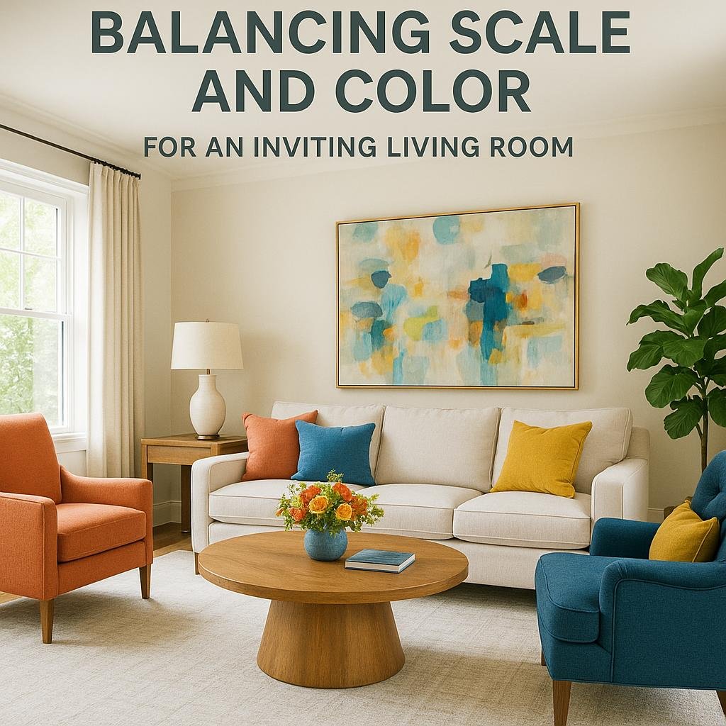
Balancing Scale and Color for an Inviting Living Room
when decorating a living room, achieving the perfect harmony between scale and color is essential to create a warm, inviting atmosphere. Start by selecting one dominant pattern, ideally in a medium scale, and use smaller-scale patterns to complement it. Such as, a large floral print on your sofa can be beautifully balanced with smaller geometric or striped cushions. This contrast in scale prevents the space from feeling too busy or overwhelming, while also giving depth and interest to the visual experience.
Color plays a pivotal role in tying multiple patterns together seamlessly. Stick to a unified color palette that shares at least two or three hues across the patterns you choose. Incorporating a common color in varying shades and intensities can make diverse prints feel cohesive. Below is a swift guide to help select complementary pattern scales and color intensities that create a balanced living room look:
| Pattern Scale | Recommended color Intensity | Effect |
|---|---|---|
| Large | Muted or neutral | Anchors the room without overwhelming |
| Medium | Rich or bold | Adds visual interest and personality |
| Small | Soft or pastel | Introduces subtle texture and refinement |
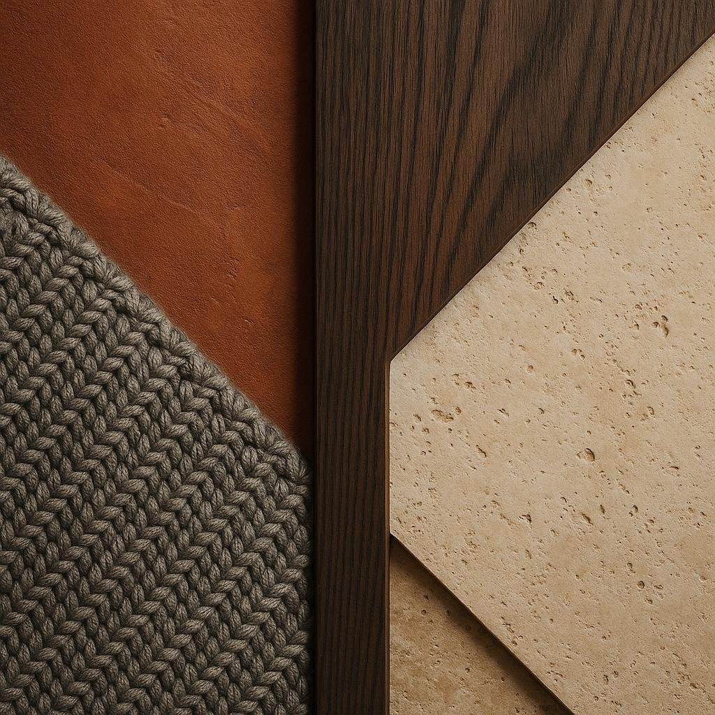
Incorporating texture and Material for Added Depth
To truly elevate your living room’s visual appeal, consider the interplay between texture and material alongside your patterned choices. Different textures can break up the visual intensity of competing patterns, providing a balanced and tactile experience. For example, pairing a soft velvet throw pillow with a rough linen sofa not only adds contrast but also invites touch, creating an inviting atmosphere. Mixing materials such as wood, metal, and glass with patterned fabrics can also deepen the spatial interest without overwhelming the senses.
When selecting materials, it’s helpful to keep a few principles in mind:
- Balance: Combine rough textures with smooth ones to avoid clutter.
- Harmony: Use materials that complement your color palette for seamless integration.
- Focus: Let one textured element be the centerpiece to anchor your room.
| Material | Ideal Texture Combo | Decor Tip |
|---|---|---|
| Velvet | Soft, plush, slightly reflective | Perfect for cushions against leather sofas |
| Wicker | Natural, rough, lightweight | Adds warmth and works well with patterned rugs |
| Polished Metal | Smooth, reflective, cool | Balances heavy patterns by introducing lightness |
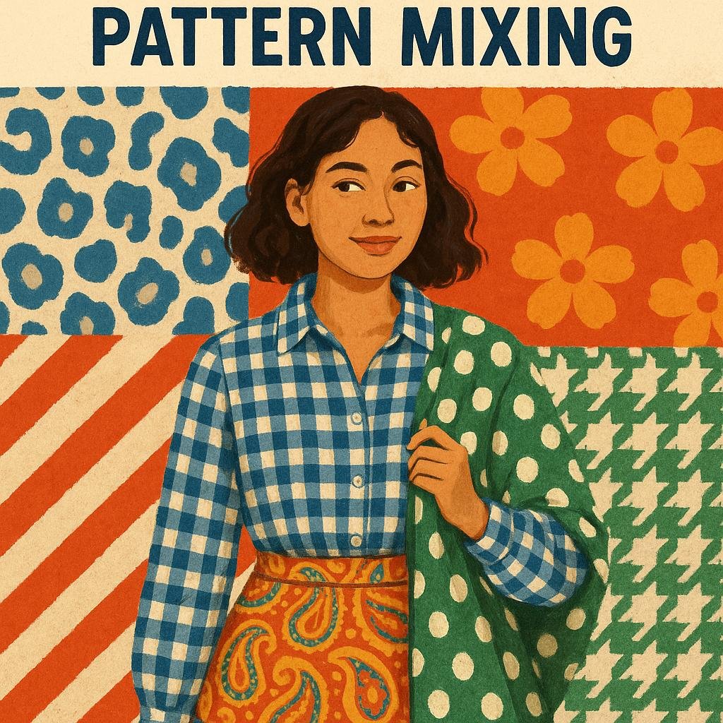
Tips for Experimenting Confidently with Pattern Mixing
Start by choosing a cohesive color palette that ties all your patterns together. Even if the patterns differ in size, shape, or style, having a unifying color helps create harmony in your living room decor. as an example, if your main colors are navy blue and cream, incorporate these shades in every pattern to maintain a balanced look. Consider using one dominant pattern paired with two or three complementary accent patterns to avoid overwhelming the space. Mixing patterns with varied scales—such as combining large florals with small geometrics—can add depth and intrigue while keeping your room visually comfortable.
Keep these essential tips in mind:
- Balance bold patterns with neutral tones to let each design shine without clashing.
- Use geometric shapes to contrast organic, flowing patterns for dynamic interest.
- Experiment with texture along with pattern to add richness to your layers.
| Pattern Type | Recommended Pairing | Effect |
|---|---|---|
| Stripes | Polka Dots or Florals | Energetic and playful |
| Plaid | Abstract or animal Print | Cozy and eclectic |
| Geometric | Botanical or Paisley | Modern yet organic |
Closing Remarks
while there are no absolute rules for mixing different patterns in living room decor, understanding a few key principles can definitely help you create a harmonious and visually appealing space. Consider balancing scale and color, maintaining a common theme, and trusting your personal style to guide your choices. With a little experimentation and confidence, mixing patterns can add depth, personality, and warmth to your living room, making it a truly inviting place to relax and entertain. So go ahead—embrace the fun of pattern play and transform your living room into a unique reflection of your taste!