How can I create a harmonious color palette for an open concept living room?
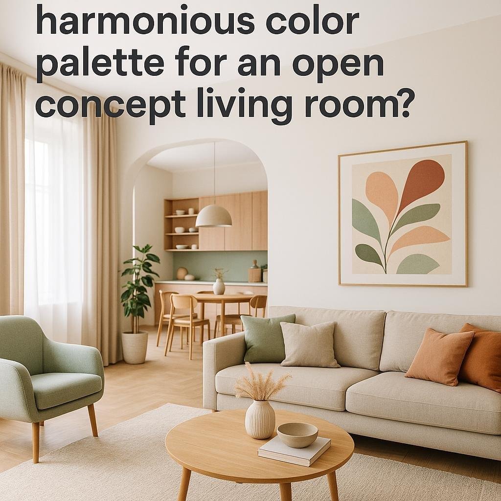
Creating a harmonious color palette for an open concept living room can transform your space into a welcoming and cohesive haven. With multiple areas blending seamlessly together, choosing the right colors is essential too establishing flow and balance throughout the room. Whether you prefer calming neutrals or bold accents, understanding how to combine hues effectively will help you design an inviting surroundings that feels both stylish and agreeable. In this article, we’ll explore practical tips and inspiring ideas to guide you in selecting colors that unify your open living area with ease and confidence.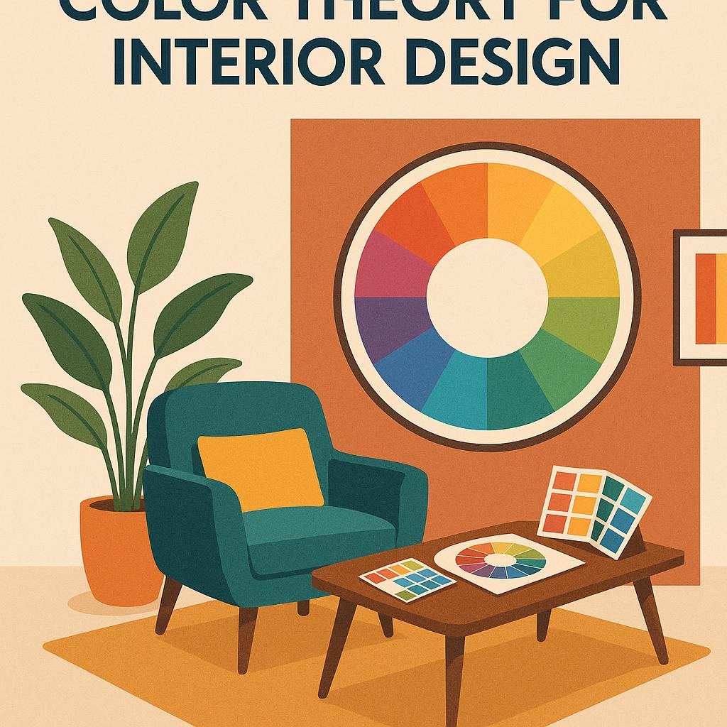
Understanding the Basics of color Theory for Interior Design
Creating a pleasing and functional color scheme for an open concept living room starts with a grasp of the color wheel and its relationships. Using complementary colors—those opposite each other on the wheel—can add vibrant contrast, while analogous colors, found next to each other, provide a serene, cohesive vibe. Incorporating a base neutral color helps ground the space and allows accent shades to pop without overwhelming the eye. Consider the natural light in your room, as it significantly affects how colors appear and interact throughout the day.
When developing your palette, aim for balance by distributing colors thru different elements such as walls, furniture, textiles, and decor. Here’s a simple guideline:
- 60% – Dominant color for large areas like walls or flooring
- 30% – Secondary color for furniture and upholstery
- 10% - Accent color for accessories and decor pieces
Using this 60-30-10 rule, you create visual harmony and ensure no single color dominates. Additionally, layering textures and various shades within the same color family can add depth without complicating the palette.
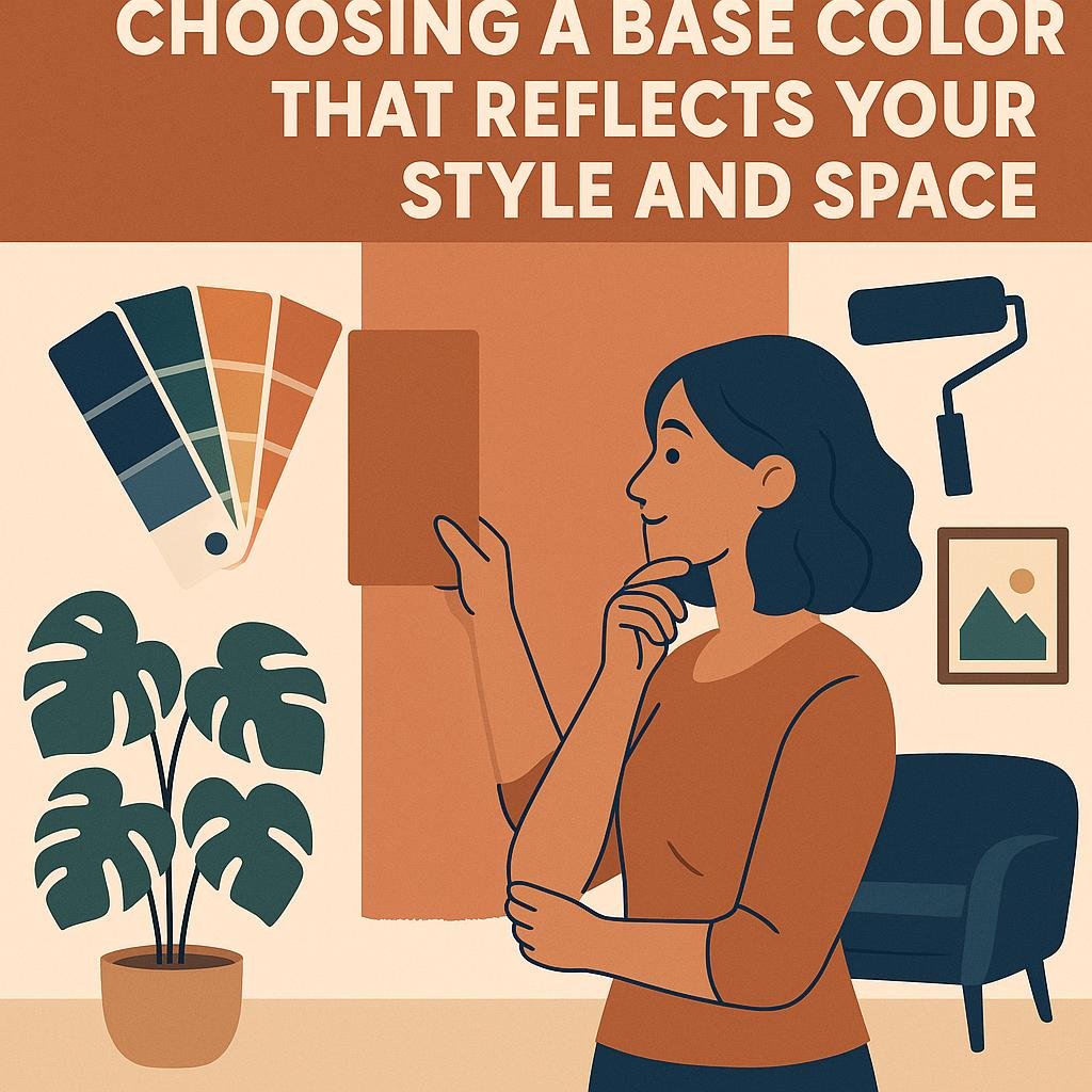
Choosing a Base Color That Reflects Your style and space
Begin by considering the mood you wont to evoke in your living room. Soft neutrals like warm beiges or cool grays create an inviting and versatile background that can easily be enhanced with accent colors,making them perfect for open concept spaces. If your style leans toward bold and vibrant, consider a rich navy or deep forest green as a base; these colors add personality while still allowing your furniture and décor to shine. Always take into account the amount of natural light your space receives, as darker base colors can make dim rooms feel smaller, while lighter shades brighten and expand the area.
Practicality is key when selecting a base color. Opt for shades that complement the existing flooring,large furniture pieces,and architectural elements to create a seamless flow throughout your open layout. Here’s a quick guide to help visualize this:
| Style | Recommended Base Colors | Effect on Space |
|---|---|---|
| Modern Minimalist | Soft White, Pale Gray | Clean, Airy, Spacious |
| Cozy Rustic | warm Taupe, Earthy Browns | Inviting, Grounded |
| Eclectic | Deep Teal, Charcoal | Bold, Dynamic |
| Scandinavian | Muted Pastels, Off-white | Bright, Calming |
- Test samples on multiple walls to see how the color changes throughout the day.
- Consider finishes as matte and satin can impact the feel of a base color differently.
- Think about long-term adaptability to avoid frequent repainting as your decorations or tastes evolve.
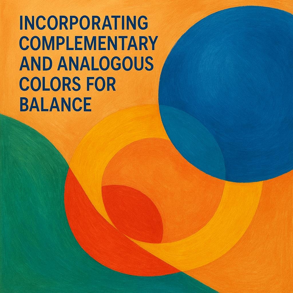
Incorporating Complementary and analogous Colors for Balance
Achieving a balanced and visually appealing color scheme in an open concept living room becomes effortless when you thoughtfully blend complementary and analogous colors. complementary pairs, found opposite each other on the color wheel—such as blue and orange or red and green—create striking contrast that energizes the space. To avoid overwhelming the room, use one color predominantly and introduce its complement as an accent through cushions, artwork, or decorative elements. This approach maintains cohesion while fostering dynamic interplay between hues, enriching the room’s atmosphere.
On the other hand, analogous colors—those neighboring each other on the color wheel like blue, teal, and green—offer a serene and harmonious vibe that’s perfect for open layouts. When combined, these colors naturally flow and blend, making transitions between different zones within the room feel seamless. Consider the following tactics to balance your palette effectively:
- Start with a dominant shade: Anchor your palette with one color, preferably a neutral or soft tone.
- Add depth: Layer in analogous colors through fabrics, rugs, or wall paint.
- Introduce contrast: Use complementary colors sparingly as accents to break monotony.
- Mind the scale: Distribute colors evenly around the room to maintain visual interest.
| Color Strategy | Effect | application Tips |
|---|---|---|
| Complementary Colors | Vibrant contrast | Use accents to highlight areas |
| Analogous Colors | Soothing harmony | Blend across textiles and walls |
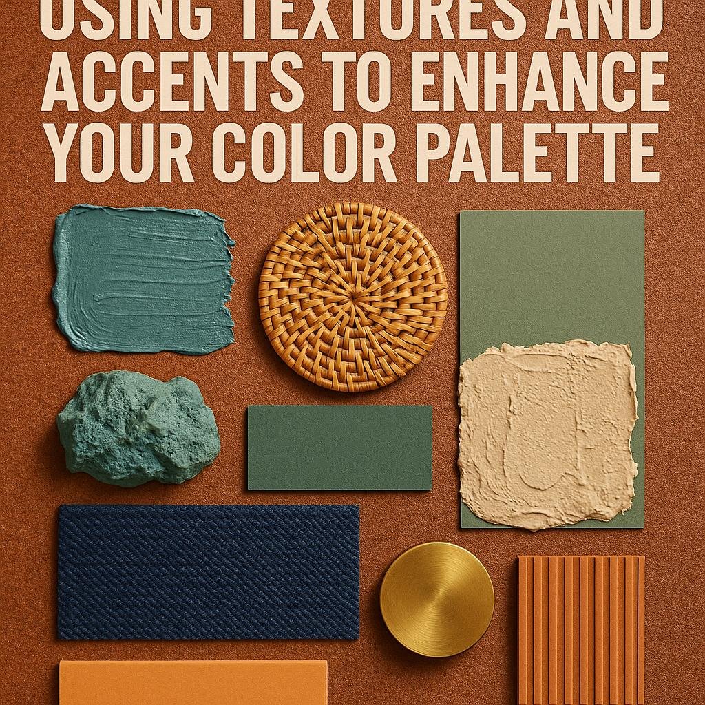
Using Textures and Accents to Enhance Your Color Palette
Incorporating diverse textures and accents is a powerful way to breathe life into your color scheme without overwhelming the space. By mixing materials like plush velvet throw pillows, woven baskets, or a shaggy rug, you create a tactile dimension that complements your hues and adds warmth. Consider layering soft textiles in neutral or muted tones that echo your primary color palette, allowing subtle contrasts to shine through and making the room feel inviting and cozy.
Accent pieces can act as the perfect punctuation marks in your open area, tying color elements together while introducing personality. Think about using:
- Metallic finishes such as brushed gold or matte black light fixtures to give a modern edge.
- natural wood accents that provide an earthy balance against bolder shades.
- Colorful art and décor to inject bursts of interest that harmonize with your main palette.
| Texture | Effect | Accent Idea |
|---|---|---|
| Linen | Soft, breathable, understated | Slipcovered sofas |
| Leather | Rich, durable, tactile contrast | Ottomans or armchairs |
| Woven | Warm, organic, textured | Rugs or baskets |
The Way Forward
Creating a harmonious color palette for your open concept living room doesn’t have to be overwhelming. By thoughtfully considering the flow between spaces, balancing warm and cool tones, and incorporating a mix of textures and finishes, you can craft a cohesive and inviting environment that reflects your personal style. Remember, the key is to maintain a sense of unity while allowing each area to shine on its own. with these tips in hand, you’re well on your way to designing a gorgeous, balanced space that feels both comfortable and connected.Happy decorating!