Are there any trends in neutral color palettes for living room design?
When it comes to designing a living room,choosing the right colour palette can set the tone for the entire space. Neutral colors have long been favored for their versatility, timeless appeal, and ability to create a calm, inviting atmosphere. But are there any new trends emerging within the world of neutral hues that are shaping living room design today? In this article, we’ll explore the latest directions in neutral color palettes, highlighting how shades of beige, gray, taupe, and off-white are being reimagined to keep living rooms both stylish and soothing. Whether you’re planning a fresh makeover or simply curious about current design influences, understanding thes trends can definitely help you create a space that feels modern, cozy, and effortlessly balanced.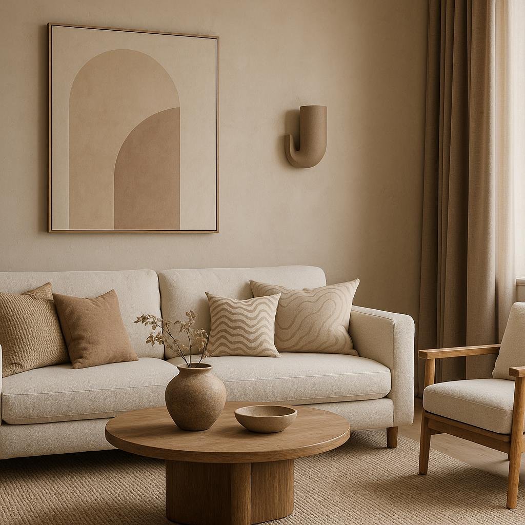
Emerging Shades and Tones in Neutral Living Room Palettes
In recent seasons, the evolution of neutral palettes in living room design has shifted towards warmer, earth-infused shades that bring a cozier and more inviting atmosphere. Instead of sticking to the classic grays and beiges, designers are incorporating soft terracotta, sandy taupes, and muted olive hues. These colors work harmoniously with natural materials like rattan, linen, and raw wood, creating a tactile richness that transforms neutral spaces from bland to breathtaking. Such subtle shifts emphasize the personality within neutrality, making rooms feel both timeless and refreshingly modern.
To capture the spirit of these emerging tones, many are blending cool and warm neutrals in dynamic combinations. For example, pairing deep charcoal with creamy ivory or dusty blush with stone gray creates depth without overwhelming the senses. Here’s a quick guide to some trending shades and their best complementary finishes:
| Shade | Best Complement | ideal Material |
|---|---|---|
| Warm Sand | Soft Wood Tones | Linen & Jute |
| Muted Olive | Matte black Accents | Clay Pottery |
| Smoky Taupe | Brushed Brass | velvet Upholstery |
| Dusty Blush | Soft walnut | Wool Textiles |
- Layering textures enhances even the simplest palettes
- balancing light and shadow highlights unique undertones
- Using accents wisely creates focal points without overpowering neutrality
balancing Warmth and Coolness for Inviting Spaces
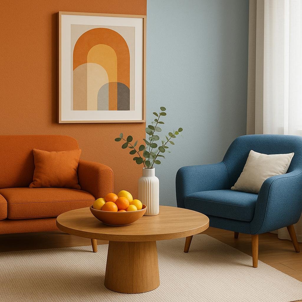
Striking the perfect harmony between warm and cool tones is essential for creating a living room that feels both cozy and refreshing. By combining warm neutrals such as beige, soft browns, or muted terracotta with cooler shades like slate gray, icy blues, or gentle taupes, you invite a dynamic contrast that elevates the overall ambiance. This interplay not only adds depth but also ensures the space remains versatile, accommodating various light conditions and evolving personal tastes.
To achieve this balance effectively, consider integrating elements that emphasize each temperature range through:
- Textiles: Warm-toned throws and cushions paired with cool-colored rugs or curtains.
- Furniture: Wooden finishes balanced with metallic or glass accents.
- Artwork and decor: Pieces that incorporate both warm and cool hues for visual continuity.
| Warm Elements | Cool Elements |
|---|---|
| Burnt orange cushions | slate gray sofa |
| Natural wood coffee table | Steel floor lamp |
| Beige wool rug | Blue ceramic vase |
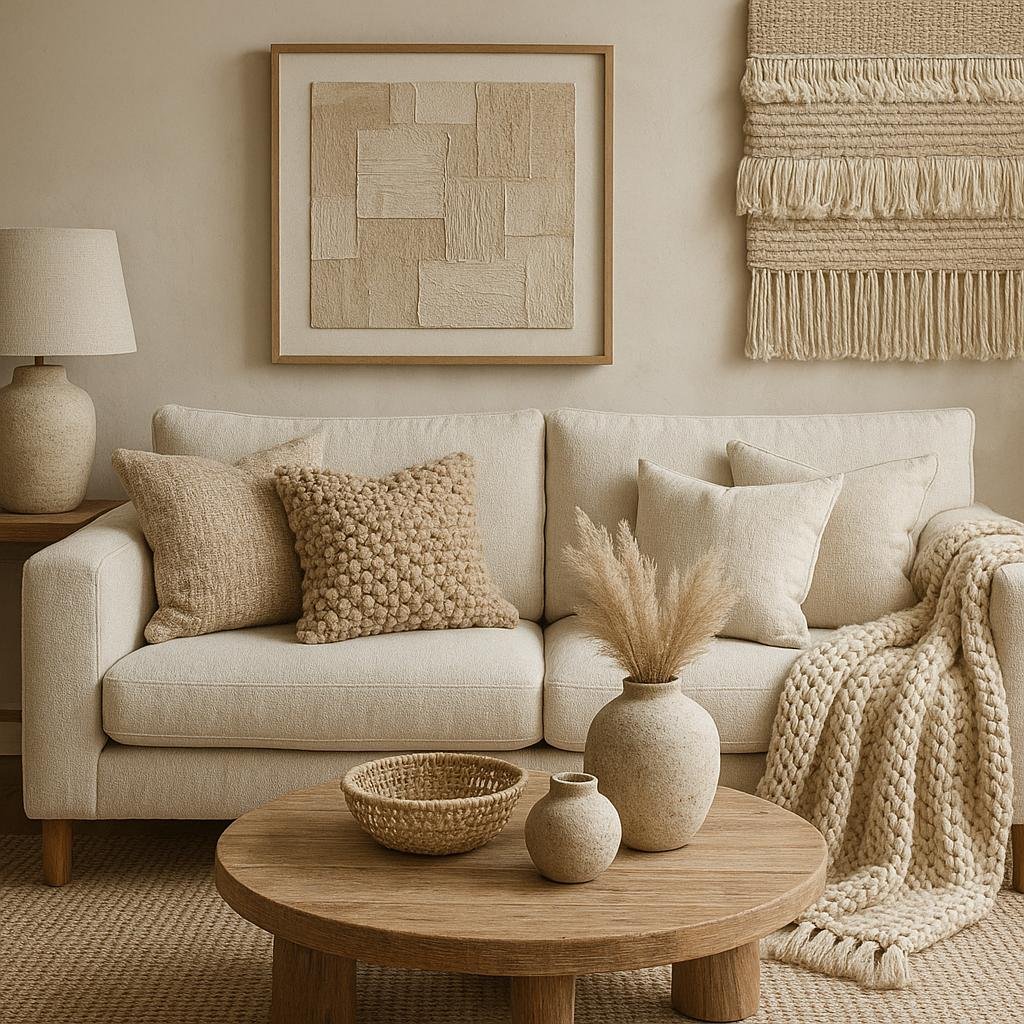
Incorporating Texture and Layering to Enhance Neutral Colors
Neutral colors, while understated, gain remarkable depth and interest through the strategic use of texture and layering. Combining materials such as woven linens, nubby wools, and smooth velvets introduces a tactile dimension that enlivens muted tones. Such as, draping a chunky knit throw over a sleek beige sofa enhances both comfort and visual intrigue, creating a cozy yet elegant atmosphere. layering different shades of the same neutral family, like greys ranging from soft dove to charcoal, further highlights texture variations and prevents the space from feeling flat or monotonous.
To master this technique, consider incorporating elements such as:
- Textured rugs with subtle patterns or raised fibers
- Accent pillows featuring embroidery or tufting
- Mixed-material furniture like wood frames paired with upholstered cushions
- Decorative baskets woven from natural fibers for practical storage and added dimension
| Material | Affect on Neutral Palette | Usage Tip |
|---|---|---|
| Linen | Light, breathable texture | Use for curtains or cushion covers |
| Leather | Rich, smooth contrast | Incorporate in armchairs or ottomans |
| Wool | Cozy, plush warmth | Choose knitted throws or rugs |
| Wood | Natural, grounding element | Use in furniture and accent pieces |
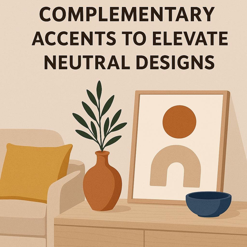
Tips for Choosing complementary Accents to Elevate Neutral Designs
When enhancing a neutral living room, selecting the right accents can transform understated elegance into a captivating focal point. Start by introducing texture through materials like woven baskets, velvet cushions, or natural wood elements, which add depth without overwhelming the calm color scheme. Additionally, play with contrasting shapes - think round mirrors paired with angular furniture to create visual interest. Don’t forget the power of subtle color pops; muted blues, soft greens, or dusty pinks pair beautifully with beiges and grays, providing personality while maintaining harmony.
To simplify your choices, here’s a helpful guide highlighting popular accent types and their impact on neutral spaces:
| Accent Type | Effect | Example Colors |
|---|---|---|
| Textiles | Add warmth and comfort | Soft taupe, charcoal, oatmeal |
| Metallics | Introduce subtle shine and luxury | Brushed gold, matte black, copper |
| Botanical | Bring life and fresh color | Olive green, sage, moss |
| Art Pieces | Create focal points and personality | Burnt sienna, navy, muted ochre |
remember that layering accents gradually and observing their interaction with natural light ensures a balanced and inviting living space. Less can truly be more when thoughtfully combined in neutral palettes!
The Way Forward
neutral color palettes continue to evolve, offering fresh and versatile options for living room design. From warm earthy tones to cool greys and soft pastels, these hues provide a calming backdrop that complements a variety of styles and personal touches. Embracing these trends allows homeowners to create inviting, timeless spaces that balance comfort with sophistication. Whether you prefer a minimalist approach or a layered, textured look, neutral colors remain a reliable foundation for designing a living room that feels both current and enduring.