Can neutral color palettes help create a cohesive look in an open concept living room?

Creating a harmonious and inviting atmosphere in an open concept living room can be both exciting and challenging. One design strategy that has gained popularity for achieving a seamless flow between different areas is the use of neutral color palettes. But can these understated tones truly help tie together an open space and provide a cohesive look? In this article, we’ll explore how neutral colors work in open concept living rooms, why they’re so effective, and offer practical tips for incorporating them into your design. Whether you’re starting from scratch or refreshing your current space, understanding the power of neutrals could be the key to a beautifully unified home.
Benefits of neutral Color Palettes in Open Concept Living Spaces
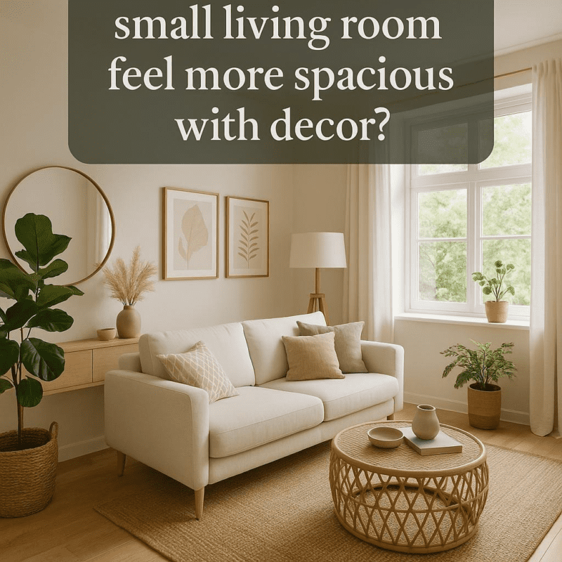
Using neutral tones in an open concept living space creates a seamless visual flow that connects different areas without overwhelming the senses. Shades like soft beige, warm gray, and crisp white serve as a versatile backdrop, allowing furniture and décor pieces to shine while maintaining harmony across the entire room. This approach helps to establish balance and cultivate a calming atmosphere, making the space feel inviting and thoughtfully designed.
Another advantage lies in the versatility neutral palettes offer for future updates and customization. Sence these colors are timeless and universally appealing, homeowners can easily introduce pops of color through accessories, textiles, or artwork without worrying about clashing or disrupting the cohesive feel.Here are some additional benefits:
- Enhances natural light by reflecting it throughout the space
- Creates a sense of spaciousness that complements the open layout
- Simplifies furniture selection as most finishes pair well with neutrals
- Supports multiple design styles from modern minimalist to rustic charm
| Feature | Benefit |
|---|---|
| Versatility | Coordinates with a wide range of colors and materials |
| Timelessness | Stays stylish through trends and seasons |
| Neutral backdrop | Allows statement pieces to stand out |
| Visual cohesion | Unifies multiple functional areas |
Choosing the Right Neutral Shades to Enhance Room Flow
Neutral shades act as the perfect canvas, allowing different zones within an open concept living room to unify effortlessly. When selecting these tones, it’s essential to consider their undertones-warm neutrals like beige and taupe evoke a cozy atmosphere, while cooler greys and soft whites can create a refreshing sense of openness. Mixing these hues thoughtfully ensures that each area flows smoothly into the next without visual disruption. Incorporating subtle variations within the same color family can add depth and interest without overwhelming the space.
To simplify your decision-making, keep in mind key characteristics of popular neutral tones:
- Warm Neutrals: Cream, caramel, warm grey – promote comfort and intimacy.
- Cool Neutrals: Slate grey, icy white, greige – enhance brightness and calmness.
- Mixed Undertones: Greige,mushroom – offer versatile adaptability across styles.
Below is a quick guide illustrating how different neutral shades can influence the room’s vibe:
| Shade | Undertone | Effect on Space |
|---|---|---|
| Warm Beige | Warm | Inviting, cozy |
| Greige | Neutral | Flexible, balanced |
| Soft White | Cool | Shining, airy |
| Charcoal Grey | Cool | Modern, grounding |
Incorporating Textures and Accents for Visual Interest
Introducing a variety of textures and accents is an essential strategy to prevent a neutral color scheme from feeling flat or monotonous. Consider layering soft fabrics like linen, velvet, or boucle in cushions, throws, and curtains to add depth and warmth. Natural elements such as wood, stone, or woven baskets create tactile contrast, enriching the sensory experience while maintaining harmony across an open space. Metallic accents in brass, copper, or matte black can serve as eye-catching focal points without overpowering the serene palette.
To achieve a dynamic yet unified look, balance is key. Here’s how you might approach it:
- Soft vs. hard materials: pair plush upholstery with sleek wooden furniture to create balanced visual interest.
- Matte vs. glossy finishes: Use matte surfaces to ground the design and subtle glossy accents for sparkle.
- Patterned textiles: Introduce gentle patterns like herringbone, stripes, or geometrics in muted tones.
| Texture Type | Material Example | Visual Effect |
|---|---|---|
| Soft | Linen cushions | Inviting and cozy |
| Natural | Woven baskets | Organic warmth |
| Metallic | Brass lamp | Elegant highlight |
| Textured fabrics | Boucle chair | Visual interest |
Tips for Balancing Warm and Cool Neutrals for Harmony
Creating a harmonious living space with neutrals means thoughtfully combining warm and cool tones. Start by choosing one tone as your base-whether it’s a soft beige or a muted gray-and let it dominate larger surfaces like walls or sofas.Then, introduce the opposite temperature in smaller doses with accent pieces such as throw pillows, rugs, or artwork. This technique prevents the palette from feeling too cold or too bland, while still maintaining an overall serene vibe.
Here are some practical tips to keep your neutrals balanced and visually pleasing:
- Layer textures: Incorporate diverse materials like linen, leather, or matte ceramics to add depth regardless of color temperature.
- Use natural elements: Wood tones frequently enough serve as a perfect bridge between warm and cool neutrals, creating effortless cohesion.
- Light layering: Add sheer curtains or soft lighting that complements both warm and cool hues to unify the space.
- Test samples: Place color swatches side by side in natural light before committing to ensure they harmonize well together.
| Warm Neutrals | Cool Neutrals | Best Pairings |
|---|---|---|
| Beige | Soft Gray | Wood accents, Cream fabrics |
| Caramel | Slate Blue | Bronze accessories, Cotton throws |
| Taupe | Stone | Linen pillows, Glass décor |
To Conclude
neutral color palettes offer a versatile and effective way to create a cohesive look in an open concept living room.By providing a harmonious backdrop, they allow different zones within the space to flow seamlessly together while still leaving room for personal touches and accent colors. Whether you prefer soft beiges, warm taupes, or cool grays, embracing neutrals can help unify your open layout and make your living area feel both inviting and visually balanced. With thoughtful layering of textures and complementary furnishings, a neutral palette can transform your open concept space into a stylish and cozy haven.


