Do neutral color palettes work well with different design themes in living rooms?

When it comes to designing living rooms, choosing the right color palette can set the tone for the entire space. Neutral color palettes-comprising shades like beige, gray, white, and soft taupe-have long been favored for their versatility and calming effect. But how well do these understated hues blend with different design themes, from modern minimalism to cozy rustic charm? In this article, we’ll explore the adaptability of neutral tones and reveal why they remain a popular choice for creating stylish, welcoming living rooms across a variety of décor styles. Whether you’re dreaming of a sleek contemporary look or a warm, inviting atmosphere, understanding how neutral colors interact with your design theme can help you craft a space that feels just right.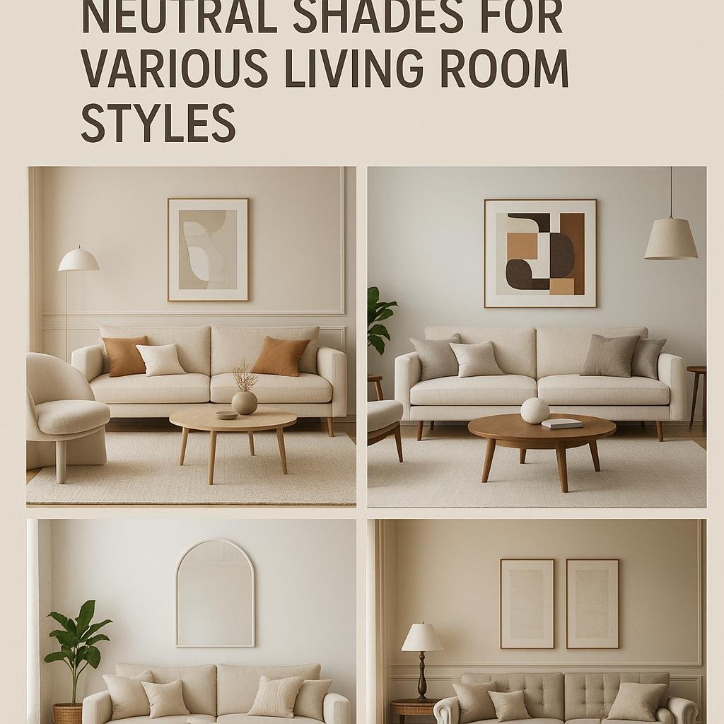
Choosing the Right Neutral Shades for Various Living Room Styles
When it comes to selecting neutral shades for living rooms, understanding the overall design style is crucial. For contemporary spaces, cool neutrals like soft grays and crisp whites create a sleek, airy vibe that complements minimalist furnishings. In contrast, warmer neutrals such as beige, taupe, and creamy hues add a cozy, inviting tone to traditional or rustic interiors, enhancing wood textures and vintage décor effortlessly. Mixing textures-like velvet cushions or woven rugs-with these neutral tones adds depth and interest without overwhelming the space.
Different design themes can be beautifully supported by carefully chosen neutral palettes. Here’s a swift guide to pairing neutrals with popular living room styles:
- Scandinavian: Soft whites, light greiges, and pale pastels create calmness and simplicity.
- industrial: Charcoal grays, muted browns, and black accents emphasize raw materials.
- Bohemian: Earthy creams and sandy tones work well alongside vibrant accessories.
- Coastal: Seafoam greens, sandy taupes, and soft blues evoke relaxation and freshness.
| Design Style | Recommended Neutral Shades | Texture Ideas |
|---|---|---|
| Modern | Cool gray, white, greige | Glossy surfaces, smooth fabrics |
| Traditional | Beige, warm taupe, cream | Velvet, rich wood grain |
| Rustic | Earthy browns, mocha, sand | Raw linen, natural fibers |
| Minimalist | Soft white, pale gray | Matte finishes, sleek metals |

How Neutral Palettes Enhance Minimalist and scandinavian Designs
Neutral color palettes serve as the cornerstone for both minimalist and Scandinavian interiors by fostering a sense of tranquility and simplicity. These muted tones-ranging from soft whites and gentle beiges to subtle grays-allow architectural elements and carefully curated furnishings to shine without distraction. The balance achieved through neutrals enhances natural light reflection, making spaces feel open and airy, a key tenet of Scandinavian design’s emphasis on wellbeing and minimalism’s focus on decluttered living.
Incorporating neutral shades brings several practical benefits to these design themes. As a notable example, they create a versatile backdrop that complements textures such as light wood grains, woven fabrics, and matte finishes, which are frequently enough featured in these styles. Below is a quick reference on how specific neutral hues boost design elements in minimalist and Scandinavian spaces:
| Neutral Hue | Design Impact | Common Use |
|---|---|---|
| Warm White | Enhances warmth and coziness | Walls and ceilings |
| Soft Gray | Introduces modern subtlety | furniture and textiles |
| Beige | Adds natural earthiness | Rugs and upholstery |
- Simplicity: Neutral palettes reduce visual noise, aligning well with minimalist principles.
- Timelessness: These shades provide a classic foundation that evolves gracefully with styling changes.
- Versatility: Easier to integrate with accent colors or natural elements like plants.

Blending Neutrals with Bold Accents in Contemporary and Eclectic Spaces
incorporating bold accents into neutral foundations is a brilliant way to breathe life into contemporary and eclectic living rooms. Neutrals such as soft taupes, warm greys, and creamy whites create a versatile backdrop that allows vibrant colors and textures to take center stage without overwhelming the space. Think of a sleek charcoal sofa adorned with mustard yellow cushions or a minimalist beige rug paired with a striking cobalt blue armchair.This blending approach not only enhances visual interest but also maintains a harmonious balance that keeps the room feeling refined and inviting.
Designers often recommend these strategic touches to inject personality while keeping the overall serenity and cohesion of the room intact. Useful techniques include:
- Layering textures: Combine matte neutrals with glossy or metallic accents to add depth.
- Focal snapshots: Position bold artworks or patterned pillows as intentional focal points.
- Balance with scale: Use larger neutral elements to ground smaller, vibrant pieces.
| neutral Base | Accent Color | Effect |
|---|---|---|
| Soft Grey | Burnt Orange | Warm & Inviting |
| Cream | Emerald Green | Fresh & Energetic |
| Beige | Deep Navy | Elegant Contrast |
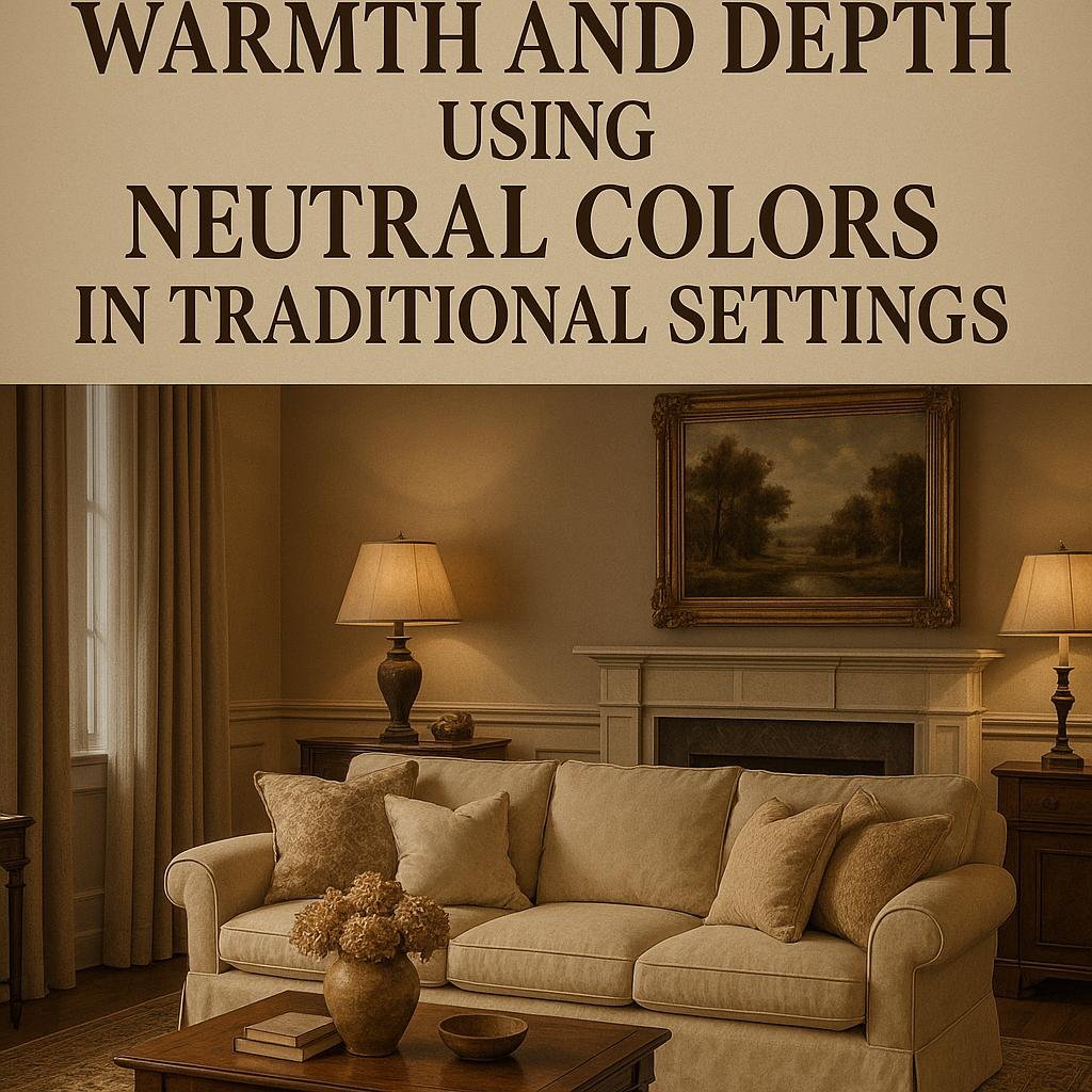
Tips for Creating Warmth and Depth Using Neutral Colors in Traditional Settings
Achieving warmth and depth in traditional interiors with a neutral palette hinges on layering textures and varying tones. Rather than relying solely on a single beige or greige, embrace a spectrum of neutrals such as soft taupes, warm creams, and muted grays. These subtle shifts in color create visual interest without overwhelming the classic elegance of traditional design. Incorporate richly textured fabrics like velvet,linen,or wool to add tactile warmth and avoid flatness. Additionally, integrating natural elements like wood accents, brass fixtures, or woven baskets complements the neutral foundation, enhancing the room’s inviting atmosphere.
thoughtful accessorizing is key to broadening the depth of neutrals in traditional settings. Use heavy, ornate mirrors or framed artwork with gilded edges to bring a sense of history and refinement. Soft, layered lighting including table lamps with fabric shades and candle sconces on the walls also plays a big role in creating mood and dimension. Here’s a quick guide to essential elements that enrich neutral living rooms in traditional homes:
- Layered Rugs: Combine sisal or jute with plush area rugs for texture contrast.
- Mixed Metals: Blend antique brass and brushed nickel for timeless appeal.
- Classic Patterns: Introduce subtle damask or toile in upholstery or drapes.
- Accent Pillows: Use varied patterns and textures in muted colors for coziness.
Final Thoughts
neutral color palettes offer remarkable versatility, making them an excellent choice for a wide range of living room design themes. Whether your style leans toward modern minimalism, cozy rustic, or elegant traditional, neutrals provide a flexible foundation that enhances other elements without overwhelming the space. By thoughtfully incorporating textures, patterns, and accent colors, you can easily customize a neutral palette to reflect your personal taste while maintaining a calm and inviting atmosphere. Ultimately, embracing neutral tones allows for timeless and adaptable living room designs that grow with you over time.