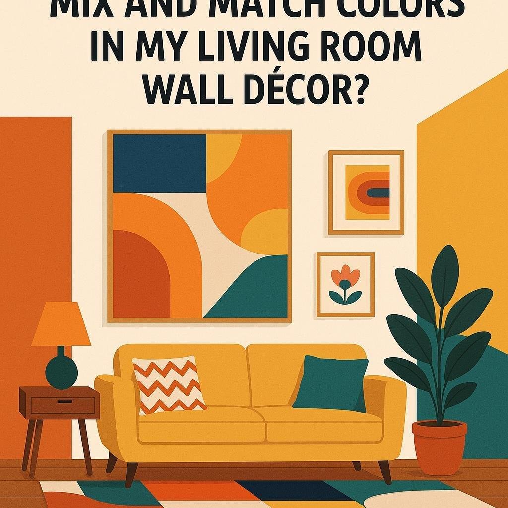
How can I mix and match colors in my living room wall decor?
Choosing the right colors for your living room walls can truly transform the space, making it feel inviting, vibrant, or serene-whatever mood you want to create. But mixing and matching colors can sometimes feel overwhelming, especially when your aiming for a balanced and cohesive look. Whether you’re working with bold hues or subtle shades, understanding a few simple principles can definitely help you combine colors confidently and creatively. In this article, we’ll explore practical tips and expert advice on how to mix and match colors in your living room wall decor, so you can design a space that reflects your personality and style.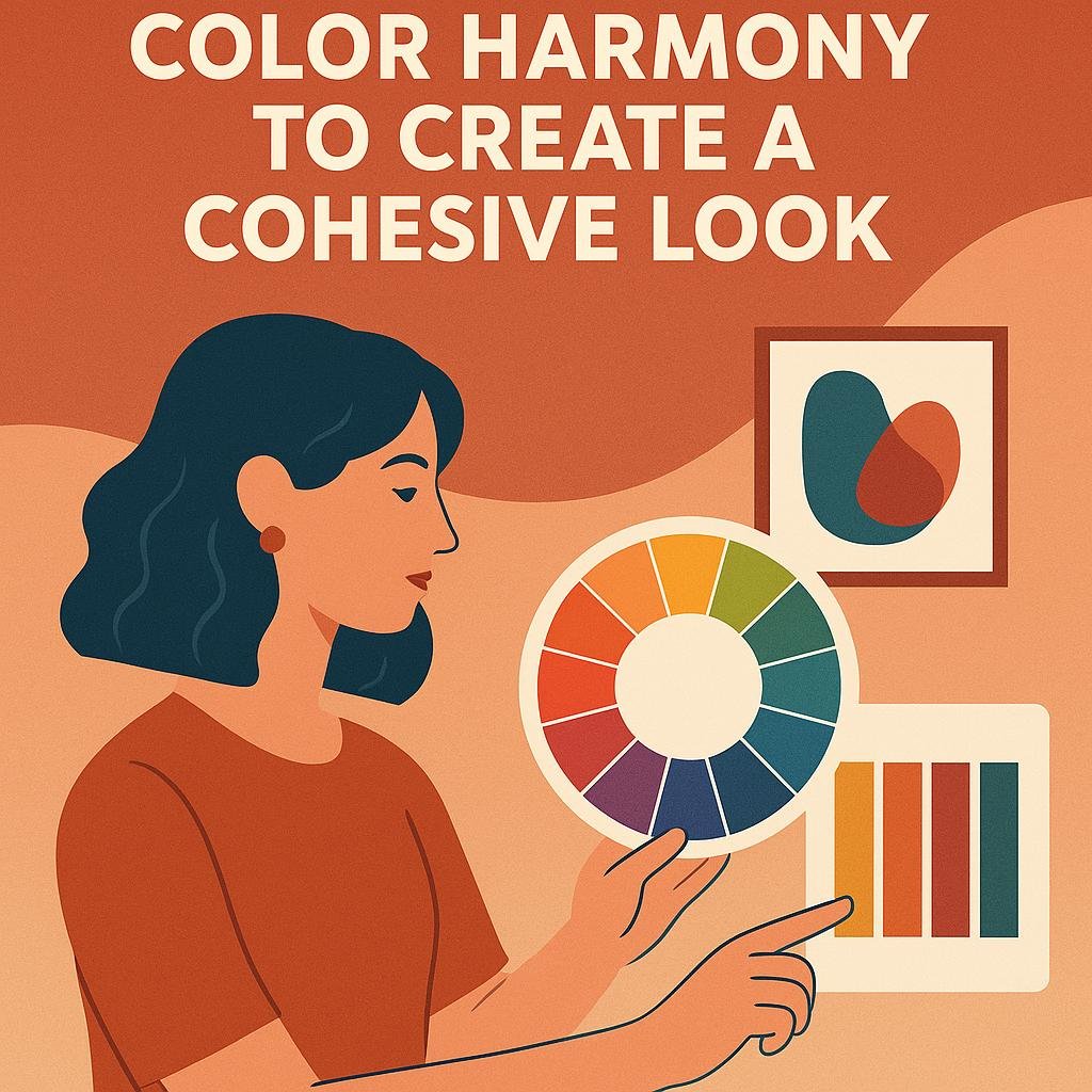
Understanding Color Harmony to Create a Cohesive Look
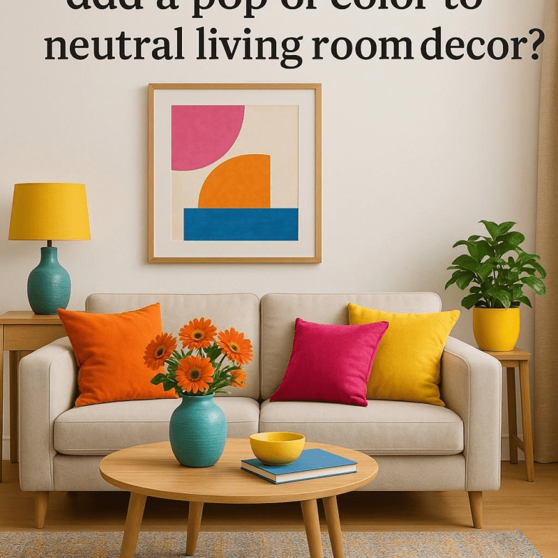
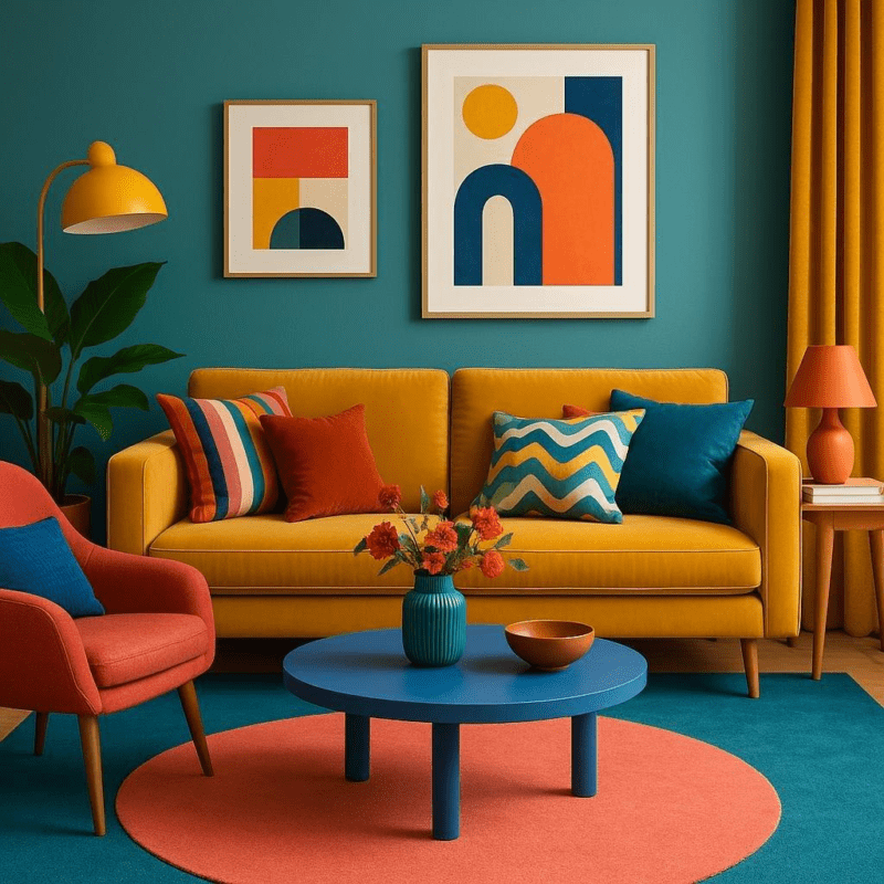
Achieving a visually appealing color scheme in your living room starts with understanding the principles of color harmony.At its core, color harmony is about combining colors that naturally complement each other, creating a balanced and pleasing environment. One popular approach is to use an analogous color scheme, which involves selecting colors that are next to each other on the color wheel, such as soft greens, muted blues, and gentle yellows. This method ensures a serene and unified look without overwhelming the senses. Alternatively, a complementary color scheme pairs colors opposite each other on the wheel, like navy blue and warm orange, to produce a vibrant, energetic atmosphere.
For practical application, consider these quick tips to blend colors smoothly in your wall decor:
- Choose a dominant color: This will anchor your design and set the overall mood.
- Add accent colors: Use these sparingly to create interest and draw attention to specific areas.
- Balance warm and cool hues: Mixing temperature tones can prevent the design from feeling too heavy or too cold.
- Incorporate neutrals: Whites, grays, and beiges serve as a visual resting place and highlight the main colors.
| Color Harmony Type | Example Colors | Affect on Room |
|---|---|---|
| Analogous | Soft green, muted blue, gentle yellow | Calming and cohesive |
| Complementary | Navy blue, warm orange | Vibrant and energetic |
| Monochromatic | Various shades of gray | elegant and subtle |
| Triadic | Red, yellow, blue | Playful and balanced |

Choosing a Base Color and Complementary Accents with Confidence
Start by selecting a base color that reflects the mood you want to create in your living room. Consider lighter tones like soft beige or pale gray for a calming effect, or choose a rich navy or forest green to add depth and sophistication. Your base color will cover the majority of your walls, so it should serve as a versatile canvas that pairs well with various accents. Don’t hesitate to sample several shades on your walls before committing-natural light can dramatically change how colors appear throughout the day.
Once your base is set, introduce complementary accents to bring your space to life. These can be achieved through accent walls, decorative pieces, or textiles such as throw pillows and curtains.Keep in mind a few simple tips:
- Contrast is key: Pair warm bases like terracotta with cooler accents such as teal or sage.
- Use the color wheel: Colors opposite each other, like blue and orange, naturally complement and energize the room.
- Limit your palette: Stick to two or three additional hues to maintain harmony and avoid overwhelming the senses.
| Base Color | Complementary Accent | Ideal Finish |
|---|---|---|
| warm Taupe | Deep Teal | Matte |
| Soft Gray | Mustard Yellow | Satin |
| Classic Navy | Burnt Orange | Eggshell |
| Muted Sage | Blush Pink | Matte |
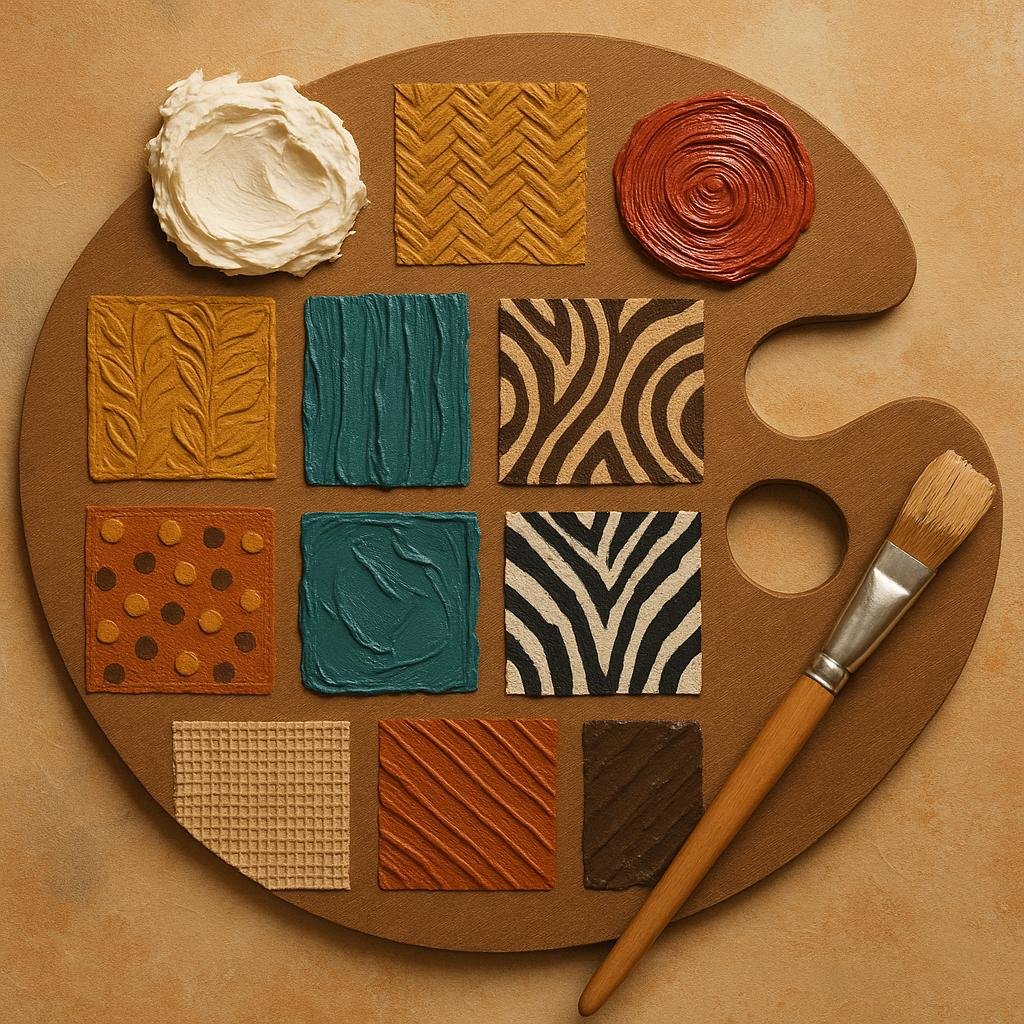
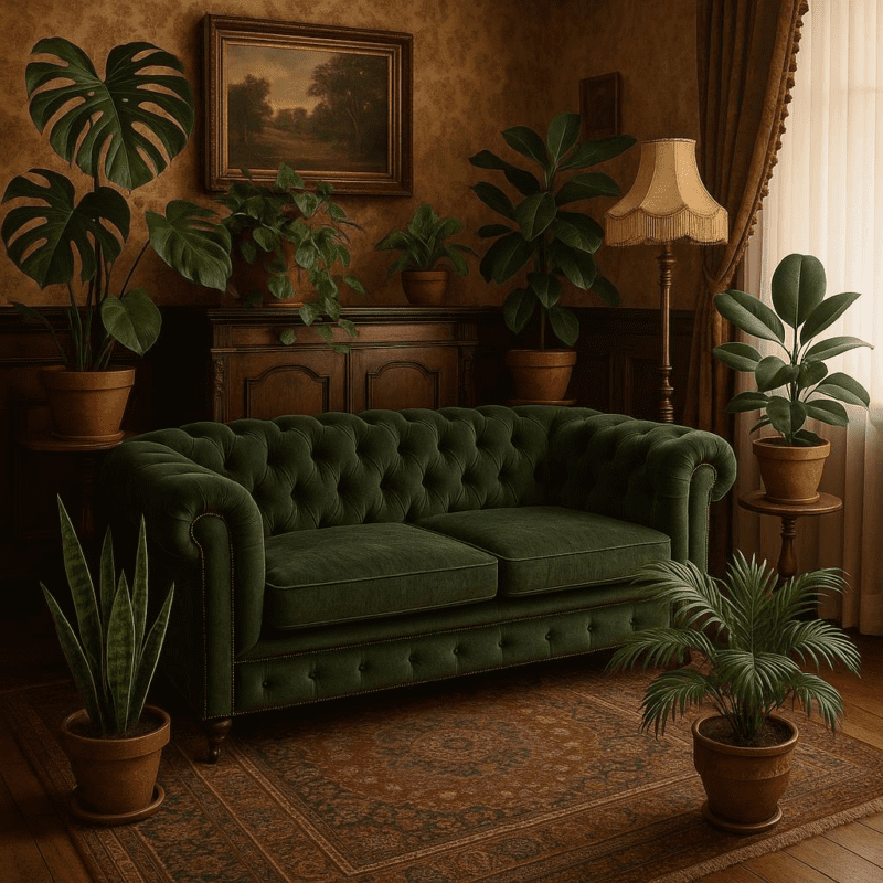
Incorporating Different textures and Patterns to Enhance Your Palette
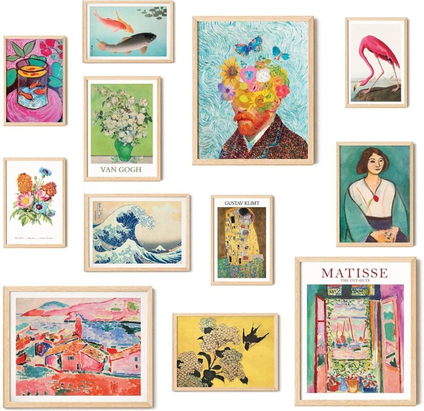
When mixing colors on your living room walls, integrating a variety of textures and patterns can amplify the depth and interest of the space. consider pairing a smooth,matte paint finish with a textured wall panel or a fabric-covered accent wall. This playful contrast doesn’t just add dimension but also invites tactile exploration.Patterns, such as subtle geometric shapes or floral motifs, can be introduced through wallpaper or stenciling to break up large blocks of color and create focal points without overwhelming the room.
To keep your palette cohesive while experimenting with complexity, try a strategic approach to your combinations:
- Balance bold patterns with neutral or solid color backgrounds
- Mix large and small scale designs to avoid visual chaos
- Incorporate natural materials like woven wall art or wooden panels for organic texture
- Use textiles such as cushions, rugs, or curtains to echo wall colors and add softness
| Texture Type | Effect | Recommended Use |
|---|---|---|
| Matte Paint | Smooth, non-reflective | Base color for calm foundation |
| Grasscloth Wallpaper | Natural, woven texture | Accent wall to add warmth |
| Brick Veneer | Rough, rustic | Industrial or cozy vibe |
| Fabric Panels | Soft, layered | Sound absorption and softness |

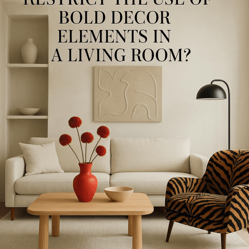
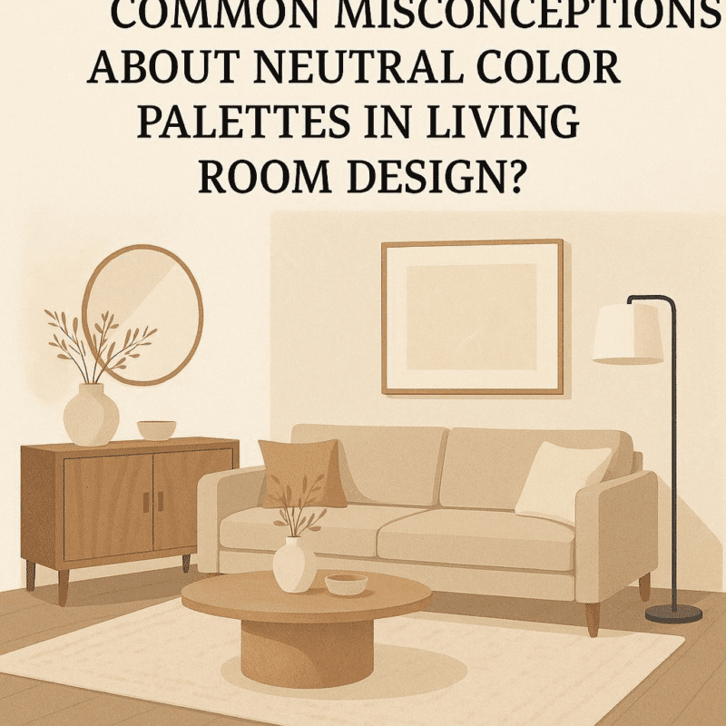
Tips for Balancing Bold Hues with Neutral Shades in Wall Decor
Start by establishing a neutral base for your living room walls using shades like soft grays, warm beiges, or classic whites. These colors act as a calming canvas and allow bold hues to pop without overwhelming the space. When selecting bold colors, consider incorporating them through accent walls, artwork, or decorative elements such as pillows and rugs. Remember, balance is key-too much bold color can make a room feel chaotic, while too many neutrals might appear dull.
To create visual harmony, try pairing your bold hues with neutrals in a thoughtfully layered approach. Use a color wheel to find complementary or analogous shades that resonate well together. Here’s a quick guide for combining bold and neutral tones:
| Bold Hue | Neutral Shade | Best usage |
|---|---|---|
| Deep Teal | Soft White | Accent Wall with White Trim |
| Rich Mustard | Light Taupe | Artwork & Accessories |
| Burnt Orange | Cool Gray | Furniture and Wall Decor |
Experiment with textures and finishes-a matte bold wall next to a satin neutral wall or velvet cushions beside linen drapes can add subtle yet impactful contrast. Above all, trust your instincts and let your personality shine through this playful color dance, crafting a welcoming and stylish living room.
Wrapping Up
Mixing and matching colors in your living room wall decor is a splendid way to express your personality and create a space that feels both inviting and visually dynamic. By understanding basic color theory, experimenting with different combinations, and considering the mood you want to set, you can confidently design walls that complement your furniture and enhance the overall ambiance of your home. Remember, there’s no one-size-fits-all formula-trust your instincts, have fun with the process, and don’t be afraid to try new things. With these tips in hand, you’re well on your way to crafting a living room that’s uniquely yours. Happy decorating!