How can textures and patterns enhance neutral color palettes in living room design?
When it comes to designing a living room, neutral color palettes offer a timeless and versatile foundation that can create a calm and inviting atmosphere. though,relying solely on shades like beige,gray,or white can sometimes result in a space that feels flat or uninspired. This is where textures and patterns come into play. By thoughtfully incorporating diffrent materials and subtle designs, you can add depth, warmth, and personality to a neutral room without overwhelming its serene quality. In this article, we’ll explore how textures and patterns can elevate neutral color schemes, transforming your living room into a stylish and pleasant retreat.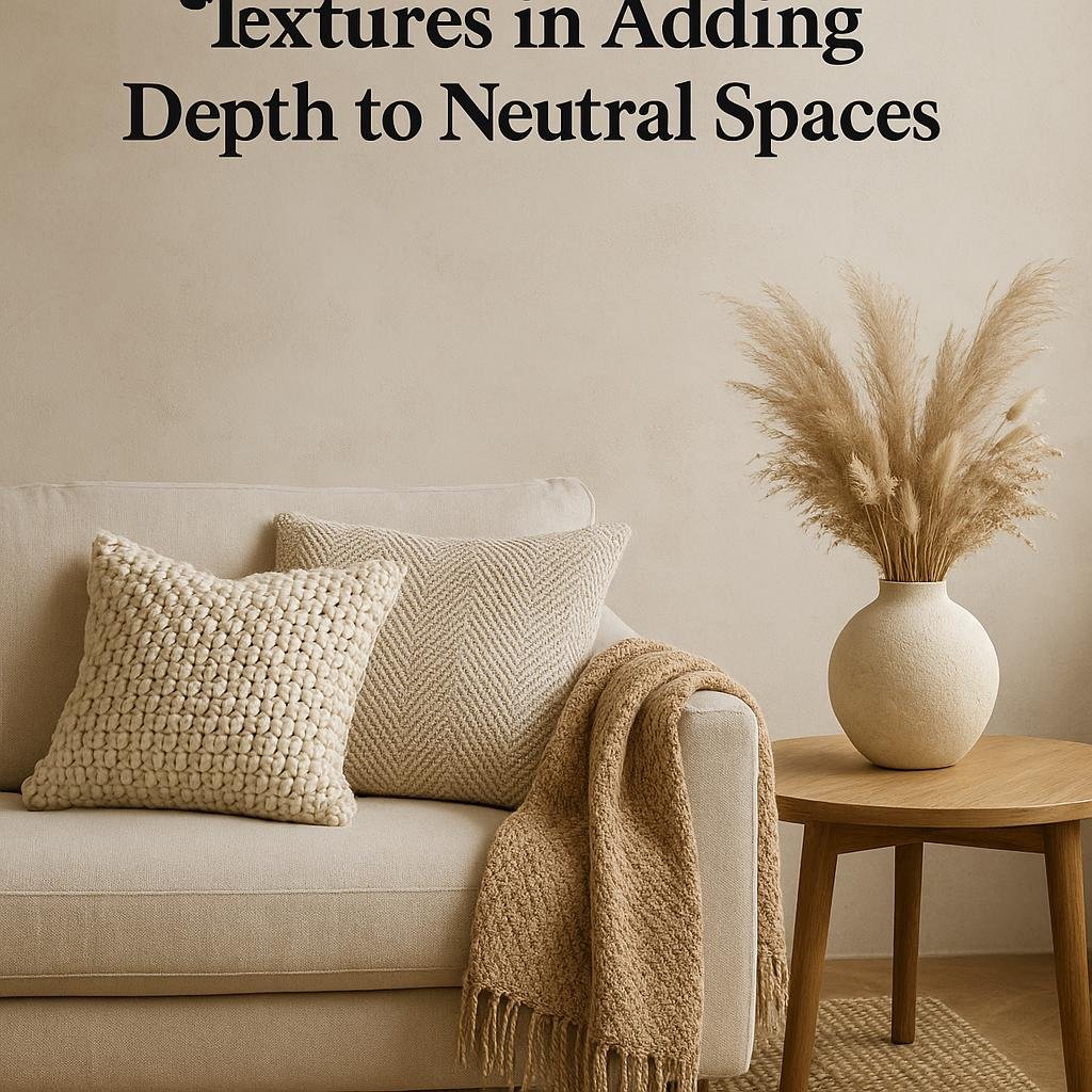
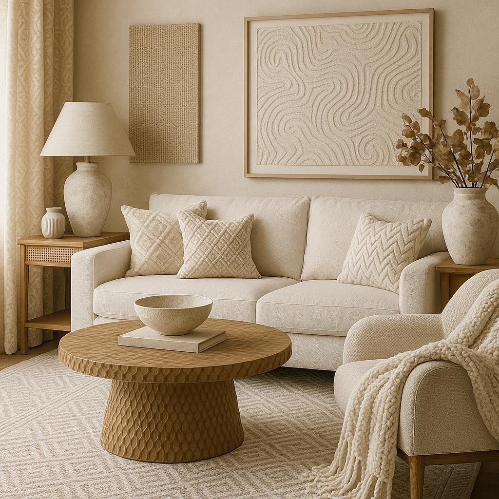
Understanding the Role of Textures in Adding Depth to neutral Spaces
Introducing various textures into a neutral color palette can transform a seemingly flat living room into a multi-dimensional haven. By incorporating materials such as velvet, linen, or wool, you create tactile interest that invites touch and adds warmth.These textures play wiht light and shadow,subtly enhancing the space without overpowering the calmness that neutral tones provide. Even small details like a woven throw or a rough-hewn wooden coffee table can provide contrast that invigorates the room’s atmosphere.
Patterns also serve as a crucial component in breaking up monotony within neutral schemes. Instead of bold colors, pattern variations in similar hues contribute to rhythm and flow. Consider including elements like geometric cushions, floral rugs, or delicate wallpaper prints that complement rather than compete with the base colors. This layering effect encourages visual engagement, making the living room feel both complex and cozy.
- Soft textures: velvet cushions, chenille throws
- Natural textures: jute rugs, wooden accent pieces
- Patterned textiles: subtle stripes, abstract shapes
- Metallic accents: brushed brass lamps, wire baskets
| Texture Type | Effect | Example |
|---|---|---|
| Soft | Adds coziness and invites touch | Velvet pillows |
| Natural | Brings warmth and organic feel | Woven baskets |
| Patterned | Breaks uniformity with subtle visual interest | Geometric rugs |
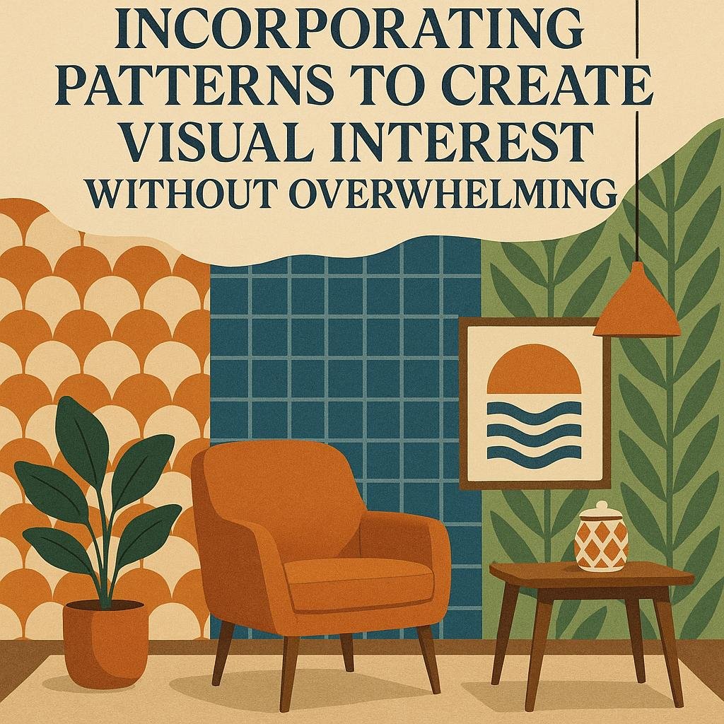
Incorporating Patterns to Create Visual Interest Without Overwhelming
Introducing patterns into a neutral living room is a fantastic way to add depth and character without overpowering the space.The key is to choose subtle, complementary patterns that bring texture and visual intrigue. Consider options like soft geometrics, gentle stripes, or delicate florals in muted tones. These patterns encourage the eye to explore the room, creating a dynamic atmosphere that remains calm and inviting. Layering patterns through items such as throw pillows, rugs, or curtains ensures a balanced and cohesive look. Always aim for a harmonious blend where textures and patterns support each other rather than compete.
To maintain visual balance,follow these principles:
- Scale Variation: Combine small-to-medium patterns with larger,simpler ones to create a rhythm that is pleasant and varied.
- Color Consistency: Stick to the neutral palette to ensure patterns complement the overall theme without disrupting the serenity.
- Texture mix: Incorporate fabrics like linen,velvet,or woven weaves to enrich the tactile experience alongside patterns.
| Pattern Type | best Submission | Effect on Room |
|---|---|---|
| Subtle Geometric | Throw pillows, area rugs | Adds modernity and structure |
| Soft Floral | Curtains, accent chairs | Introduces softness and warmth |
| Light Stripes | Blankets, upholstery | Enhances length and spacious feel |
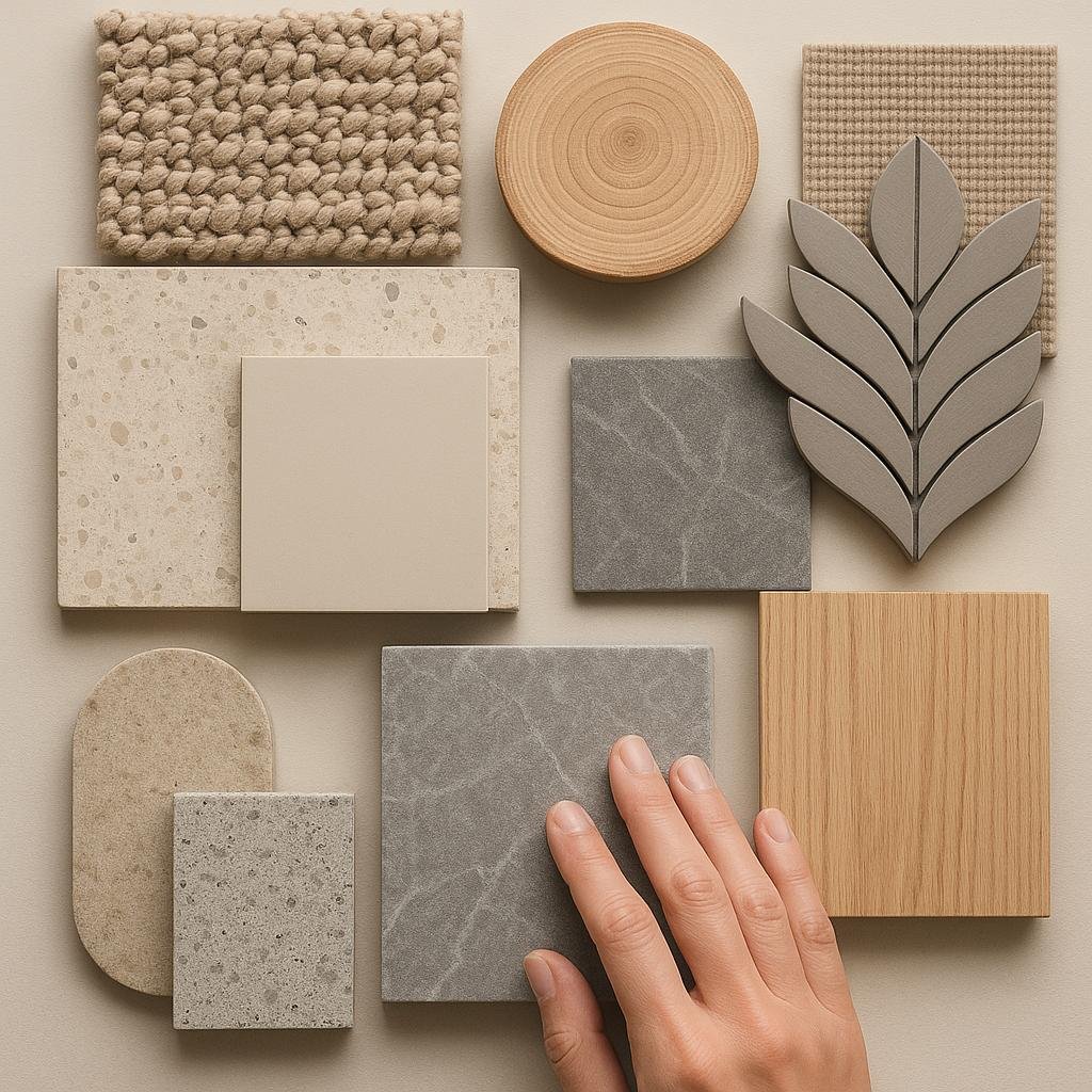
Choosing the Right Materials to Complement Neutral Color Schemes
When building a neutral color palette, selecting materials is a critical step to avoid a flat or monotonous look. Incorporate a variety of textures such as soft linens, rugged leather, smooth ceramics, and natural woods to create depth and visual interest. These materials work harmoniously with neutral hues like beige, gray, and off-white, emphasizing subtle contrasts that catch the eye without overwhelming the space. Combine textiles like velvet cushions with woven throws or add a jute rug beneath a sleek coffee table to introduce tactile richness that invites touch and comfort.
Patterns also play a pivotal role in energizing a muted backdrop. Opt for understated geometric designs, organic motifs inspired by nature, or classic stripes in similar tonal ranges to maintain cohesion while introducing personality. Using patterned upholstery, wallpaper, or decorative accessories in neutrals creates layers of style that elevate your living room’s aesthetic. Here’s a fast guide to pairing textures and patterns with specific neutral shades:
| Neutral Shade | Recommended Textures | Suggested Patterns |
|---|---|---|
| Warm Beige | Woven wicker, soft suede | Subtle floral, herringbone |
| Cool Gray | Brushed metal, smooth leather | Chevron, abstract geometric |
| Soft White | Linen, embossed plaster | Delicate lace, tonal stripes |
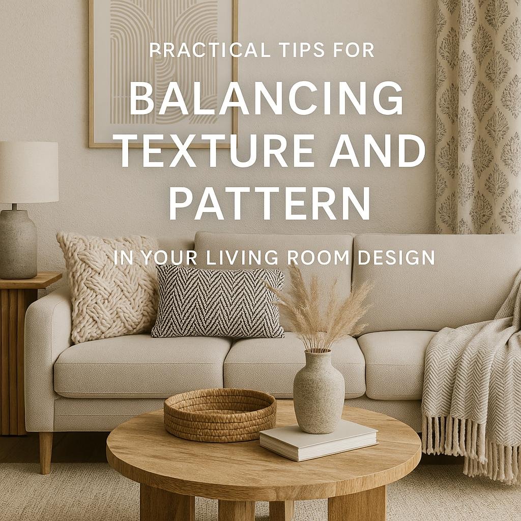
Practical Tips for Balancing texture and Pattern in Your Living Room Design
When working with a neutral color palette, texture becomes your secret weapon to inject warmth and character into the living room. Start by layering various materials like a chunky knit throw on a linen sofa or a velvet cushion atop a cotton rug. Mixing these tactile elements creates depth without overwhelming the calm, understated hues. To avoid visual clutter, choose patterns with subtle variations that complement the textures rather than compete with them-think soft geometrics or delicate botanicals in muted tones.
Balancing texture and pattern also means respecting scale and proportion. Large-patterned curtains can anchor the room while smaller patterned accessories, such as pillows or lampshades, add intrigue without overshadowing the space.Use the following guidelines to keep harmony:
- Mix small, medium, and large scale patterns to create visual layers.
- Incorporate smooth surfaces like glass or polished wood to balance rougher textures.
- Alternate matte and glossy finishes for a dynamic look that catches the eye.
| Element | Texture Examples | Pattern Suggestions |
|---|---|---|
| Upholstery | Linen, velvet | Subtle stripes, herringbone |
| Rugs | Jute, wool | Low-contrast florals, geometrics |
| Accents | Ceramic, wood grain | Dot prints, abstract shapes |
Future Outlook
Incorporating textures and patterns into a neutral color palette is a powerful way to add depth, interest, and personality to your living room design. By thoughtfully mixing materials, fabrics, and subtle patterns, you can create a space that feels warm, inviting, and visually dynamic without overwhelming the serene essence of neutral tones. Whether you prefer a minimalist vibe or a cozy, layered look, textures and patterns offer endless possibilities to elevate your neutral living room into a stylish and comfortable retreat. Don’t be afraid to experiment-you might just discover the perfect combination that brings your space to life.