What are some classic color palettes for living room design?
Choosing the right color palette is a essential step in designing a living room that feels both inviting and timeless. Classic color schemes have stood the test of time, offering a perfect balance between style and comfort. Whether you prefer warm neutrals, soft pastels, or bold contrasts, understanding these tried-and-true palettes can help you create a space that reflects your personality while maintaining a cohesive and elegant look.In this article,we’ll explore some of the most popular classic color palettes for living room design,providing inspiration and guidance for making your space truly shine.
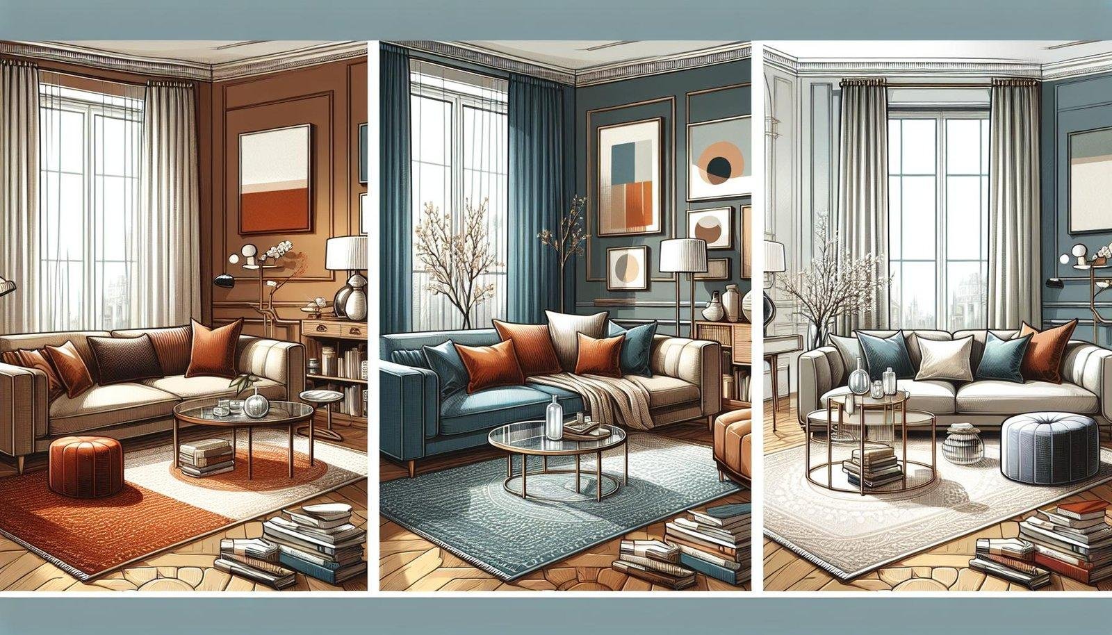
Timeless Neutral Tones for a Cozy and Elegant Living Room
Neutral tones remain a favorite for those aiming too create a living room that is both warm and refined. Shades like ivory, taupe, soft beige, and gentle greys serve as a versatile backdrop, allowing furniture and decor to shine without overwhelming the space. These colors evoke a sense of calm and timelessness,making them ideal for rooms where relaxation and subtle sophistication are desired.
Incorporating natural textures and materials complements neutral palettes beautifully. Consider elements such as:
- Woven jute rugs or soft wool throws
- Light wood finishes and rattan accents
- Matte ceramic vases and muted metallic touches
By layering these textures, you add depth and interest without relying on loud color contrasts. The result is a cohesive,inviting space where every detail contributes to an understated elegance.
Bold and Vibrant Colors to Energize Your Space
Injecting bold and vibrant colors into your living room can entirely transform the atmosphere, making it feel energized and alive. Consider integrating jewel tones like emerald green, sapphire blue, and ruby red to create a rich and dynamic palette. These colors command attention and pair beautifully with neutral elements such as crisp whites or soft grays to balance intensity without overwhelming the space.
To effectively use bold colors,try these strategies:
- Accent walls: Paint one wall in a striking hue to draw the eye and add depth.
- statement furniture: Choose sofas or chairs in vivid shades to act as focal points.
- decor accessories: incorporate cushions, rugs, and art pieces in contrasting vibrant colors.
| color | Effect | Best Use |
|---|---|---|
| Emerald Green | Invigorates and refreshes | Accent walls,cushions |
| Sapphire Blue | Calming yet bold | Statement sofas,rugs |
| Ruby Red | Warmth and passion | Decor accessories,art |
Soft Pastel Palettes for a Calm and Inviting Atmosphere
Soft pastel colors create a gentle and serene ambiance,making your living room feel like a welcoming retreat. Shades such as blush pink, mint green, and light lavender work beautifully to soften the space and bring a sense of tranquility. These hues pair wonderfully with natural textures like light wood or linen, enhancing the cozy atmosphere without overwhelming the senses. Incorporating pastel tones through accent pieces such as cushions, throws, or delicate artwork helps guide the eye effortlessly around the room while keeping the palette airy and fresh.
To balance the softness, consider combining pastels with crisp whites or warm neutrals. This contrast prevents the room from appearing too muted and adds visual interest. Here’s a quick guide to some classic pastel color combinations perfect for a calm and inviting living area:
- blush Pink + Cream + Light Gray: Offers a romantic yet modern feel.
- Mint Green + Soft Beige + White: Creates a fresh and clean environment.
- Lavender + Pale Blue + Off-White: Evokes peacefulness with a hint of cool sophistication.
| Pastel Palette | Primary Color | Accent Colors | Ideal Texture |
|---|---|---|---|
| Blush Serenity | Blush Pink | Cream, Light Gray | Linen, Light Wood |
| Mint Breeze | Mint Green | soft beige, White | Woven Fabrics, Rattan |
| Lavender Dream | Lavender | Pale Blue, Off-White | Velvet, Cotton |
Earthy Shades that Bring Warmth and Natural Beauty
Incorporating earthy tones into your living room creates a tranquil and inviting atmosphere that feels connected to nature. Colors such as rich terracotta, warm ochre, soft moss green, and deep browns work harmoniously to bring depth and coziness to any space. These shades are perfect for homeowners looking to evoke comfort while maintaining a sophisticated and timeless look.Pairing these colors with natural materials like wood, linen, and jute enhances the organic vibe and grounds the overall design.
To make the most of these warm, earthy shades, consider the following design elements:
- Accent walls: use a muted clay or burnt sienna shade to create a focal point without overwhelming the room.
- Textiles: Incorporate cushions, throws, and rugs in varying textures and complementary earthy hues to add layers of warmth.
- Natural Decor: Decorate with indoor plants, woven baskets, and wooden artifacts to amplify the natural beauty of the palette.
| Color | Design Tip | Effect |
|---|---|---|
| Terracotta | Accent or feature wall | Creates warmth and energy |
| Moss Green | Soft furnishings | Brings calm and balance |
| Warm Ochre | Artwork and accessories | Adds a golden glow |
| Deep Brown | Furniture bases | Grounds the space |
The way Forward
Incorporating classic color palettes into your living room design is a timeless way to create a welcoming and stylish space. Whether you prefer the calm neutrals of a Scandinavian-inspired scheme or the rich, warm tones of traditional interiors, these tried-and-true combinations provide a solid foundation to express your personal style. By understanding and experimenting with classic palettes, you can transform your living room into a harmonious and inviting retreat that stands the test of time. Remember, the key is to balance colors thoughtfully to reflect both comfort and elegance in your home.