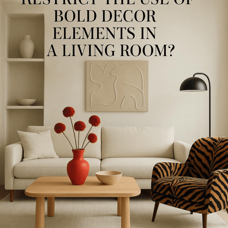
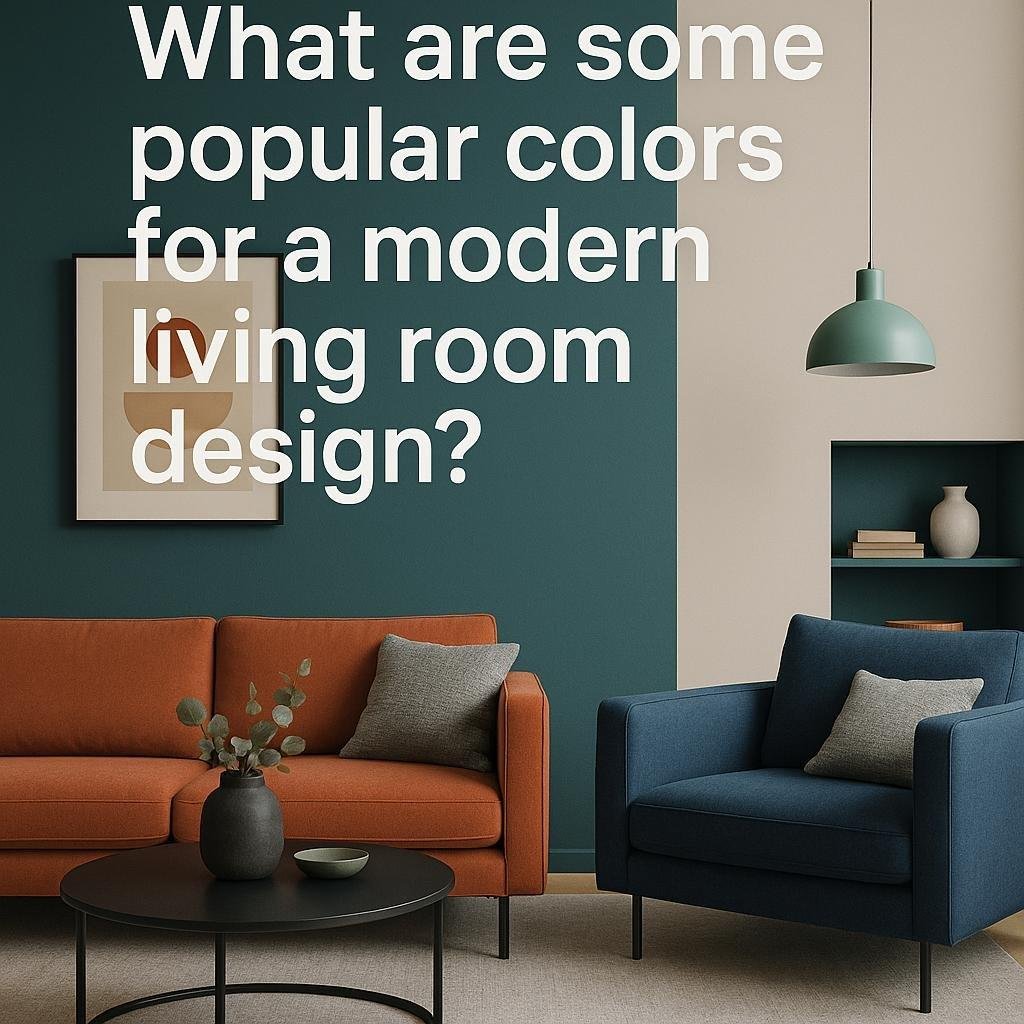
What are some popular colors for a modern living room design?
When it comes to designing a modern living room, choosing the right colour palette is one of the most exciting and impactful decisions you can make. The colors you pick not only set the mood but also influence how spacious, cozy, or vibrant your space feels. Whether you prefer calm neutrals, bold accents, or a blend of both, understanding the popular color trends for modern living rooms can help you create a stylish and inviting atmosphere. In this article, we’ll explore some of the most favored colors that are shaping modern living room designs today, giving you plenty of inspiration for your next makeover.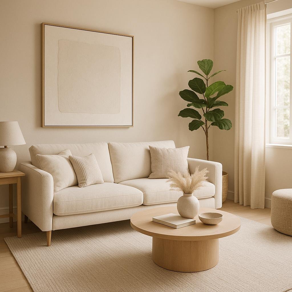
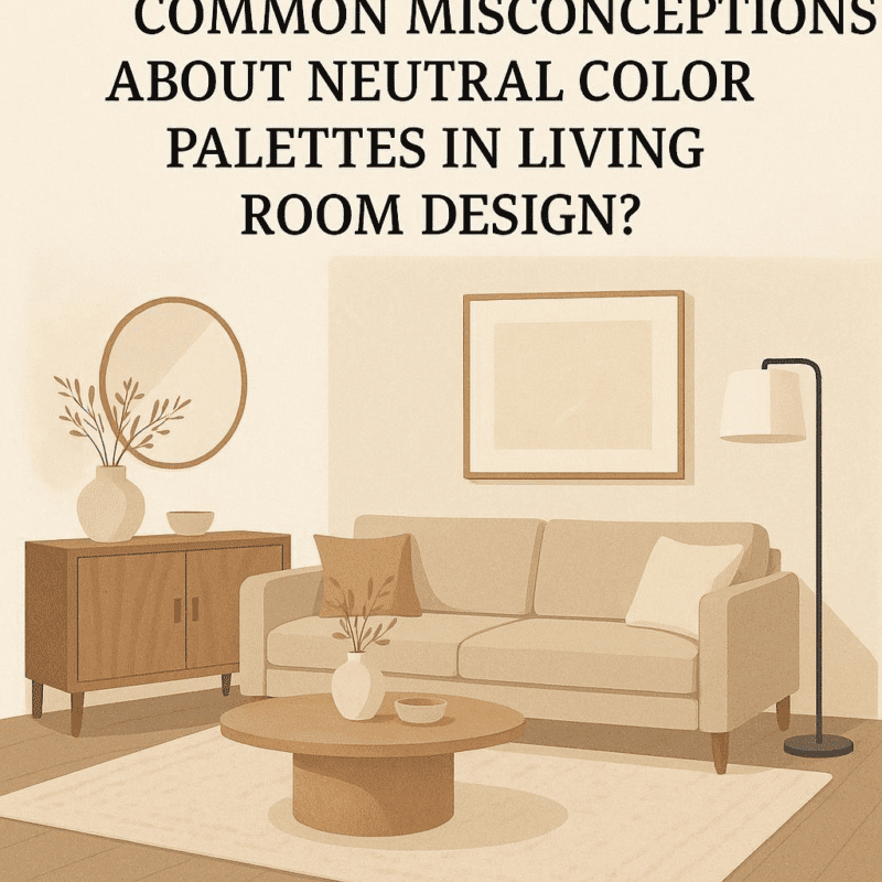
Popular Neutral Shades That Create a Calm and Versatile Living Space
When aiming for a serene and adaptable living surroundings,neutral shades like soft beige,warm taupe,and muted greys are timeless choices that bring balance and sophistication to any modern living room.These hues effortlessly complement various textures and furnishings, allowing you to switch up accessories or accent colors without the need for a complete redesign. their understated nature also enhances natural light, creating an inviting and peaceful atmosphere that’s perfect for relaxation or entertaining guests.
To add dimension without overwhelming the space, many designers use a palette of neutrals paired with subtle contrasts like ivory whites or charcoal accents. Incorporating these shades results in a harmonious blend of calm and depth that supports multiple styles-from minimalist to Scandinavian or contemporary chic. Below is a swift reference of popular neutral tones along with their mood-enhancing qualities:
| Color | Characteristic | Best Paired With |
|---|---|---|
| Soft Beige | warm and welcoming | Olive greens, burnt orange |
| Muted Gray | Modern and calm | Blush pink, navy blue |
| Warm taupe | earthy and grounding | Mustard yellow, teal |
| Ivory White | luminous and clean | Natural wood tones, gold accents |
| Charcoal | Bold and sophisticated | Soft pastels, metallics |

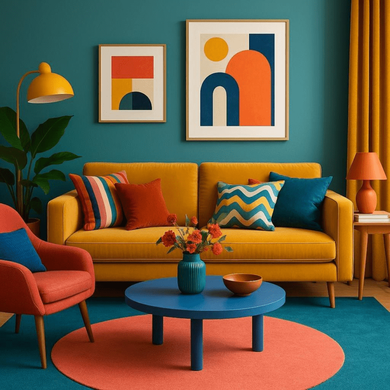
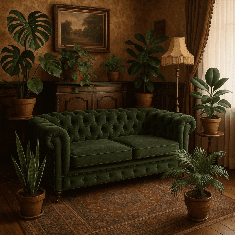
Bold Accent Colors to Add Personality and Depth
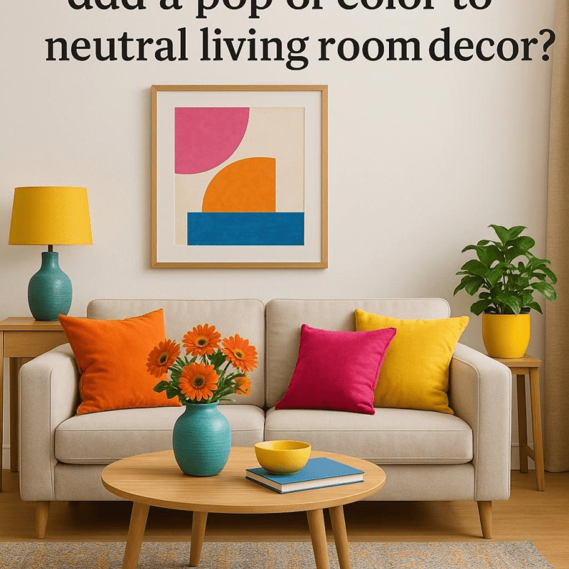
incorporating bold accent colors into your living room palette can dramatically transform the space, adding vibrant energy and a sense of personality. Popular choices like deep emerald green, rich navy blue, and fiery terracotta inject life into neutral backdrops, making the room both inviting and dynamic.These colors work wonderfully on accent walls, throw pillows, statement furniture pieces, or even artwork, lending depth and visual intrigue without overwhelming the entire space.
When selecting bold accent colors, it’s essential to balance them thoughtfully to maintain harmony. Consider pairing these hues with softer neutrals like warm beige, soft greys, or creamy whites to create contrast and prevent the room from feeling cluttered. Hear’s a quick guide to well-loved bold accents and their complementary neutrals, helping you mix and match with confidence:
| Bold Accent Color | Complementary Neutral | Use suggestions |
|---|---|---|
| Emerald Green | Warm Beige | Velvet cushions, accent chair |
| Navy Blue | Creamy White | Area rugs, curtains |
| Terracotta | Soft grey | Pottery, throw blankets |
- Tip: Use bold colors in small doses to create focal points without overpowering the room.
- Tip: Experiment with textures in bold hues, such as woven fabrics or glossy ceramics, to add tactile depth.
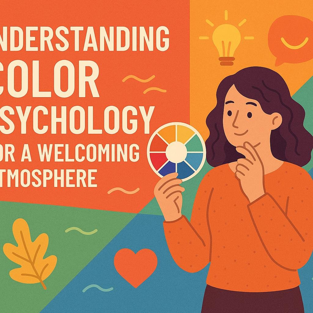
Understanding Color Psychology for a Welcoming Atmosphere
Color has a profound impact on the way a space feels, influencing emotions and perceptions without us even noticing. When aiming for a welcoming atmosphere in a modern living room, choosing the right hues can transform the area into a sanctuary of comfort and style. Warm tones like soft taupes, muted oranges, and gentle yellows invite relaxation and conversation, while cool shades such as slate blues and forest greens foster a calm and refreshing vibe. Using these colors strategically helps create an environment where guests feel both comfortable and captivated.
To balance modern aesthetics with a cozy ambiance, consider the psychological effects behind each color choice. Here’s a quick guide:
- Earthy neutrals: Promote stability and warmth without overwhelming the senses.
- Dusty Blues: Encourage serenity and clear thinking.
- Soft Greens: Bring the outdoors in,signaling renewal and growth.
- Warm Grays: Offer a versatile, inviting backdrop that pairs well with bold accents.
| Color | Psychological Effect | Ideal use |
|---|---|---|
| Terracotta | Comfort and vitality | Accent walls or textiles |
| Sage Green | Balance and renewal | Upholstery and décor |
| Charcoal Gray | Elegance and depth | Furniture pieces or rugs |
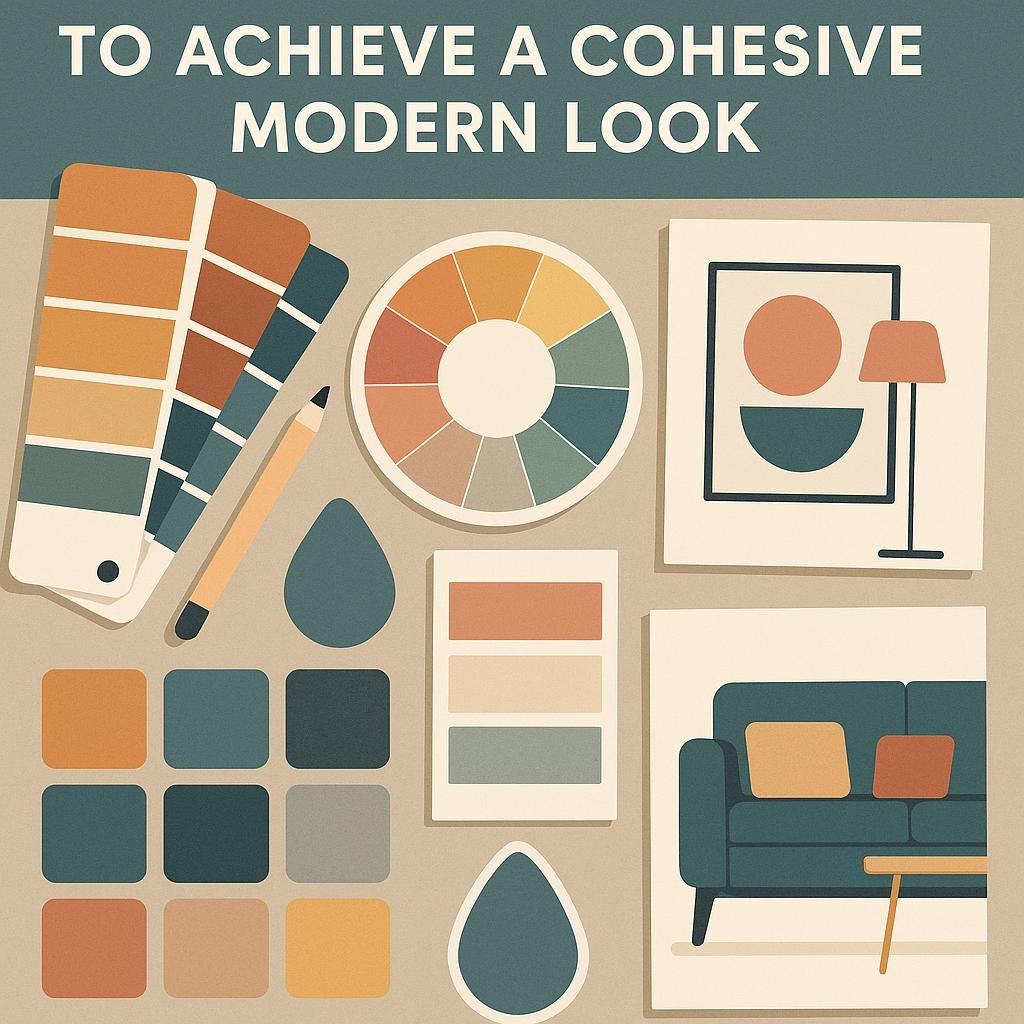
Tips for Combining Colors to Achieve a Cohesive Modern Look
Mastering the art of color combination is key to crafting a living room that feels both fresh and inviting.Start by choosing a dominant neutral base like soft grays, warm taupes, or crisp whites. These colors create a versatile backdrop that allows accent tones to shine without overwhelming the space. To add personality and depth, incorporate one or two bold accent colors such as deep navy, muted mustard, or rich emerald. This palette strategy keeps the overall look balanced and harmoniously modern, avoiding clashes while providing eye-catching interest.
When blending hues, pay attention to undertones and temperature. Warm colors like terracotta and burnt orange pair beautifully with earthy neutrals, while cool tones such as icy blues and charcoal grays complement sleek metallics and glass. For a practical guide, consider this simple chart of harmonious color pairings:
| Primary Neutral | Accent Colors |
|---|---|
| Soft Gray | Mustard Yellow, Navy Blue |
| Warm Taupe | Burnt Orange, Olive Green |
| Bright White | Emerald Green, Charcoal |
Pro tips to keep in mind:
- Use textures like velvet or woven fabrics to introduce dimension amid color blocks.
- Limit the use of stark contrasts to maintain a cohesive flow.
- Introduce natural materials (wood, stone) to soften and unify the overall scheme.
the Way Forward
choosing the right colors for a modern living room can truly transform the space, creating an atmosphere that reflects your personality and style. Whether you prefer calming neutrals, bold accents, or soft pastels, popular color choices like cool grays, warm earth tones, and muted blues offer versatile options to suit any modern aesthetic. Remember, the key is to balance color with texture and lighting to achieve a cohesive and inviting environment. With these ideas in mind, you’re well on your way to designing a living room that is both contemporary and comfortable.