What are some timeless color palettes for a traditional living room?
When designing a traditional living room, choosing the right color palette is key to creating a space that feels warm, inviting, and timeless. Unlike trendy hues that may quickly go out of style, timeless color palettes offer enduring elegance and versatility, allowing your living room to remain classic and cozy for years to come. In this article, we’ll explore some of the most enduring color combinations that perfectly complement traditional decor, helping you create a living room that’s both stylish and comfortably familiar. Weather you prefer rich, warm tones or soft, muted shades, these palettes provide a beautiful foundation for your classic living space.
Classic Neutrals That Create a Cozy and Elegant Ambiance
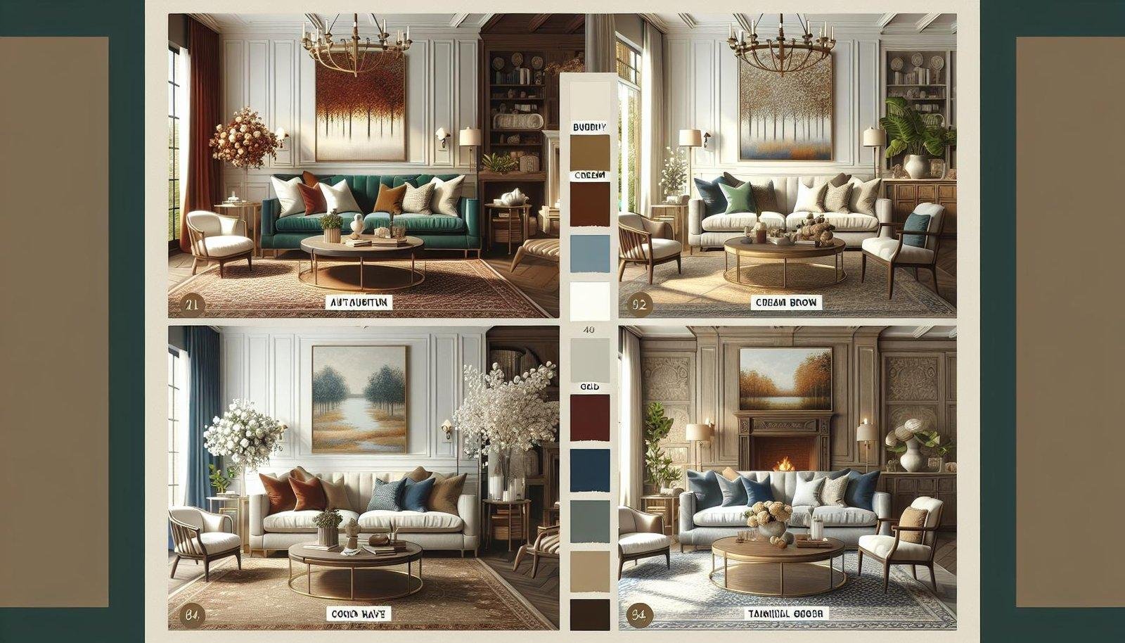
incorporating classic neutral shades into your living room design effortlessly merges comfort wiht timeless elegance. Soft taupes, warm greiges, and rich ivories serve as an ideal canvas to build upon, offering versatility that complements both antique furnishings and contemporary accents. These hues evoke a calming atmosphere while highlighting architectural details such as crown moldings and wainscoting, further enhancing the room’s traditional character. To bring depth and warmth, consider layering textures like plush wool throws, velvet cushions, and handwoven rugs which work harmoniously within a neutral palette.
To create a balanced and inviting aesthetic,pairing classic neutrals with subtle accent colors is key.Think muted golds, deep navy blues, or even soft olive greens to add dimension without overpowering the serene background. Below is a helpful guide showcasing some enduring neutral pairings and their complementary accents that will sustain your living room’s charm over the years:
| Primary Neutral | Complementary Accent | Ideal Textures |
|---|---|---|
| Warm Taupe | Muted Gold | Velvet, Linen |
| Soft Greige | Olive Green | Wool, Suede |
| Creamy Ivory | Deep Navy Blue | Satin, Handwoven Cotton |
Rich Earth Tones Perfect for Warmth and Depth
Earth tones bring an undeniable sense of warmth and settling calmness to a traditional living room.Shades like terracotta, burnt sienna, deep ochres, and mocha create an inviting atmosphere that feels both timeless and grounded. These colors work beautifully with wooden furniture, exposed brick walls, and antique accents, bringing out the natural textures and craftsmanship that define classic interiors.
Incorporating rich earth tones also allows you to layer textures and complementary shades to add depth without overwhelming the space. Consider pairing these hues with soft creams, moss greens, or muted golds to maintain a cohesive yet dynamic palette. Here’s a simple guide to blend warmth and depth effectively:
- Base Colors: warm browns and clay reds
- Accent Colors: Moss green, mustard yellow, soft cream
- Textures: Leather, burlap, woven rugs, and brass details
| Color | Texture | Effect |
|---|---|---|
| Burnt Sienna | Velvet cushions | Rich, cozy contrast |
| Ochre | Wool throw blankets | soft warmth |
| Mocha Brown | Leather armchair | Timeless sophistication |
Soft Pastels Bringing Subtle Sophistication to Traditional Spaces
Incorporating soft pastels into a traditional living room elevates the space with an air of serenity and understated charm. These gentle hues, such as muted blush, pale sage, and powder blue, work harmoniously with classic wood tones and vintage furnishings. Their subtlety adds depth without overpowering the room’s architectural details like crown moldings or fireplace mantels,allowing timeless elements to shine while refreshing the overall atmosphere.
To seamlessly blend soft pastels into your design, consider pairing them with neutral accents and rich textures. For example, a velvet blush cushion on a deep wood armchair or a sage green area rug under a classic coffee table can add dimension and warmth. Here’s a quick reference to ideal pastel shades and their best traditional pairings:
| Pastel Shade | Complementary Traditional Elements |
|---|---|
| Powder Blue | Antique white paneling, silver accents |
| Pale Sage | Mahogany furniture, cream textiles |
| Muted Blush | Gold leaf mirrors, woven linens |
| Soft Lavender | Chesterfield sofas, marble side tables |
How to Combine Timeless Colors for Balanced and Inviting Living Rooms
Pairing timeless colors thoughtfully creates a harmonious atmosphere that feels both balanced and welcoming.Start with a neutral base, such as soft creams or warm taupes, that sets the stage without overwhelming the space.Complement these with rich, classic hues like deep navy, forest green, or burgundy to add depth and sophistication. Textured fabrics and natural materials, such as a wool rug or wooden furniture, enhance the layers of color, making the room feel cozy and inviting.
To maintain equilibrium in your palette, use three to four colors strategically. Consider this approach:
- Dominant color: Neutral shades for walls and large furniture pieces.
- Secondary color: Classic, comforting tones in upholstery or curtains.
- Accent color(s): Bold hues in throw pillows, artwork, or decorative accessories.
| Element | Recommended Colors |
|---|---|
| Walls | Cream, Ivory, Warm Taupe |
| Furniture | Chestnut Brown, Navy Blue, Forest Green |
| Accents | Burgundy, Mustard Yellow, Oxidized Copper |
Key Takeaways
Incorporating timeless color palettes into your traditional living room creates an atmosphere of enduring elegance and warmth. By choosing classic combinations like soft neutrals, rich earth tones, or sophisticated jewel hues, you can craft a space that feels both inviting and refined. Remember, the key to a lasting design lies in selecting colors that not only complement your furnishings but also resonate with your personal style.With these enduring palettes, your traditional living room will remain a cherished and beautiful retreat for years to come.