What are some tips for incorporating neutral color palettes in a living room?
Creating a living room that feels both inviting and timeless can be beautifully achieved by incorporating a neutral color palette. Neutrals offer a versatile foundation that promotes calmness and balance, making it easier to mix and match different styles and textures. Whether you prefer soft beiges, warm greys, or crisp whites, using neutral shades can enhance natural light and create a sophisticated backdrop for your décor. In this article,we’ll explore practical tips to help you seamlessly incorporate neutral colors into your living room,ensuring a space that’s cozy,stylish,and uniquely yours.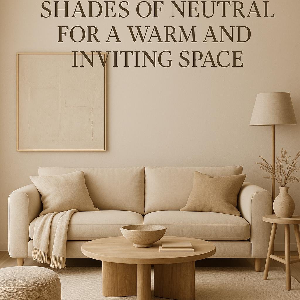
Choosing the Right Shades of Neutral for a Warm and Inviting Space
Selecting the perfect neutral shades is key to crafting a living space that feels warm yet effortlessly inviting. Focus on neutrals with warm undertones such as creamy ivories, beige with hints of gold, or soft taupes. Thes shades naturally impart a cozy ambiance without overpowering the room. When layering these tones, consider pairing a light almond wall color with furniture in caramel or cinnamon hues. This dynamic creates depth and harmony, preventing the room from feeling flat or sterile.
Tips for choosing warm neutral shades:
- Test samples in natural light: colors can shift dramatically throughout the day.
- Mix textures: combine matte, suede, and woven fabrics to add visual interest within a neutral palette.
- Use accent elements: Incorporate warm metallics like bronze or brass to complement neutral tones.
| Shade | Warm Undertone | Best Use |
|---|---|---|
| Ivory | yellow Gold | Walls, ceiling |
| Beige | Soft Caramel | Upholstery, rugs |
| Taupe | Light Brown | Throws, cushions |
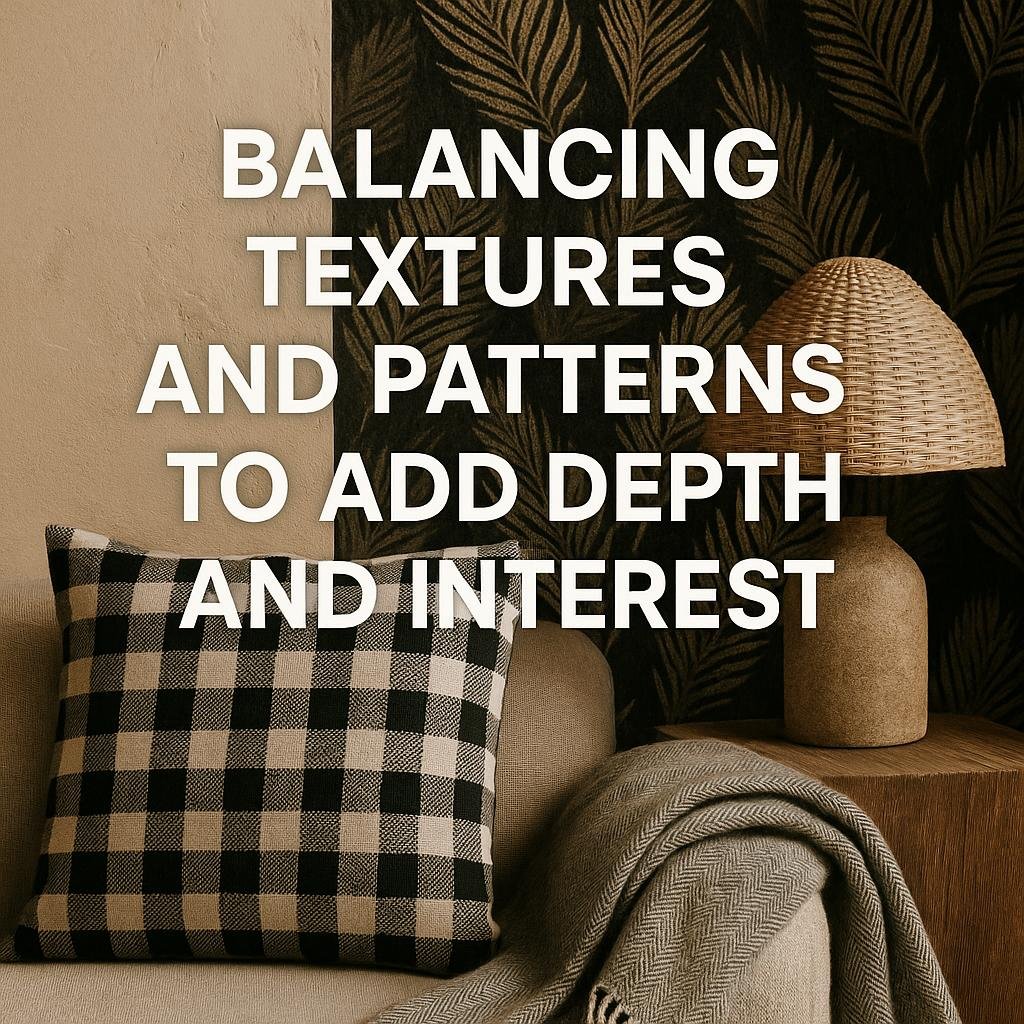
Balancing Textures and Patterns to add Depth and Interest
When working with a neutral color scheme, incorporating a variety of textures can elevate the space by adding tactile dimension and visual intrigue. Think beyond smooth surfaces-introduce materials like plush velvet cushions,woven jute rugs,or distressed wood accents. These textural contrasts invite the senses to explore the room and prevent the design from feeling flat or monotonous. layering different textures in the same neutral tone creates subtle complexity, making the space cozy and inviting without overwhelming the calming palette.
Patterns also play a crucial role in enriching a neutral living room, but the key is balance. Opt for soft geometrics, muted florals, or understated stripes that won’t compete with each other or the overall color story. Mixing patterns of varying scales-such as pairing a large-scale rug pattern with small-scale throw pillow designs-ensures each element contributes harmoniously. Use patterns sparingly and intentionally,focusing on textiles and accessories,to maintain the room’s serenity while adding a layered,curated feel.
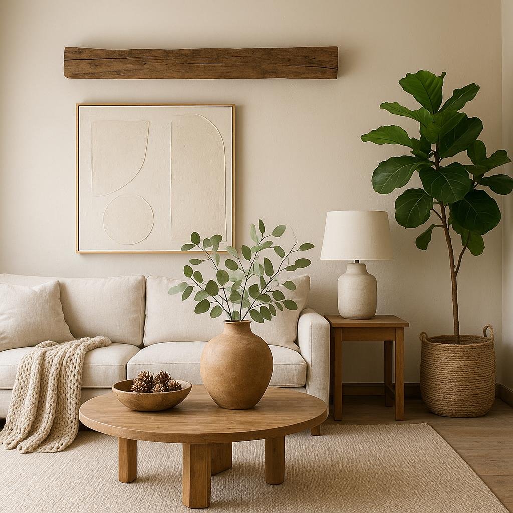
Incorporating Natural Elements to Enhance the Neutral Palette
Bringing natural elements into a neutral color scheme creates warmth and depth without disrupting the calm ambiance. Incorporate materials like wooden furniture, rattan baskets, and jute rugs to add texture and organic charm to the space.These elements complement beige, white, and gray tones by introducing subtle variations while maintaining a balanced and cohesive look. Even small touches such as dried pampas grass or fresh leafy plants can breathe life into the room and reinforce a tranquil, nature-inspired feel.
You can also use natural color accents by introducing stone, clay, or linen accessories. These provide a tactility that neutral paint and upholstery alone cannot offer. Experiment with layering different natural materials, like a soft wool throw on a leather sofa or a timber coffee table with ceramic pots. Here’s a quick guide to pairing natural elements with your neutral palette for a harmonious effect:
- Wood: Light oak or walnut for warmth
- Stone: Marble or slate for subtle pattern
- Textiles: Linen, cotton, and wool for softness
- Plants: Snake plant or fiddle leaf fig for greenery
- Decor: Terracotta pots or woven baskets for earthy tones

Using Accent Colors to Create Focal Points Without overpowering
Incorporating subtle pops of color within a neutral living room can effortlessly draw the eye without disrupting the serene atmosphere. A well-chosen accent color-be it a soft blush, muted teal, or warm mustard-can introduce visual interest and create natural focal points.Use accent colors sparingly on items like throw pillows, vases, or artwork to keep the room feeling balanced. This technique lets the neutral palette shine while gently guiding attention to key areas such as the seating arrangement or a decorative shelf.
When introducing accent colors, consider layering textures and finishes to enhance depth and dimension. For example, a velvet cushion in a rich accent hue paired with a matte ceramic vase can make a subtle yet striking statement. Here’s a quick guide to applications that work well:
- Textiles: Curtains,rugs,or cushions
- Artwork: Framed prints or canvases with hints of the accent shade
- Decor pieces: Lamps,throws,or decorative bowls
- Furniture: Accent chairs or ottomans in muted tones of the accent color
to sum up
Incorporating a neutral color palette into your living room is a timeless and versatile approach that creates a calming and inviting space. By thoughtfully layering different shades, adding texture, and incorporating subtle accents, you can achieve a look that feels both sophisticated and cozy. Remember, neutrals provide the perfect backdrop to showcase your personal style while allowing adaptability for seasonal updates and décor changes. With these tips in mind, you’re well on your way to crafting a living room that’s effortlessly elegant and welcoming.


