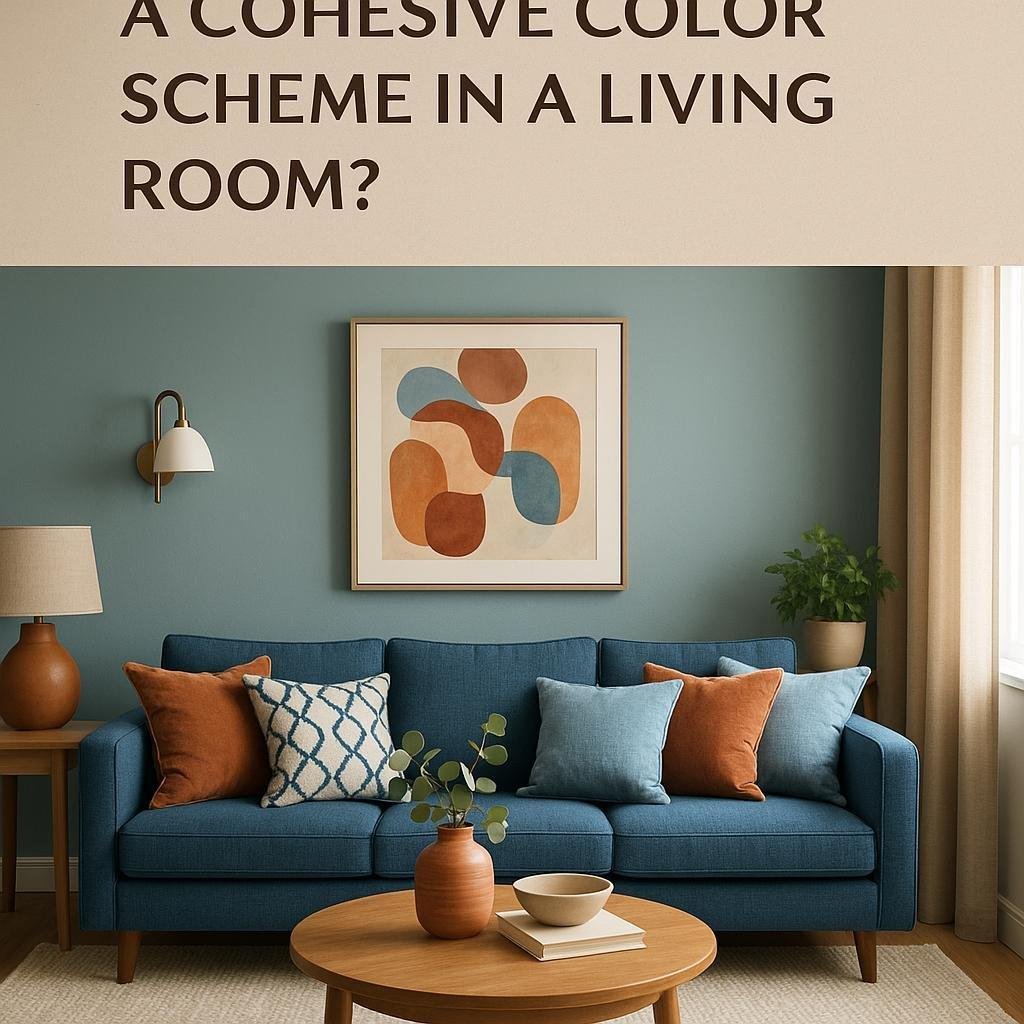
What are some ways to create a cohesive color scheme in a living room?
Creating a cohesive color scheme in a living room can transform the space into a welcoming adn harmonious environment where every element feels thoughtfully connected. Whether you’re starting from scratch or looking to refresh your current décor, understanding how to select and combine colors effectively is key to achieving balance and style. In this article, we’ll explore some practical and creative ways to develop a color palette that not only enhances your living room’s mood but also reflects your personal taste. From using color theory basics to mixing textures and patterns, these tips will help you craft a living space that feels both inviting and visually pleasing.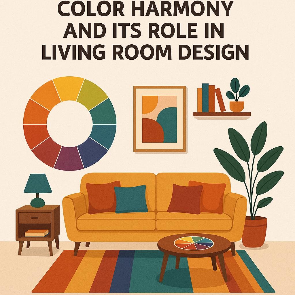
Understanding Color Harmony and Its Role in living Room Design
Creating a gorgeous and balanced living room begins with understanding how colors interact with each other. Color harmony is the principle that helps you combine shades in a way that feels pleasing and natural to the eye. A great starting point is to select a base color that reflects the mood you want to evoke-whether it’s calm, vibrant, or cozy. From there, you can use complementary colors (those opposite each other on the color wheel) to add dynamic contrast, or analogous colors (colors next to each other) for a softer, more serene feel. Remember that adjusting the shades and tints of your chosen palette allows for subtle variations without losing cohesion.
To further enhance harmony, incorporate these practical approaches:
- Limit your palette: Stick to three to four main colors to avoid visual chaos.
- Balance warm and cool tones: Create depth by mixing warm hues like reds and oranges with cool blues or greens.
- Use neutrals wisely: Whites, grays, and beiges provide breathing space and unify bold colors.
- Consider the lighting: Natural and artificial light affect how colors appear, so test swatches in different conditions.
| Harmony type | effect | Example Colors |
|---|---|---|
| Complementary | High Contrast & Vibrant | Blue & Orange |
| Analogous | Calm & Unified | Yellow, Yellow-Green & Green |
| Monochromatic | Elegant & Minimal | Various blues |
| Triadic | Balanced & Dynamic | Red, Blue & Yellow |
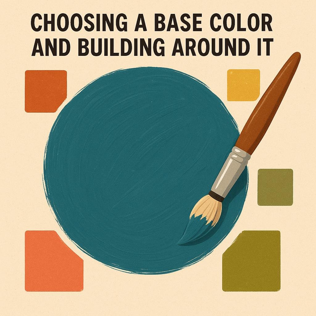
Choosing a Base Color and Building Around it
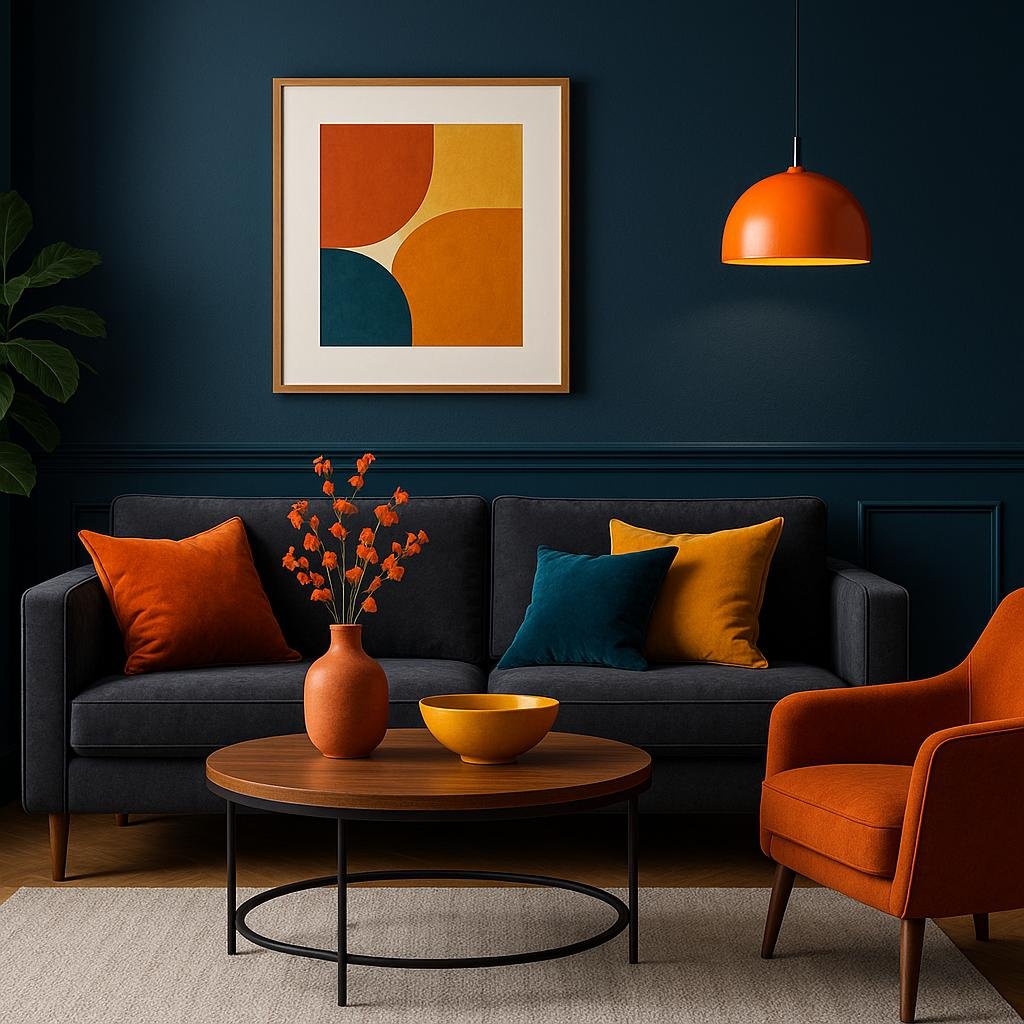
Start by selecting a base color that resonates with the mood you want to create in your living room. This foundational shade will guide all other decisions and ensure consistency throughout the space. Consider neutral tones like soft grays,warm beiges,or creamy whites for a versatile canvas that adapts well to different accent colors. Alternatively, choose a bold hue such as rich navy or forest green if you want the room to make a striking impact. The key is to let this color dominate large elements like walls, rugs, or major furniture pieces, setting a harmonious tone for the entire room.
Once the base color is established, build your palette by adding complementary and contrasting shades to enrich the environment without overwhelming it. Use an unnumbered list like this for guidance:
- Complementary accents: Choose colors located opposite your base shade on the color wheel for lively contrast (e.g., navy base with warm, burnt orange cushions).
- Monochromatic harmony: Utilize various tints and shades of the base color to add depth and subtle complexity (light blue walls with teal throws).
- Neutral buffers: Balance vibrant choices with softer neutrals like white, tan, or charcoal to keep the scheme grounded.
| base Color | Accent Colors | Neutral Options |
|---|---|---|
| Soft Gray | Mustard Yellow, Blush Pink | Charcoal, Cream |
| Deep Navy | Burnt Orange, Gold | White, Tan |
| Olive Green | Coral, Peach | Beige, Taupe |
Incorporating Accent Colors for Depth and Interest
Adding accent colors is a brilliant way to inject personality and dimension into your living room while keeping the overall palette harmonious. Choose one or two vibrant hues that complement your base colors, then introduce them through smaller items like throw pillows, vases, or artwork. This method ensures your color scheme feels intentional without becoming overwhelming. Consider the emotional impact of your accent colors-warm tones like mustard or burnt orange can create a cozy atmosphere, while cool shades like teal or emerald bring a refreshing calmness.
When applying accent colors, balance is key. Use them strategically in concentrated areas to guide the eye and create focal points. Here are some creative ways to incorporate accents:
- Textiles: Rugs, cushions, or curtains that feature your accent hues add texture and warmth.
- Furniture: Accent chairs or side tables in bold colors make a stylish statement.
- Decorative objects: Think lamps, picture frames, or decorative bowls to punctuate the space.
| Accent Color | Effect | Ideal Use |
|---|---|---|
| Mustard Yellow | Warm and inviting | Throw pillows, lampshades |
| Teal | Calming and fresh | Artwork, side tables |
| Burnt Orange | Energetic and vibrant | rugs, statement chairs |
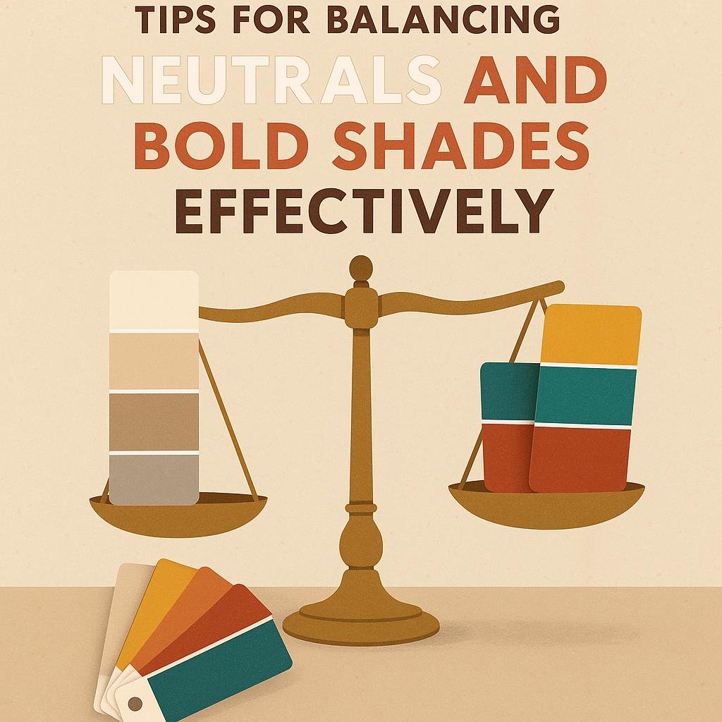
Tips for Balancing Neutrals and Bold Shades Effectively
Achieving the perfect harmony between neutrals and bold shades starts with understanding the role each color plays in your living room.Neutrals act as the canvas, providing a calm and versatile backdrop that can help bold hues truly shine without overwhelming the aesthetic.Begin by choosing a dominant neutral-such as soft beige, cool gray, or creamy white-that covers larger areas like walls and major furniture pieces. Then, introduce bold shades through accent items like cushions, rugs, or artwork. This layered approach helps you control the visual energy and maintain a sense of balance.
To keep the overall look cohesive, consider implementing these practical tips:
- Limit the bold palette: Stick to one or two saturated colors to avoid a chaotic feel.
- Play with texture: Matte neutrals offset glossy,vibrant fabrics beautifully,adding depth without clashing.
- Use repetition: Repeat bold hues in small bursts throughout the space to create unity.
- Mind the proportions: Aim for a visual ratio where neutrals occupy about 70% of the space and bold colors cover the remaining 30%.
| Color Type | Ideal Use | Example |
|---|---|---|
| Neutrals | Walls, large furniture, flooring | light gray sofa, off-white walls |
| Bold shades | Decor accents, textiles, artwork | Emerald cushions, navy rug |
Closing Remarks
Creating a cohesive color scheme in your living room doesn’t have to be overwhelming. By thoughtfully selecting complementary colors, balancing neutrals with accent hues, and considering the room’s lighting and furniture, you can craft a space that feels harmonious and inviting. Remember, your living room reflects your personal style, so don’t be afraid to experiment and make adjustments until the colors truly resonate with you. With these tips in mind, you’re well on your way to designing a living room that’s both beautiful and agreeable. Happy decorating!