Can I mix patterns with my living room color palette?
Mixing patterns with your living room color palette can be a fun and creative way to add personality and depth to your space. Whether you prefer bold geometric designs, subtle florals, or playful stripes, understanding how to combine patterns effectively can transform your living room from simple to stunning.In this article, we’ll explore practical tips and design principles that make pattern mixing approachable and enjoyable, helping you create a cohesive and visually captivating environment without overwhelming your senses. If you’ve ever wondered how to balance colors and patterns in your living room, you’re in the right place!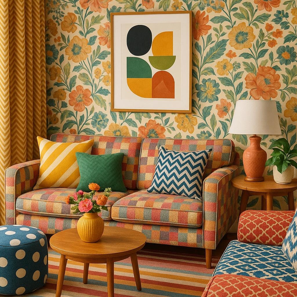
Understanding the Basics of mixing Patterns and Colors in Your living Room
When integrating various patterns into your living room’s color palette, the key is to maintain a harmonious balance that doesn’t overwhelm the space. Start by selecting a dominant color that ties all your patterns together-this acts as the visual thread keeping your decor cohesive.As an example, if your room features a soft blue wall, choosing patterns that incorporate shades of blue, white, or complementary neutrals will create a seamless look. Mixing large-scale patterns with smaller, more subtle designs can add depth and interest without seeming chaotic.
Here are a few practical tips to keep in mind when mixing patterns and colors:
- Limit your palette: Stick to 2-3 colors to avoid clashing hues.
- Contrast is key: Pair bold geometric shapes with soft florals or stripes.
- Texture matters: Combine different textures like velvet, linen, and silk within patterns to add tactile variety.
- Use solids strategically: Break up busy patterns with solid-colored furniture or curtains.
| Pattern Type | Best Paired With | Color Palette Tips |
|---|---|---|
| floral | Stripes or Polka dots | Soft Pastels or Neutrals |
| geometric | Solids or Subtle Textures | Bold Contrasts and Monochromes |
| Chevron | Small-scale Patterns | Neutral Tones with Pops of Color |
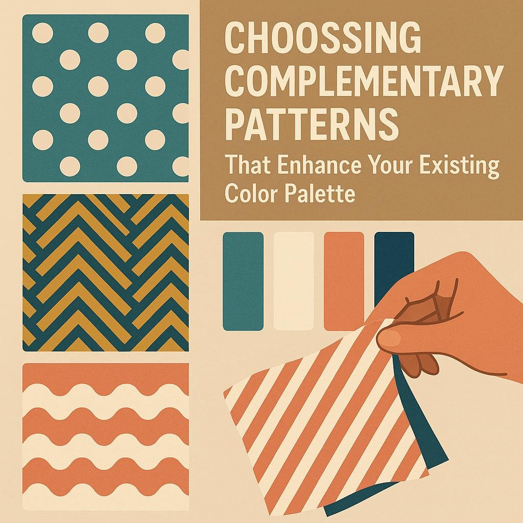
Choosing Complementary Patterns That Enhance Your Existing Color Palette
Start by identifying the dominant colors in your living room’s existing palette and then seek patterns that feature these hues alongside complementary tones. This approach creates a harmonious look while introducing visual interest. As an example, if your living room showcases soft blues and greys, patterns incorporating subtle navy or muted coral accents can add depth without overwhelming the space. Remember, the key is to balance familiarity with variety-choosing prints that echo your primary colors but also bring in fresh elements.
A practical way to mix patterns effectively is by varying scale and texture. Combine a large floral print in your room’s main color with smaller geometric or striped designs in coordinated shades. To simplify your selections, refer to the table below, which categorizes common pattern types alongside examples of complementary color pairings:
| Pattern Type | Suggested Complementary Colors | typical Uses |
|---|---|---|
| Floral | Soft pastels or bold jewel tones | Accent pillows, curtains |
| Geometric | neutrals with one accent color | Rugs, upholstery |
| Stripes | Monochrome variations or contrasting brights | Throws, cushions |
| Animal Print | Earth tones or solid dark colors | Accent chairs, small decor pieces |
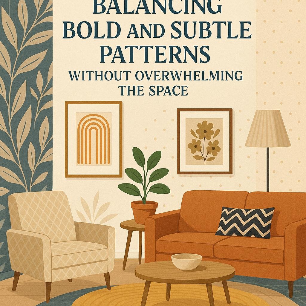
Tips for Balancing Bold and Subtle Patterns Without overwhelming the Space
When combining bold and subtle patterns, the key is to establish a clear visual hierarchy that allows each element to shine without competing for attention. Start by choosing one dominant pattern that aligns closely with your living room’s main color palette. This should be your statement piece-think a large-scale floral or geometric print on a sofa or rug. Complement this with smaller, less intricate patterns in neutral or analogous hues to create a cohesive flow. Using patterns that share a common color can unify diverse styles, making the mix feel intentional rather than chaotic.
To help balance bold and subtle patterns, consider these practical tips:
- Vary scale: Pair large motifs with tiny prints to create rhythm and avoid visual overload.
- Limit your palette: Stick to two or three colors in your patterns to keep harmony.
- Anchor with solids: Use solid-colored furniture or accessories to give the eyes a rest between patterned pieces.
- Texture matters: Mix patterns with different fabric textures to add depth without clashing.
| Pattern Type | Suggested Use | Color Tips |
|---|---|---|
| Bold Geometric | Accent chair or large rug | Choose 2-3 colors from palette |
| Subtle Stripes | Throw pillows or curtains | Use lighter or muted tones |
| Floral Prints | Artwork or smaller cushions | Match base color of wall or sofa |
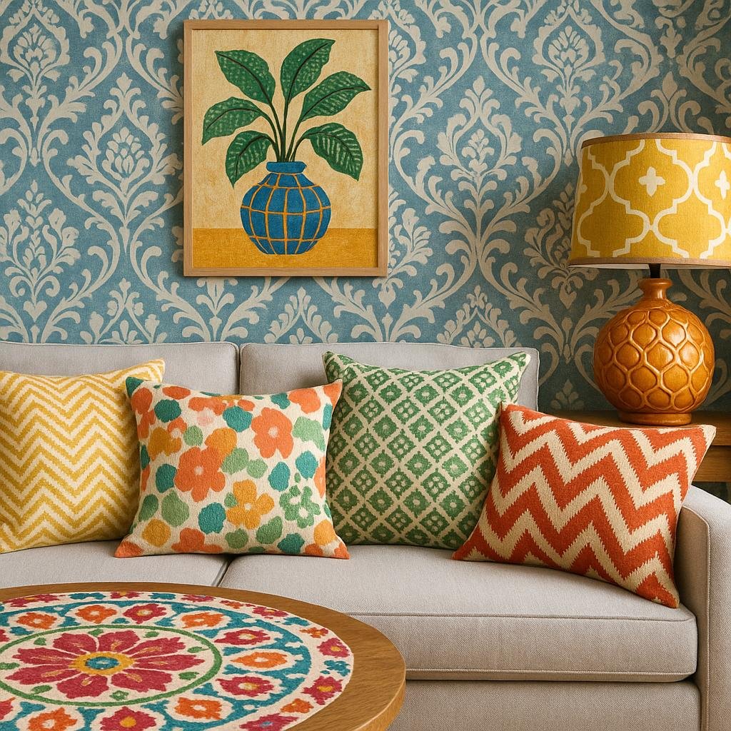
Creative Ideas for Incorporating Patterns Through textiles and Decorative Accents
When it comes to enlivening your living room with dazzling patterns, textiles and decorative accents offer versatile, low-commitment options perfect for experimentation. Start by choosing a few statement throw pillows or an area rug featuring a bold geometric or organic motif that complements your existing color palette. Layering multiple patterns works best when they share a common color or tone; for example, combining navy stripes with floral cushions in shades of blue can create a cohesive yet dynamic look.Don’t shy away from mixing scales-pairing larger patterns with smaller ones creates visual interest without overwhelming the space.
Beyond textiles, decorative accents provide subtle ways to introduce patterns without dominating the room. consider ceramic vases etched with intricate designs, patterned lampshades, or framed fabric art to add texture and charm. Here’s a simple guide to balance patterns effectively:
| Pattern Type | Ideal Scale | Complementary Accent Ideas |
|---|---|---|
| Floral | Medium to Large | Solid-colored pillows, rattan baskets |
| Geometric | Small to Medium | Metallic trays, minimalist art pieces |
| Abstract | Varied | Textured throws, sculptural decor |
| Stripes | Thin to Medium | Monochrome accents, wooden frames |
In Summary
Mixing patterns with your living room color palette is a fun and creative way to add personality and depth to your space. By thoughtfully combining different textures, scales, and colors, you can create a harmonious look that feels both dynamic and balanced. Remember to start with a cohesive color scheme and let your patterns complement rather than compete with each other. With a little experimentation and attention to detail, your living room can become a stylish and inviting haven that reflects your unique taste. So go ahead-embrace patterns and watch your space come to life!


