Can I use a high contrast color palette for a dramatic living room design?
When it comes to designing a living room that truly stands out, color choices play a pivotal role. One approach that has gained meaningful attention is using a high contrast color palette to create a dramatic and visually striking space.But can this bold design strategy work effectively in a living room, an area often associated with comfort and relaxation? In this article, we’ll explore the impact of high contrast colors, how to balance them for maximum effect, and practical tips for incorporating them into your living room design to achieve a dramatic yet inviting atmosphere. Whether you’re a seasoned decorator or just starting out, understanding the power of contrast can transform your space in exciting ways.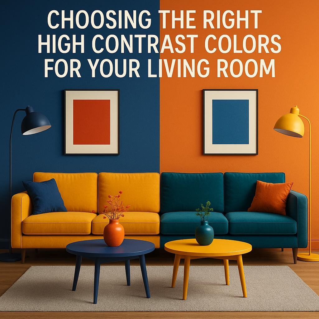
Choosing the Right High Contrast Colors for Your living Room
When selecting high contrast colors for your living room, the key is to strike a balance between boldness and harmony. Start by choosing a dominant color that sets the mood, such as a deep navy or charcoal gray. Pair it with an accent color that pops, like vibrant mustard yellow, rich coral, or striking teal. The contrast should create visual interest without overwhelming the space. Using neutral shades such as crisp white or soft beige can temper the intensity and provide breathing room, ensuring the room feels inviting rather than chaotic.
Consider how lighting and room size affect your palette. Natural light can soften contrasts, while dim or artificial lighting might intensify them, so test your choices at diffrent times of day. Here are some effective pairings to inspire your design:
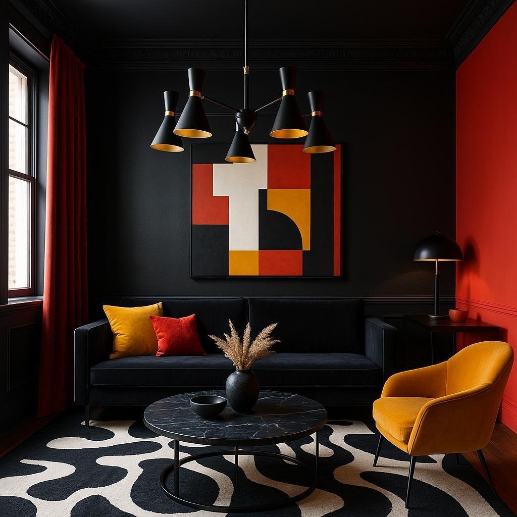
- Black & Gold – Opulent and timeless
- Charcoal & Blush Pink – Modern and elegant
- Navy & Bright Orange – Energetic and bold
- Dark Green & Cream – Earthy yet elegant
| Primary Color | Accent Color | Mood Created |
|---|---|---|
| Deep Navy | Burnt Orange | Warm & Inviting |
| Charcoal Gray | Lime Green | Fresh & Dynamic |
| Rich Plum | Gold | Luxurious & Dramatic |
| Black | White | Classic & Bold |
Balancing Bold Hues with Neutral Tones to Create Drama
Achieving a perfect balance between vibrant and muted shades is key to crafting a dramatic living room that feels both dynamic and inviting. High-contrast palettes, such as pairing a rich navy or emerald with soft beige or gray, create visual tension without overwhelming the space. this interplay allows bold accents to pop while neutral hues ground the overall design, lending sophistication and depth. Consider incorporating a statement wall or standout furniture piece in a bold color, complemented by textiles, rugs, and accessories in calming neutrals to maintain harmony.
To seamlessly blend these elements, keep in mind a few essential tips:
- Anchor your palette: Use neutral tones as the foundation for floors, walls, or large furniture.
- Layer textures: Mix fabrics like velvet, linen, and wool in both bold and neutral shades for tactile interest.
- Consider lighting: Warm lighting enhances bold colors, while cool lighting can soften neutrals.
- Use accents wisely: Introduce pops of color through pillows, art, or décor, ensuring they complement rather than compete.

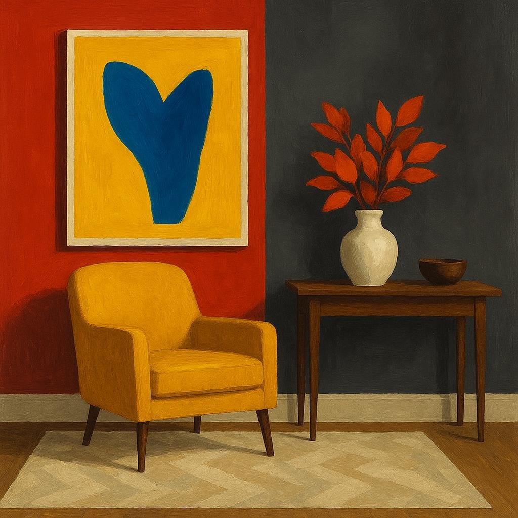
Incorporating Textures and Patterns to Enhance Contrast
Bringing varied textures and patterns into your living room space can transform a high contrast color palette from bold to captivating. Think beyond color alone—introduce tactile elements such as a velvet sofa, a woven rug, or silk throw pillows to add depth and invite touch. These different textures catch light differently, enhancing the dynamic interplay between your room’s dark and light hues. For example, a matte charcoal wall looks stunning when contrasted with a glossy, patterned metallic accent piece, creating multidimensional interest that pleases both the eye and the senses.
When selecting patterns, balance is key to maintaining drama without overwhelming the space. Consider mixing geometric prints with organic shapes to keep visual momentum flowing. To help strategize your choices, here’s a quick reference table showcasing effective texture and pattern pairings for high contrast designs:
| Texture | Pattern | Effect on Contrast |
|---|---|---|
| Suede | Herringbone | Softens sharp contrasts |
| Linen | Bold stripes | Amplifies linearity and depth |
| polished wood | Abstract swirls | Adds warmth amid stark colors |
| Brushed metal | Minimalist dots | Reflects light subtly for balance |
- Layering different textures keeps the eye engaged, preventing one area from feeling flat.
- Choosing patterns that contrast in scale also prevents clashes—pair large, bold designs with small, delicate motifs.
- Use texture and pattern to guide focal points and create harmony within dramatic color contrasts.
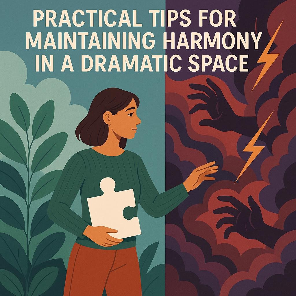
Practical Tips for Maintaining Harmony in a Dramatic Space
Balancing bold hues and high contrast in a living room can instantly create a striking ambiance, but achieving harmony requires intentional choices.Begin by selecting a dominant color to ground the space—this is your anchor. Use that shade on larger surfaces like walls or rugs, then introduce contrasting accents in smaller doses through pillows, art, or decor. This approach prevents overwhelming the senses and ensures a fluid visual flow. Incorporate neutral tones such as soft beiges, greys, or creams as buffers to soften transitions between dramatic colors, effectively calming the overall mood.
Another key tip is to vary the texture and finish of your materials. Pair matte paints with glossy cushions or mix smooth leather with plush fabrics to add depth without adding more color complexity. Lighting plays a critical role here; warm-toned light can mellow the starkness of contrast, while cooler lighting can intensify the drama. Consider the following practical color and texture combos:
- Velvet Emerald Green + Matte Charcoal Walls
- Glossy Black Accents + Soft Linen Upholstery
- Rich Burgundy Decor + Neutral Beige Carpets
| Design Element | Suggested Usage | Effect |
|---|---|---|
| Bold Wall Color | One feature wall | Creates focal point |
| Neutral Base | Floor and upholstery | Balances intensity |
| Decorative Accents | Pillows, throws, art | adds pops of contrast |
| layered Lighting | Table, floor, ambient lights | Controls mood |
Concluding Remarks
using a high contrast color palette can be an excellent choice for creating a dramatic living room design.By thoughtfully combining bold colors and balancing light and dark tones, you can achieve a space that feels vibrant, dynamic, and visually engaging. Remember to consider the overall mood you want to set and the existing elements in your room to ensure harmony. With a bit of creativity and careful planning, a high contrast palette can transform your living room into a stunning focal point that truly reflects your personal style.