Do neutral color palettes work well in homes with high ceilings?
High ceilings can instantly elevate the sense of space and grandeur in a home, creating an open and airy atmosphere. However, decorating such expansive rooms can sometimes pose a challenge, especially when choosing the right color palette. Neutral colors-think soft whites, warm beiges, and gentle greys-are often praised for their versatility and calming effect. But do these subtle shades truly complement homes with high ceilings? In this article, we’ll explore how neutral color palettes perform in spacious rooms and offer practical tips to help you achieve a balanced, inviting look that highlights your home’s architectural features.
Benefits of Neutral Color Palettes in Enhancing High Ceiling Spaces
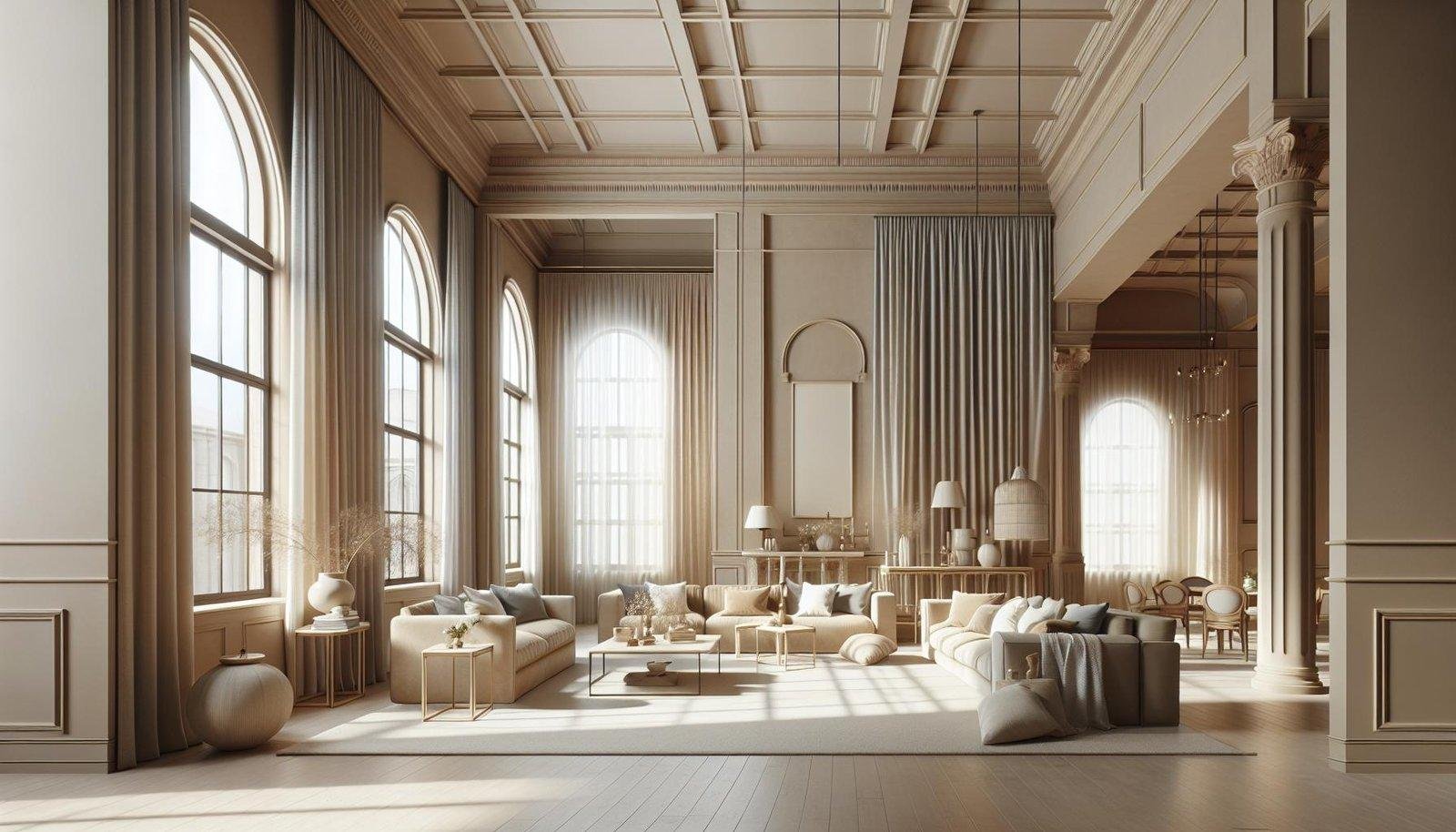
Neutral color schemes have an innate ability to harmonize with the grandeur of high ceilings by emphasizing the spaciousness without overwhelming the room. These hues-ranging from soft beiges and warm grays to muted taupes-create a tranquil backdrop that enhances natural light, allowing architectural features like crown molding or exposed beams to shine. The subtlety of neutrals helps maintain a balanced ambiance, preventing the upper height from making the space feel cold or cavernous. Rather, they promote a cozy, inviting atmosphere that feels both elegant and serene.
in addition to visual balance, neutral palettes offer versatility when furnishing and accessorizing.They act as a perfect canvas for layering textures and complementary tones that add depth and dimension. Consider these advantages:
- Enhanced Light Reflection: Light neutrals bounce sunlight deep into the room, maximizing brightness.
- Timeless Appeal: Neutral shades never go out of style,ensuring longevity in design choices.
- Adaptability: Easily paired with accent colors for seasonal updates or personal flair.
- Space Definition: Helps delineate different zones without visual clutter in open, lofty areas.
| Neutral Tone | Recommended Use | Effect on High Ceilings |
|---|---|---|
| Soft Beige | Living Rooms, Dining Areas | Warmth and coziness |
| cool Gray | Bedrooms, Home Offices | Modern and calming |
| Muted Taupe | Kitchens, Hallways | Textural interest, grounding effect |
How Neutral Tones Create a Cozy Atmosphere in Tall Rooms
Neutral tones are exceptional at grounding expansive spaces, particularly those with soaring ceilings that might or else feel cavernous or overwhelming. Colors like warm beiges, soft grays, and gentle taupes soften the verticality of the room by creating a seamless flow between walls, furnishings, and architectural features. These muted hues absorb natural and artificial light evenly, avoiding harsh contrasts that could accentuate emptiness. By using layers of neutral shades, you introduce warmth and depth that gently embrace the space, making it feel inviting and balanced without sacrificing the openness that high ceilings offer.
Incorporating neutral colors also allows for versatile textural combinations that enhance coziness. Consider incorporating:
- Natural wood elements to add warmth and organic charm.
- Soft fabrics like linen or wool to provide tactile comfort.
- Matte finishes that minimize glare and reinforce a soothing ambiance.
These textures, when combined with a neutral palette, create a harmonious sensory experience that is visually and physically comforting. The result is a tall-room atmosphere that feels both spacious and intimately welcoming, proving that neutral tones are an ideal choice for balancing scale and coziness in high-ceilinged homes.
Choosing the Right Shades to Complement Architectural Features
When selecting shades to enhance your home’s architectural features,it’s crucial to consider how light interacts with both color and structure. Neutral hues such as soft greys, warm taupes, and creamy ivories can amplify the grandeur of high ceilings by creating an airy, spacious feel. These colors reflect natural light effortlessly, making the room appear even taller and inviting. Pairing these neutrals with subtle accent shades - like muted blues or gentle greens – can highlight unique elements such as exposed beams, crown molding, or intricate trims without overwhelming the space.
Additionally, the balance and contrast of shades play a vital role in drawing attention to architectural details. For instance,darker neutrals on window or door frames combined with lighter wall tones can define and emphasize these features beautifully. Consider this simple guideline when integrating shades:
- Light neutrals foster openness and brightness
- Darker neutrals add depth and highlight textures
- Accent touches bring dimension without distraction
| Architectural Feature | Recommended Neutral Shade | Effect Achieved |
|---|---|---|
| High Ceilings | Soft Off-White | Enhances vertical space |
| Crown Molding | Warm taupe | Defines lines subtly |
| Exposed Beams | Charcoal Gray | Creates striking contrast |
Tips for Balancing Light and Shadow with Neutral walls and Décor
Achieving the perfect harmony between light and shadow in spaces with neutral walls calls for a blend of thoughtful choices and subtle layering. To bring depth to these expansive rooms, use varied textures-think soft linens, woven baskets, and matte wood finishes-that gently catch and diffuse natural light. Strategically placing mirrors opposite windows amplifies daylight while creating dynamic shadow play. Incorporating warm-toned accents, such as creamy beige or soft taupe cushions, adds a cozy contrast without overpowering the serene base palette. Don’t underestimate the power of layered lighting: combining ceiling fixtures with floor lamps or wall sconces introduces adjustable shadows that complement the high ceilings, giving the room a balanced and inviting vibe.
Adding visual interest while maintaining a neutral foundation can also be managed by integrating subtle color variations within soft furnishings and décor elements. For instance,mixing matte and glossy surfaces creates gentle highlights that interact beautifully with natural light throughout the day.Using a mix of natural fibers and metals provides an organic interplay of shadows, making the space feel lively yet grounded.To help you visualize,here’s a quick overview of key elements to consider:
| Element | Effect on Light | Suggested Neutral Hue |
|---|---|---|
| Textured Fabrics | Softens Shadows | Warm Ivory |
| Mirrors | Reflects and Amplifies | Silver Gray |
| Matte Wood | Absorbs Glare | Light Oak |
| Metal Accents | Creates Highlights | Brushed Nickel |
In Summary
neutral color palettes can be an excellent choice for homes with high ceilings. Their subtle tones help to balance the spaciousness by creating a warm and inviting atmosphere without overwhelming the room.By thoughtfully incorporating textures, varying shades, and complementary accents, homeowners can enhance the architectural beauty of high ceilings while maintaining a cohesive and elegant look. whether aiming for a modern, minimalist vibe or a cozy, timeless feel, neutral colors offer versatile options that work harmoniously in lofty spaces.