How can I use color to add depth to my living room design?

Creating a living room that feels both inviting and visually engaging often comes down to one key element: color. Beyond simply choosing your favorite hues, understanding how to use color effectively can add a sense of depth and dimension to your space, making it appear larger, cozier, or more dynamic. Whether you’re working with a small apartment or a spacious family room, the right color strategies can transform your living room into a more layered and engaging habitat. In this article, we’ll explore practical tips and ideas on how to use color to enhance depth in your living room design, helping you create a space that’s as beautiful as it is comfortable.
Choosing the Right Color Palette to Create Visual Layers
To effectively craft visual layers using color, start by selecting a base color that sets the mood for your living room. This foundational hue shoudl anchor the space and work harmoniously with natural light throughout the day. Once established, introduce supporting tones that contrast or complement this base without overwhelming it. Think of it as creating a color family: the primary shade holds the room together, while secondary colors offer subtle depth and interest. Incorporating darker or muted variations can definitely help add dimension, while lighter accents bring areas forward visually.
Consider thes strategies when building your palette:
- Monochromatic layering: Use different shades and tints of one color to create a cohesive yet textured feel.
- analogous harmony: Select colors adjacent to each other on the color wheel for smooth transitions between layers.
- Accent pops: Include one or two bold colors sparingly to draw attention and add vibrancy.
- Neutrals for balance: Incorporate beiges, grays, or soft whites to offset brighter elements and give the eye a place to rest.
| Layer | Color Role | Effect |
|---|---|---|
| Base | Main room color | Sets overall tone and mood |
| Secondary | Complementary/supporting shades | Adds dimension and subtle contrast |
| Accent | Bolder hues or patterns | Creates focal points and visual interest |
| Neutral | Off-whites,grays | Provides balance and softness |
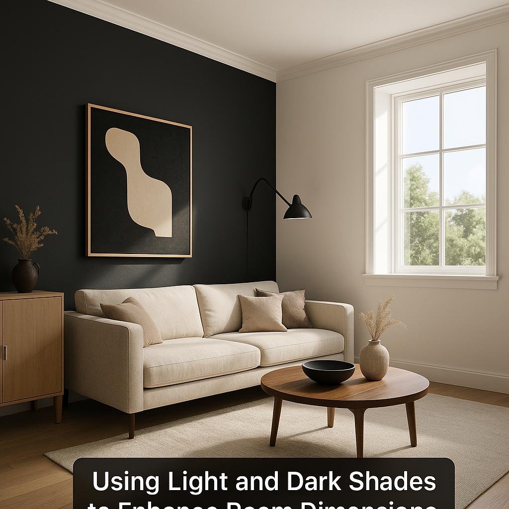
Using Light and Dark Shades to Enhance Room Dimensions
Playing with light and dark shades is a brilliant way to manipulate the perception of space in your living room. Light colors naturally reflect more light, making the room feel open and airy-perfect for smaller or cramped spaces. By painting walls in soft creams, pale blues, or gentle grays, you set a bright foundation that visually expands the room. Pair this with strategically placed lighting and light-colored furniture to amplify this effect.
Conversely, incorporating darker shades can add warmth and intimacy while also creating depth.Accent walls,dark-colored furniture,or rich textiles like deep navy,charcoal,or forest green create focal points that visually draw the eye backward,enhancing the room’s dimensions. Here’s a rapid guide on how to balance both for maximum impact:
- Light shades: Walls, ceilings, and large furniture pieces
- dark shades: Accent walls, rugs, cushions, and framed art
- Balance: Mix in metallic or glass elements to reflect light and prevent heaviness
| Area | Suggested Light Shade | Suggested Dark Shade |
|---|---|---|
| Walls | Soft White | Charcoal Grey |
| Furniture | Beige Linen | Deep Navy |
| Accents | Pastel Blue | Forest Green |

Incorporating Accent Colors for Focal Points and Interest
strategically using accent colors can transform your living room by drawing attention to specific areas or features. Opt for hues that contrast with your primary palette to create captivating focal points. Such as, a bright coral throw pillow or a rich emerald vase against neutral-colored furniture instantly adds vibrancy and interest. These pops of color not onyl energize the space but also guide the eye toward elements you want to showcase, like artwork, shelves, or architectural details.
When incorporating accent colors,balance is key to avoid overwhelming the room. Consider the 60-30-10 rule-where 60% of the room is your primary color,30% is a secondary color,and 10% is reserved for accents. Here’s a simple table to illustrate how this might look in practice:
| Color Role | Percentage | Example in Living Room |
|---|---|---|
| Primary Color | 60% | Walls, large sofa |
| Secondary Color | 30% | Area rug, curtains |
| Accent Color | 10% | throw pillows, lamps, artwork |
- Use accents in accessories like cushions, vases, or lampshades
- Consider metallic finishes (gold, copper) as subtle accent colors
- Rotate accent colors seasonally for a fresh look without major changes

Balancing cool and Warm Tones to Shape the Atmosphere
Integrating both cool and warm tones in your living room design can create a dynamic yet harmonious space that feels inviting and balanced. Cool colors like blues, greens, and purples frequently enough evoke calmness and can visually expand the room, making it feel more open. Warm hues such as reds, oranges, and yellows bring energy and coziness, perfect for creating intimate conversation areas or accent walls.The key is to use these tones thoughtfully-perhaps start with a neutral base and then layer in warm accents through textiles, artwork, or small furniture pieces while keeping larger elements like walls and sofas in cooler shades.
To master this balance, consider the function and mood of each area within the living room. You can use the following guidelines to help decide where and how to place your color choices:
- Warm tones for zones where activity and social interaction happen.
- Cool tones for relaxation spots like reading nooks or near windows.
- Mix texture and materials to soften the transition between cool and warm palettes.
- Incorporate metallics or natural wood to bridge the two temperatures elegantly.
| Color Category | Effect | Ideal Placement |
|---|---|---|
| Cool tones | Calming, expands space | Walls, large furniture |
| Warm Tones | Inviting, energizes | Accents, textiles, décor |
| Neutral base | Balances and connects | Floors, rugs, curtains |
In Retrospect
Incorporating color thoughtfully can truly transform your living room, adding layers of depth and personality that make the space feel both inviting and dynamic. By experimenting with different shades, contrasts, and accent tones, you can create a harmonious design that reflects your style while visually expanding your room. Remember, the key is to balance bold choices with subtle nuances to achieve a look that’s rich and captivating without overwhelming the senses. With these color strategies in hand, you’re well on your way to crafting a living room that feels as spacious as it is welcoming. Happy decorating!