How can I use color to make a statement in my living room design?
Color has the incredible power to transform any space, and your living room is no exception. Whether you want to create a cozy retreat, a vibrant gathering spot, or a stylish showcase, using color thoughtfully can make a bold statement and reflect your personality. In this article, we’ll explore practical tips and creative ideas to help you harness the potential of color in your living room design, turning it into a space that truly stands out. Let’s dive in and discover how the right hues can elevate your home’s style and atmosphere!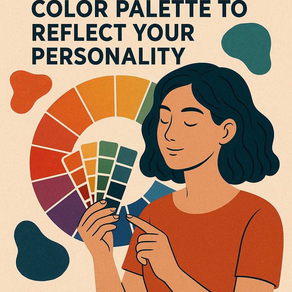
Choosing the Right Color Palette to Reflect Your Personality
When selecting hues for your living room, think beyond trends and focus on what truly resonates with your spirit. Colors have a profound ability to convey emotions and tell stories - from the calming blues that evoke serenity to the fiery reds that spark passion and energy. Start by identifying shades that align with your personality traits. Are you a lover of tranquility? Soft greens and muted earth tones can create a rejuvenating retreat. If you’re adventurous, vibrant yellows or deep purples might be your perfect match. remember, the key is to create a palette that not only appeals visually but also inspires how you feel every time you step into the room.
Use this simple guide to help translate personality into palette choices:
- Calm and Collected: Pale blues, gentle lavenders, soft taupes
- Bold and Energetic: Bright oranges, ruby reds, electric blues
- Warm and Inviting: Burnt oranges, golden yellows, terracotta
- Elegant and Refined: Charcoal gray, deep emerald, rich navy
- Natural and Grounded: Sage green, warm browns, clay tones
| Personality Trait | Suggested Base Color | Accent Color |
|---|---|---|
| Creative | Teal | Magenta |
| optimistic | Sunshine Yellow | Coral |
| Serene | Soft Blue | White |
| Bold | Crimson | Black |
| balanced | Olive Green | Mustard |
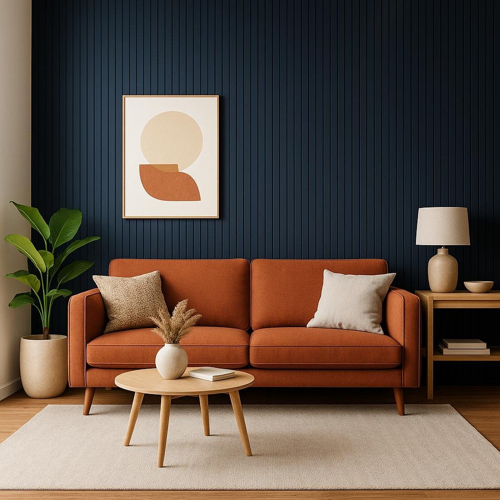
Using accent Walls to create Focal Points and add Depth
when aiming to add personality and character to your living room, incorporating an accent wall offers a dynamic way to focus attention without overwhelming the space. Choose a color that contrasts or complements your overall palette to instantly draw eyes towards a specific area, such as behind a sofa or fireplace. This technique not only establishes a visual hierarchy but also injects an element of surprise and depth, making the room feel carefully curated yet cozy.
To maximize impact, consider the textures and finishes that come with your chosen hue.Matte paints offer subtle sophistication, while glossy or metallic finishes can introduce reflective qualities, enhancing light and spatial perception. Below is a rapid guide to pairing popular accent wall colors with suggested textures for optimal effect:
| Accent Wall Color | Suggested Texture/finish | Room Impact |
|---|---|---|
| Deep navy Blue | Matte or Velvet Finish | Creates cozy, immersive depth |
| Vibrant Mustard | Matte with a touch of Satin | Adds warmth and energy |
| Soft Sage Green | Eggshell or Chalk | Feels calming and fresh |
| Rich Charcoal | Matte or Metallic | modern and dramatic focal point |
- Position furniture strategically: Highlight the accent wall by placing key pieces in front of it to strengthen the statement.
- Layer with complementary accessories: Add cushions,rugs,and artwork in coordinating tones to unify the design.
- Balance the rest of the space: Use lighter hues around the room to prevent the accent wall from overpowering the atmosphere.
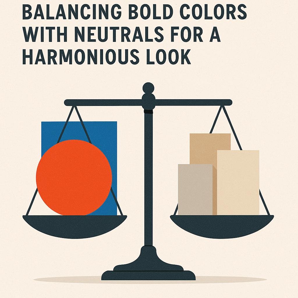
Balancing Bold Colors with Neutrals for a Harmonious Look
Introducing bold colors into your living room can instantly elevate the space,but pairing them wisely with neutral tones ensures the design remains inviting rather than overwhelming. Begin with a rich, vibrant hue in elements like cushions, an accent wall, or artwork. Balance this energy with calming neutrals such as soft grays, warm beiges, or creamy whites to ground the room’s atmosphere. This approach not only lets your bold choices shine but also creates a visually pleasant environment where every element complements the other.
To make this blend work effectively,consider these tips:
- Choose one dominant bold color and limit its use to statement pieces for maximum impact.
- Use neutrals in large areas like sofas, curtains, or rugs to create a soothing backdrop.
- Incorporate varying textures in neutrals to add depth without competing with your bold accents.
- Play with patterns that combine both bright and neutral tones for a harmonious aesthetic.
| Element | Bold Color Role | Neutral Color Role |
|---|---|---|
| Accent Wall | Focal point with vibrant paint | Surrounding walls keep balance |
| Furniture | Throw pillows or chairs | Main sofas, ottomans |
| Decor | Artwork and accessories | Rugs, lampshades |
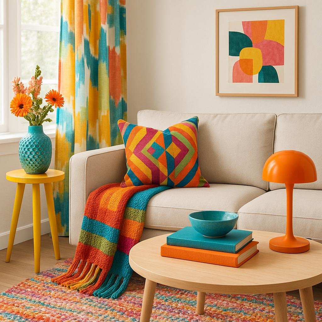
Incorporating color Through Accessories and Textiles for Easy Updates
One of the most flexible ways to inject personality and vibrancy into your living room is by using colorful accessories and textiles. These elements allow for a dynamic shift in mood without the commitment of repainting walls or investing in new furniture. Think of swapping out throw pillows in bold hues or patterned designs to instantly brighten your sofa,or layering vibrant area rugs to define a space with eye-catching charm. Accessories such as lampshades, decorative trays, and artful vases can also serve as small but impactful color accents that bring energy and cohesion to the room’s palette.
For those who love to refresh their space frequently, textiles offer an easy and cost-effective solution. Here are some ideas that can definitely help you make stylish updates:
- Change up curtains with fabrics in trending colors or classic shades to alter the room’s ambiance.
- Swap throws seasonally, opting for lightweight linens in spring and cozy knits in winter to engage both color and texture.
- Use patterned cushions combining multiple tones that relate to your base colors for a layered and captivating look.
| Accessory | Color Tip | Update Frequency |
|---|---|---|
| Throw Pillows | Mix solids with prints for depth | seasonal |
| area Rugs | Choose statement colors to anchor furniture | Annually |
| Decorative Vases | Use jewel tones for pops of sophistication | whenever desired |
Wrapping Up
Incorporating color thoughtfully into your living room design is a powerful way to express your personality and set the mood of the space. Whether you choose bold, vibrant hues to create a striking focal point or soft, muted tones for a calming ambiance, the key is to balance color with your overall style and lighting. Remember,experimenting with different shades and combinations can lead to surprising and delightful results. With these tips in mind, you’re well-equipped to use color confidently and make a memorable statement in your living room that truly feels like home.