How can neutral color palettes create a sense of calm in a living room?
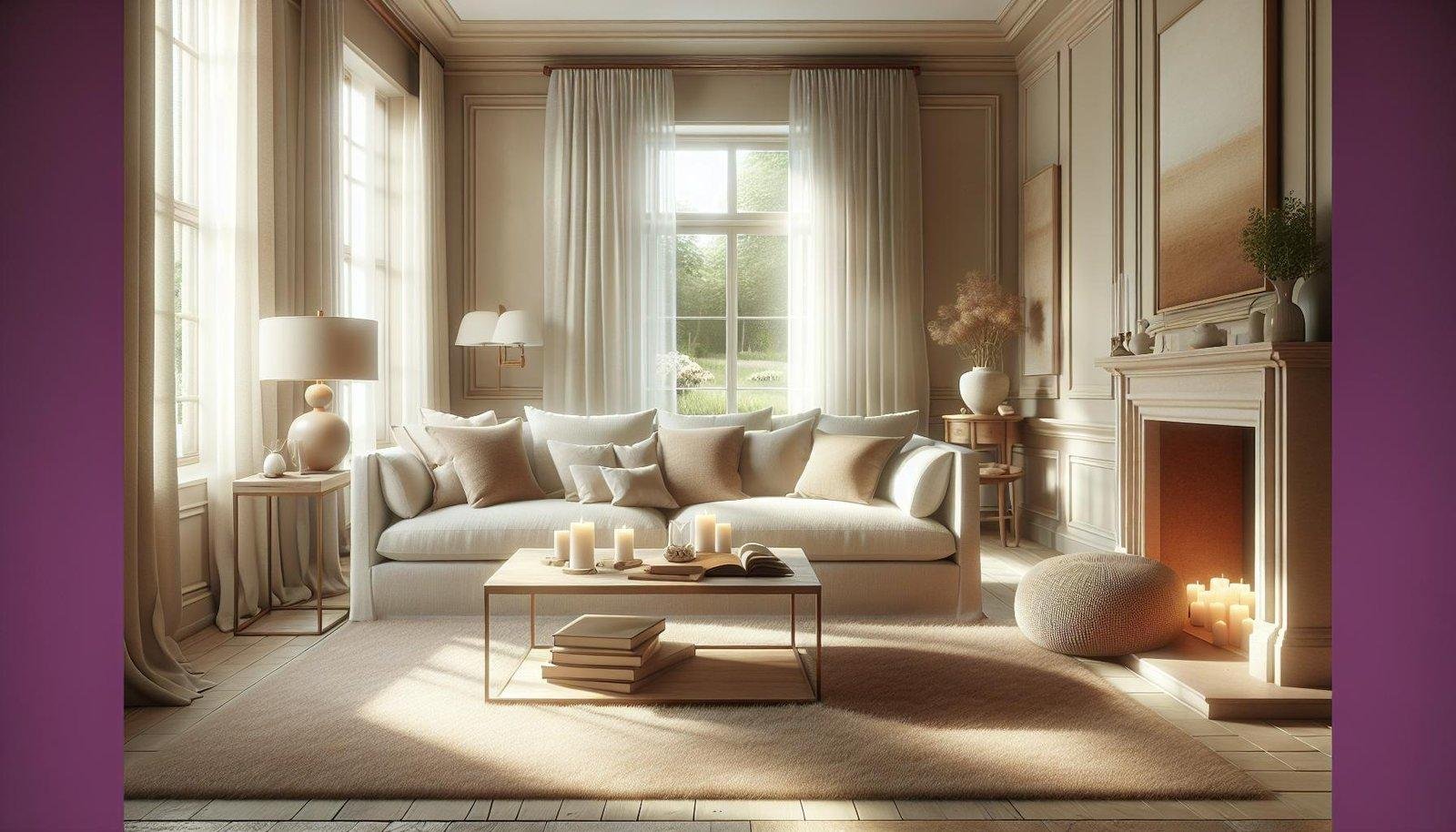
Creating a peaceful and inviting living room is a goal for many homeowners, and one of the most effective ways to achieve this is through the use of neutral color palettes. These subtle hues-ranging from soft beiges and warm taupes to gentle grays and creamy whites-have a remarkable ability to foster a sense of calm and balance in any space. by blending seamlessly with natural light and complementing a variety of textures and furnishings, neutral colors offer a versatile foundation that soothes the mind and creates a welcoming atmosphere. In this article, we’ll explore how neutral color palettes can transform yoru living room into a serene retreat, perfect for relaxation and rejuvenation.
Understanding the Psychological Impact of Neutral Colors on Mood
Neutral colors like soft beiges, warm grays, and creamy whites have a unique ability to soothe the mind by providing a non-distracting backdrop that promotes relaxation. These shades reduce visual clutter and allow the brain to unwind, which is why they are ofen associated with feelings of tranquility and balance. When incorporated thoughtfully in a living room, neutral palettes can create an inviting atmosphere where stress naturally melts away. Psychologically, these hues help regulate emotions by:
- Encouraging mindfulness through their understated presence
- Reducing anxiety by avoiding overly stimulating colors
- Fostering warmth and comfort without overwhelming the senses
Understanding the psychological mechanisms behind these effects can guide homeowners and designers in crafting spaces that nurture calmness and rejuvenation. To illustrate this relationship, here is a simple overview of how different neutral tones influence mood:
| neutral Tone | Mood Effect |
|---|---|
| Warm Beige | Comforting, Cozy |
| Soft Gray | Calm, Balanced |
| Creamy White | Clean, Peaceful |
| Muted Taupe | Grounding, Neutral |
Choosing the Right Neutral Shades for a Tranquil living Space
When striving for a serene atmosphere in your living room, opting for neutral shades can be a game-changer. Colors like soft taupes,warm beiges,and muted greys work harmoniously to create a balanced and soothing surroundings. These hues act as a perfect backdrop, allowing natural light to play off surfaces gently without overwhelming the senses. Additionally, subtle undertones-such as a hint of lavender in grey or a blush undertone in beige-can add just enough personality to keep the space from feeling flat, boosting tranquility through nuanced warmth.
To ensure your neutral palette promotes relaxation, consider layering textures and finishes alongside your color choices. Here are some tips to guide your selection:
- Matte finishes: reduce glare and invite softness.
- Textured fabrics: like linen or boucle add depth without disrupting calm.
- Natural elements: wood tones or stone accents enhance earthy neutrality.
| Neutral Shade | Undertone | Calming Effect |
|---|---|---|
| warm Beige | Soft peach | Inviting & cozy |
| Greige | Subtle grey-violet | Balanced & grounded |
| Stone Grey | Blue undertone | Cool & refreshing |
Incorporating Texture and Layers to Enhance Calmness
Utilizing a variety of textures and layered elements in a neutral-toned living room can significantly amplify the tranquility of the space. By combining materials like plush cushions, soft woolen throws, and natural linen curtains, the room invites tactile exploration that soothes the senses. These contrasting yet harmonious textures break the monotony often associated with neutral palettes, creating a agreeable environment where each surface offers a new sensory experience. Incorporating natural elements such as woven baskets or jute rugs adds an organic quality that complements the muted color scheme effortlessly.
Layering goes beyond just fabrics-it can be extended to art, lighting, and furniture placement to build depth and visual interest without overwhelming the calm. Consider the following layering techniques to maintain serenity:
- Soft overlays: Draped throws and layered cushions in varying shades of beige and ivory.
- Subtle patterns: Muted geometric or botanical prints that blend seamlessly into the neutral backdrop.
- Varied materials: Incorporate wood, ceramics, and glass to add dimension while preserving the calm aesthetic.
- Lighting layers: Use floor lamps, table lamps, and ambient lighting to create warm, inviting glows.
Tips for Balancing Neutrals with Accents to Maintain Visual Interest
Integrating accents into a neutral palette is an art that transforms serenity into sophistication. To keep your living room calm yet engaging, start by selecting accent pieces that complement rather than overpower. Consider incorporating soft textures like velvet cushions or a wool throw in muted pastels or deep earth tones. These subtle contrasts enrich the space without breaking the gentle rhythm created by your neutrals. Additionally, accents with natural materials such as wood, rattan, or stone bring warmth and depth, enhancing the sensory experience and making the room inviting yet balanced.
Another strategy is to repeat accent colors thoughtfully around the room to create harmony and flow. Such as, a hint of brass in a lamp, the muted green of a ceramic vase, and the burnt orange of an artwork can work together beautifully when spaced evenly. Visual interest is also maintained by varying shapes and finishes – matte, glossy, or metallic - which adds layers of intrigue without cluttering the serene baseline. Below is a simple guide to pairing neutrals with accents,helping you visualize effective combinations:
| Neutral Base | Accent Colors | Suggested Textures/Materials |
|---|---|---|
| Warm Beige | Terracotta,Olive Green | Linen,Terracotta Pottery |
| Soft Gray | Mustard Yellow,Navy Blue | Velvet,matte Ceramics |
| Cool White | Blush Pink,Brushed Gold | Silk,Metallic Accents |
The Conclusion
Incorporating a neutral color palette in your living room is a simple yet effective way to foster a peaceful and inviting atmosphere. By embracing soft, muted tones, you create a harmonious backdrop that not only soothes the senses but also allows your personal style and furnishings to shine. Whether you prefer warm beiges, cool grays, or gentle taupes, these calming hues can transform your space into a restful retreat. Remember, achieving tranquility is all about balance-pairing your neutral colors with natural textures and thoughtful accents can enhance the overall sense of calm. With these insights, you’re well on your way to designing a living room that feels both serene and stylish.