What are some tips for mixing and matching colors in a living room?
Creating a harmonious and inviting living room often hinges on one key element: color. Mixing and matching colors can seem daunting,especially with so many shades and combinations to choose from. Though, with a few thoughtful tips and a bit of creativity, you can transform yoru living space into a vibrant, balanced haven that reflects your personal style.In this article, we’ll explore practical advice to help you confidently blend colors in your living room, ensuring every hue complements the next and brings your space to life.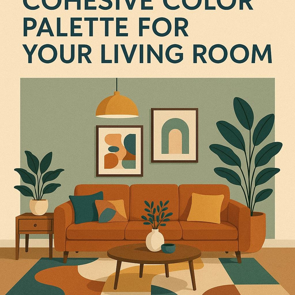
Choosing a Cohesive color Palette for Your Living Room
start by selecting a primary color that reflects the mood you want to create in your living room-whether it’s calming, vibrant, or cozy. From there, build your palette by choosing complementary and accent colors that balance and enhance your base tone. A useful rule to follow is the 60-30-10 guideline: 60% dominant color (walls or large furniture), 30% secondary color (smaller furniture or rugs), and 10% accent color (decorative pillows, artwork, or vases).This balance creates visual harmony and prevents any one hue from overwhelming the space.
When mixing patterns and textures, use your chosen colors consistently to tie everything together. Don’t shy away from experimenting with shades and tints of your palette for added depth. Below is a quick reference table to help you mix and match colors effectively:
| Element | Color Role | Examples | Tips |
|---|---|---|---|
| Wall Paint | Dominant | Soft Gray, Warm Beige | Choose neutral or muted colors for versatility |
| sofa & Large Furniture | Secondary | Deep Blue, Olive Green | Use richer tones to provide contrast |
| Accessories | Accent | Mustard Yellow, Coral | Add pops of color through pillows, throws, and art |
| Textures & Patterns | Enhancers | Linen, Velvet, Geometric Prints | Mix textures while repeating colors for cohesiveness |

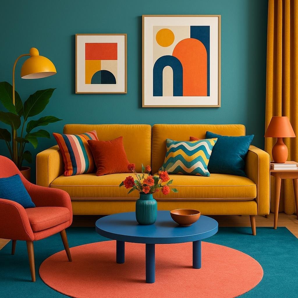
Balancing Bold and Neutral Colors for Visual Harmony
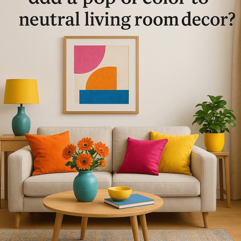
When curating a living room palette, pairing bold colors with neutrals creates a perfect canvas for both energy and calmness. Start by selecting one or two vibrant shades-such as a deep sapphire or a lively mustard-and anchor them with soothing neutrals like soft greys, creamy whites, or warm beiges. This technique not only prevents the space from feeling overwhelming but also allows accent pieces like pillows, rugs, or artwork to pop without clashing. Remember, neutrals serve as the silent partner, giving bold hues the stage to shine while maintaining overall balance.
Here are some practical tips to help you achieve harmony in your color mix:
- Use the 60-30-10 rule: 60% neutral tones, 30% dominant bold colors, and 10% accent colors for contrast.
- Texture adds depth: Combine different materials in neutral shades with colorful accessories to enrich the visual experience.
- Gradation works wonders: Incorporate various tones of your bold colors to soften the transition between shining and neutral.
- Natural light is key: Observe how daylight affects your chosen colors to maintain harmony throughout the day.
| Color role | Example | Affect |
|---|---|---|
| Neutral Base | Beige walls, gray sofa | Calm, spacious feel |
| Bold Accent | Deep blue cushions | Visual interest, energy |
| Highlight | Mustard throw blanket | Warmth, contrast pop |

Incorporating Texture and Patterns to Enhance Color Combinations
Integrating textures and patterns is a clever way to add depth and personality to your living room’s color palette. Textured fabrics like velvet, linen, or woven wool bring a tactile richness that enhances solid hues, making colors appear more vibrant and dynamic. Consider layering a chunky knit throw over a smooth, solid-colored sofa or adding a shaggy rug beneath a sleek coffee table to create visual interest while maintaining harmony. Patterns-think geometric prints, florals, or subtle stripes-can introduce movement into the space, preventing a flat or monotonous look when paired thoughtfully with your chosen color scheme.
When mixing patterns with colors, balance is key. You might want to combine:
- Large scale patterns with smaller,more delicate ones for contrast.
- Neutral backgrounds paired with colorful accents to avoid overwhelming the space.
- Repeating colors found across different patterns to unify the mix.
| Textural Element | Best Color Pairings | Effect |
|---|---|---|
| Velvet Cushions | Jewel tones (emerald, sapphire) | Luxurious, cozy |
| Woven Rugs | Earth tones (terracotta, beige) | Warmth, grounding |
| Silk Curtains | Soft pastels (lavender, blush) | Elegant, airy |
| Striped Patterns | Bold contrasts (black & white) | dynamic, modern |
By thoughtfully blending various textures and patterns together with your colors, you transform your living room into a layered, inviting retreat that tells a story beyond just paint swatches and fabric samples.

Tips for Using Accent Colors to Highlight Key Features
When integrating accent colors, focus on strategic placement to draw attention to key areas without overwhelming the space. Consider using a bold shade on a single wall, a piece of furniture, or select decor items like cushions or vases. This creates focal points that guide the eye naturally while maintaining overall harmony within your living room’s palette. Remember,the goal is to highlight,not dominate-so balance pops of color with neutral or muted tones to keep the room inviting and cohesive.
Experimenting with texture and finish alongside your accent colors can elevate the visual interest. For example, a matte navy accent wall pairs beautifully with glossy gold or brass accessories, amplifying the richness of both elements. Use accent hues in varying intensities by introducing lighter or darker tones of the same color to add depth. Here’s a quick reference table to help match accent colors with complementary materials and finishes:
| Accent Color | Complementary Materials | Finish Suggestions |
|---|---|---|
| Emerald Green | Velvet, Marble | Matte wall, Polished decor |
| Mustard Yellow | Wood, Linen | Natural texture, Satin accents |
| Coral | Ceramics, Wicker | Glossy finishes, Matte cushions |
| Slate Blue | Leather, Glass | Matte furniture, Shiny accessories |
Wrapping Up
Incorporating a thoughtful mix of colors in your living room can truly transform the space into a welcoming and vibrant surroundings. By balancing hues, considering the room’s natural light, and trusting your personal style, you can create a cohesive and visually appealing design that reflects your personality.Remember, experimenting with different combinations is part of the fun-don’t be afraid to try new shades and textures until you find the perfect blend. With these tips in mind, your living room will become a colorful haven that invites comfort and creativity.