Are pastel colors suitable for a living room?

Choosing teh perfect color palette for your living room can significantly influence the atmosphere and overall feel of the space. Among the many options available, pastel colors have gained popularity for their soft, calming qualities and versatility. But are pastel colors really suitable for a living room? In this article, we’ll explore the benefits and considerations of using pastel shades in your living space, helping you decide if these gentle hues are the right choice to create a warm and inviting habitat.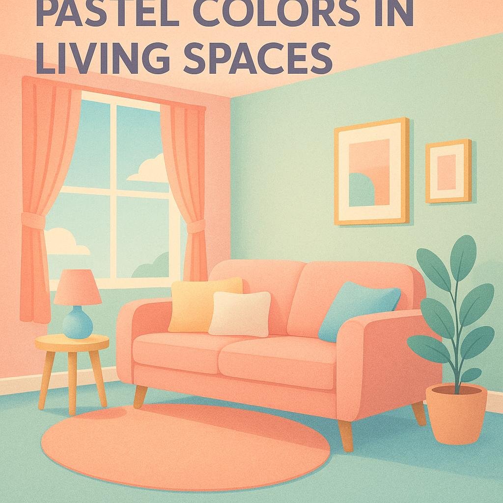
The Psychological Impact of Pastel Colors in living Spaces
Incorporating pastel tones into your living room can have a subtle yet profound effect on your mood and mindset.These soft hues like blush pink, mint green, or baby blue are often associated with tranquility and calmness, creating an environment that feels both cozy and inviting. Such colors tend to reduce stress and promote relaxation, making your living space an ideal sanctuary after a busy day. Pastels excel in balancing energy-they neither overwhelm nor tire the eyes, setting a gentle ambiance perfect for socializing or unwinding.
Moreover, pastel shades can influence your perception of space and light, enhancing the overall atmosphere. Here are some notable psychological benefits of pastel colors in living areas:
- Stress reduction: Soft blues and greens help soothe nerves and calm the mind.
- Creativity boost: Subtle yellows and lavenders spark inspiration without distraction.
- Warmth and comfort: Light peach and coral shades make a room feel welcoming.
- Enhanced brightness: Pastels reflect natural light,making spaces feel more open and airy.
| Pastel Color | Psychological Effect | Suggested Usage |
|---|---|---|
| Powder Blue | Calmness and peace | Accent wall or cushions |
| Soft Pink | Warmth and compassion | Throws, rugs, or drapes |
| Mint Green | Freshness and renewal | Furniture or décor pieces |
| Lavender | Creativity and mindfulness | Artwork or small accessories |
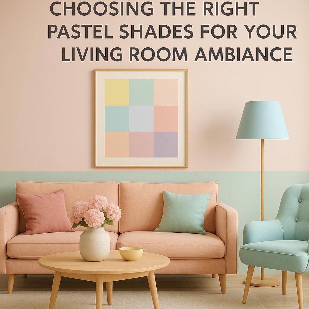
choosing the Right Pastel Shades for Your Living room Ambiance
Creating a serene and inviting atmosphere in your living room starts with selecting pastel shades that complement your space’s natural light and existing décor. Soft blues and greens evoke tranquility and are perfect for rooms with ample sunlight, enhancing the airy feel. Meanwhile, gentle pinks and lavenders add warmth and charm, making the space cozy without overwhelming the senses. When choosing, consider the undertone of the pastel-cool undertones bring a refreshing vibe, while warm undertones create a more intimate setting.
To simplify your selection process,here’s a handy guide to match pastel shades with different living room moods:
| Pastel Shade | Ambiance Created | best Decorating Style |
|---|---|---|
| Mint Green | Refreshing & calm | Modern Minimalist |
| Blush Pink | Soft & inviting | Romantic Vintage |
| Powder Blue | Peaceful & airy | Coastal Chic |
| Lavender | Soothing & elegant | Classic Contemporary |
- test samples on your walls during different times of the day to see how light affects the color.
- Pair pastels with natural textures like wooden furniture or linen curtains to keep the space grounded.
- Use accent colors wisely-neutral tones like beige or soft gray can balance pastel vibrancy.
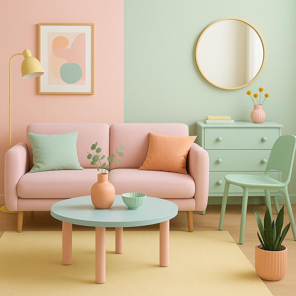
Combining Pastel Colors with Furniture and Décor for a Cohesive Look
Integrating pastel tones into your living room’s furniture and décor offers an opportunity to create a serene and inviting atmosphere. When choosing pieces, think about opting for soft-colored sofas or armchairs in blush pinks, mint greens, or powder blues. These shades can be perfectly complemented by neutral accessories such as cream or beige throws and cushions that add subtle contrast without overpowering the delicate hues. To enhance cohesion, consider selecting wooden furniture in light finishes like oak or maple, which harmonize naturally with pastel palettes and maintain a balanced, airy look.
Tips for cohesive pastel décor:
- Mix and match various pastel shades for depth without clashing.
- Use metallic accents such as brass or rose gold lamps and frames to add warmth and a modern touch.
- Incorporate textured materials like linen or velvet in pastel tones for visual interest.
- Balance pastel walls with neutral or white ceilings and trims to prevent overwhelming the space.
| Furniture Type | Suggested Pastel Shade | Complementary Décor |
|---|---|---|
| Sofa | Soft lavender | Light wood coffee table, cream cushions |
| Accent Chair | Powder blue | Brass floor lamp, plush rug |
| Bookshelf | Misty mint | Rose gold frames, linen baskets |

Practical tips for maintaining Pastel Walls and Fabrics in High-Traffic Areas
Maintaining pastel walls in bustling living rooms requires a strategic approach to keep their soft hues vibrant and fresh. One effective method is to apply a high-quality, washable paint with a matte or eggshell finish, which not only reduces glare but also resists smudges and stains better than flat paints. Regularly dust your walls using a microfiber cloth to prevent grime build-up and tackle any marks promptly with a gentle soap solution to avoid stubborn stains. Additionally, placing washable or decorative wall decals can serve as a protective layer in high-contact areas, preserving the underlying pastel color while adding a touch of design.
Fabrics in pastel shades can be particularly delicate but can thrive in high-traffic zones with proper care. Opt for upholstery with stain-resistant treatments or blends containing synthetic fibers that are easier to clean and less prone to color fading. Frequent vacuuming with a soft brush attachment helps maintain fabric texture and prevent dirt infiltration. For spills and dirt, keep a fabric-safe cleaner handy and address issues promptly. Below is a quick reference table of fabric care tips ideal for pastel furnishings in busy living spaces:
| Fabric Type | Recommended Care | Cleaning Frequency |
|---|---|---|
| Linen Blend | Vacuum & spot clean | Weekly |
| Microfiber | Wipe with damp cloth | Twice Weekly |
| Cotton Mix | Gentle fabric shampoo | Bi-weekly |
Pro tip: Rotate cushions and occasionally expose fabrics to indirect sunlight to help even out any fading and prevent patches over time. Incorporating washable throws and slipcovers can also be a stylish and practical solution, extending the life and vibrancy of pastel textiles in lively living rooms.
Future Outlook
pastel colors can be an excellent choice for a living room, offering a soft and calming atmosphere that promotes relaxation and comfort. their versatility allows them to complement a variety of design styles, from modern minimalist to cozy cottage aesthetics. Whether you prefer subtle shades or a mix of pastel tones, incorporating these colors thoughtfully can brighten up your space without overwhelming it. Ultimately, the suitability of pastel colors depends on your personal taste and how you want your living room to feel-quiet and serene or light and cheerful. With the right balance, pastels can truly transform your living room into a welcoming and stylish haven.