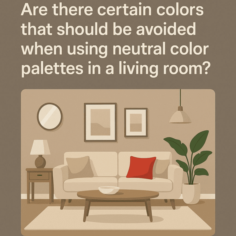
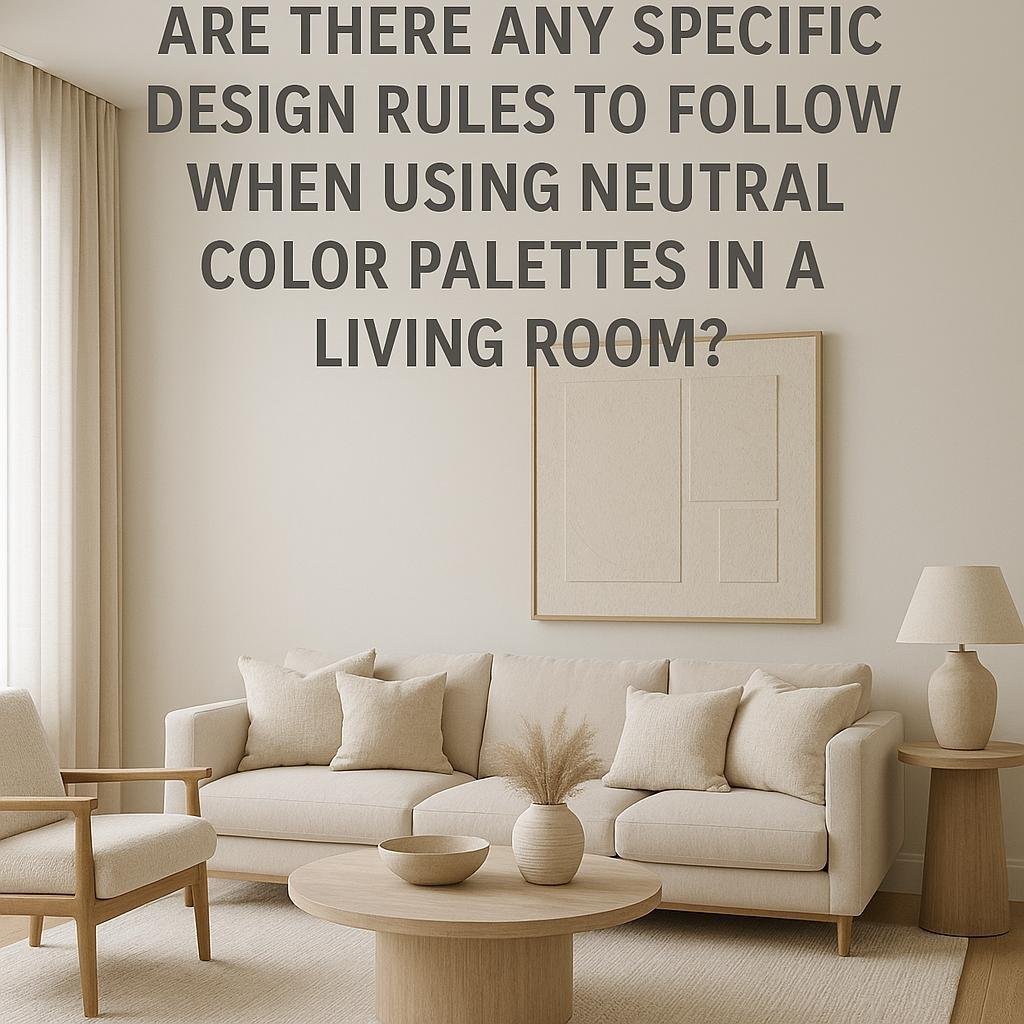
Are there any specific design rules to follow when using neutral color palettes in a living room?
When it comes to designing a living room, neutral color palettes have become a popular choice for creating a calm, inviting, and timeless space. These soft, understated hues-think shades of beige, gray, white, and taupe-offer a versatile backdrop that can easily adapt to different styles and moods. But while neutral colors may seem simple at first glance,there are some significant design rules to keep in mind to ensure your living room feels balanced,warm,and visually interesting. In this article, we’ll explore the key guidelines for using neutral palettes effectively, helping you create a harmonious and stylish living space that truly feels like home.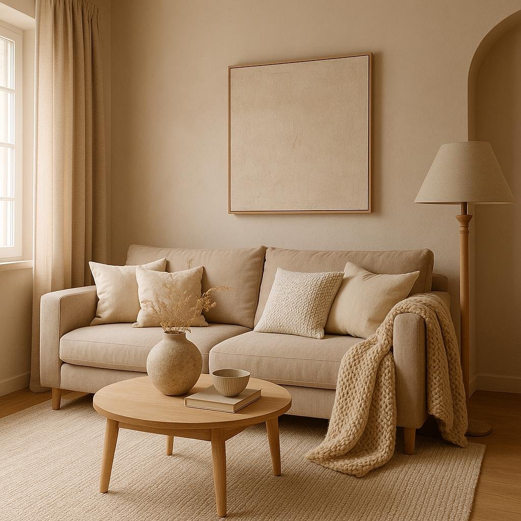
Choosing the Right Shades of Neutral for a Cozy Atmosphere
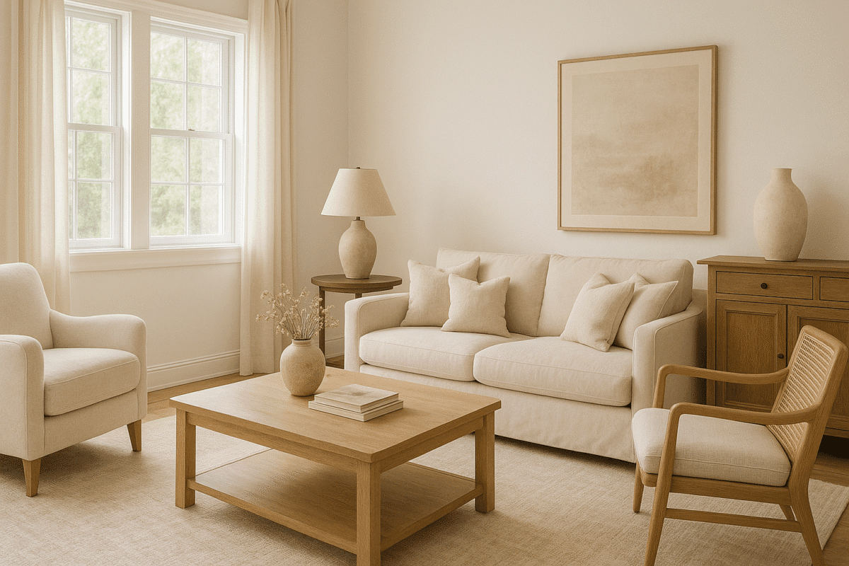
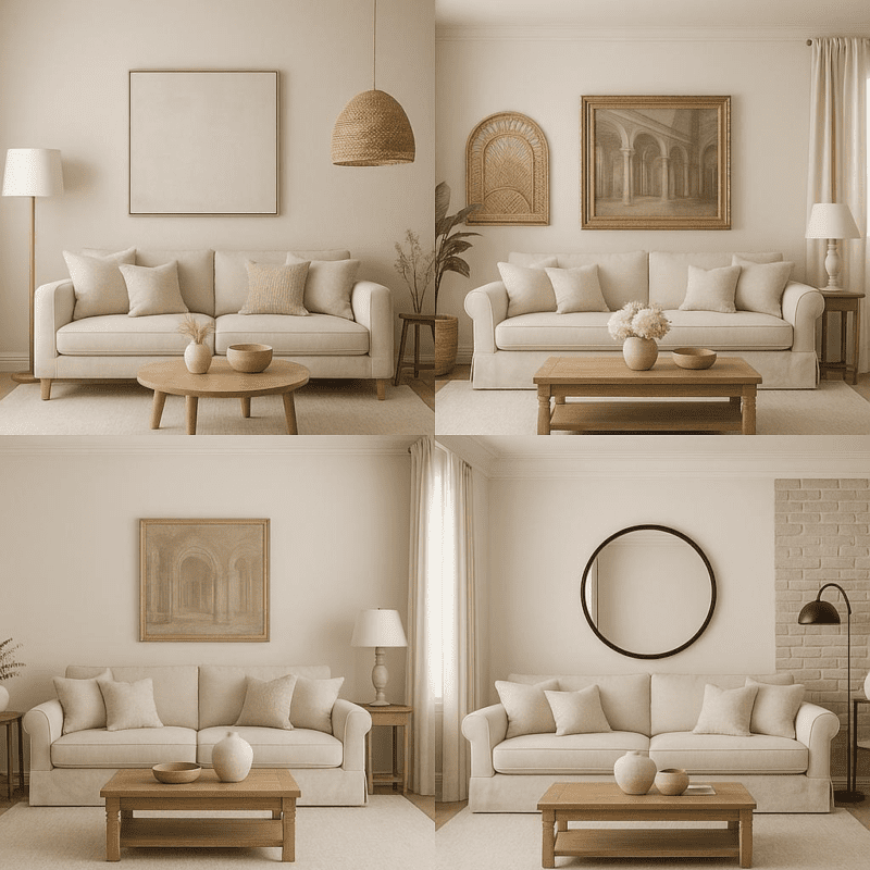
When aiming for a cozy atmosphere using a neutral palette, choosing the right shades is basic. Opt for warmer tones such as soft beiges,creamy ivories,or gentle taupes rather of cooler greys or stark whites. These hues naturally evoke a sense of warmth and comfort, inviting relaxation and tranquility. Additionally, layering different shades of neutrals-think a light sand sofa paired with a deeper mocha rug-adds depth and dimension without overwhelming the space. Texture also plays a key role: integrating tactile elements like plush wool throws, linen cushions, or a shaggy rug heightens the cozy factor while maintaining a harmonious neutral base.
To further enhance comfort, consider balancing your neutrals with subtle accents and finishes. here are a few tips to keep in mind:
- Mix matte and glossy surfaces to create visual interest while staying understated.
- Introduce natural materials like wood, leather, or woven baskets to break up monotony and bring warmth.
- Play with scale and pattern using soft geometric prints or delicate stripes, but keep the palette unified.
| Shade | Feeling Conveyed | Ideal Accent Colors |
|---|---|---|
| Beige | warm, inviting | Burnt orange, olive green |
| Cream | Soft, calming | Blush pink, soft gold |
| Taupe | earthy, grounded | Deep navy, rust red |
Balancing Texture and Pattern to Add Depth and Interest
when working with a neutral palette, incorporating a variety of textures is essential to prevent the space from feeling flat or monotonous. Think beyond color by mixing materials such as soft linen cushions, rugged jute rugs, and sleek metal accents. The tactile contrast between these elements naturally creates visual interest and invites touch, enriching the overall sensory experience of the room.
Patterns can also be introduced thoughtfully, but the key lies in moderation and scale. Opt for subtle, understated patterns like thin stripes, delicate geometrics, or gentle tonal prints that complement the neutrals without overpowering the serenity of the space. to help you balance texture and pattern effectively, here’s a speedy guide:
- Texture: Use at least three different textures to add depth.
- Pattern Scale: Combine one large-scale and one small-scale pattern.
- Color Tones: Stick to variations of the neutral base to maintain cohesion.
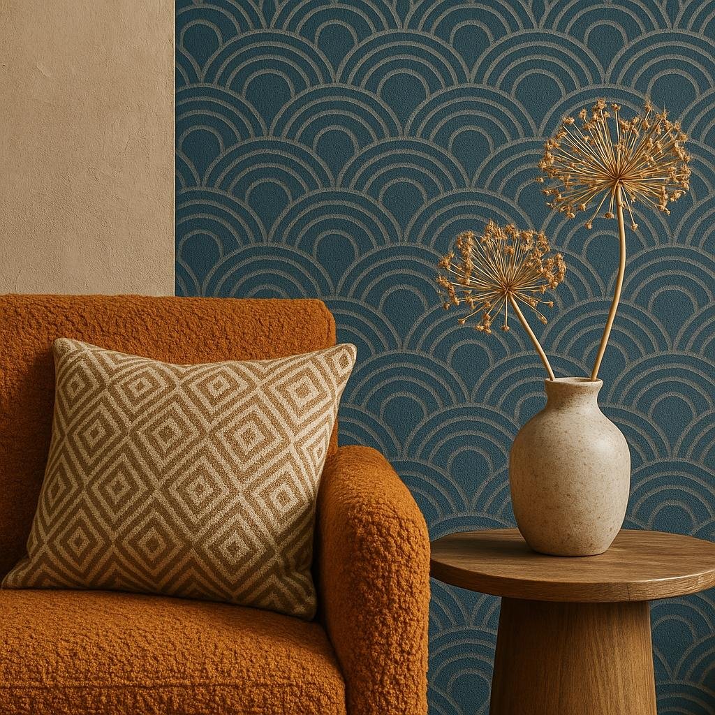
Incorporating Accent Colors to Enhance the Neutral Palette
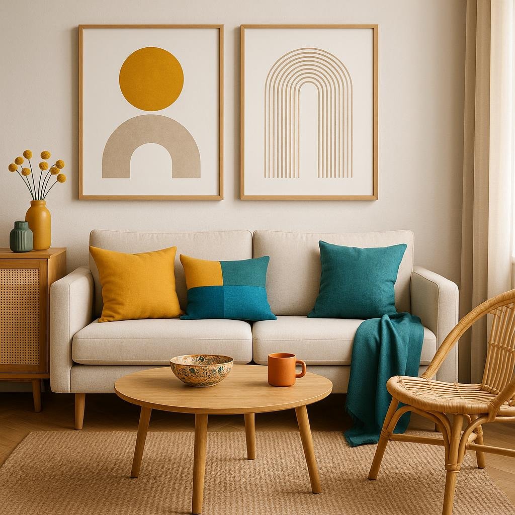
Introducing accent colors into a neutral living room can effortlessly breathe life and personality into the space. To maintain balance, it’s essential to choose accent hues that complement the existing palette without overpowering it. Consider selecting one to two bold colors-such as deep blues,vibrant oranges,or rich greens-that can be strategically applied through accessories like throw pillows,artwork,or an accent chair. This approach ensures a harmonious blend where the neutrals provide a calm backdrop, and the accents bring vibrancy and interest.
When applying these colors, keep in mind a few simple guidelines to maximize impact:
- Placement matters: Use accents in focal points like a fireplace mantel or a gallery wall.
- Texture plays a role: Combine colored textiles or ceramics with different textures to add dimension.
- Balance is key: Distribute accent colors evenly across the room to avoid visual clutter.
| Accent Color | Recommended Use | Effect |
|---|---|---|
| Mustard Yellow | Throw Pillows & Rugs | Warmth & Cheerfulness |
| Teal | Artwork & Vases | Depth & Serenity |
| Terracotta | Accent Chair & Lamps | Earthy & Inviting |
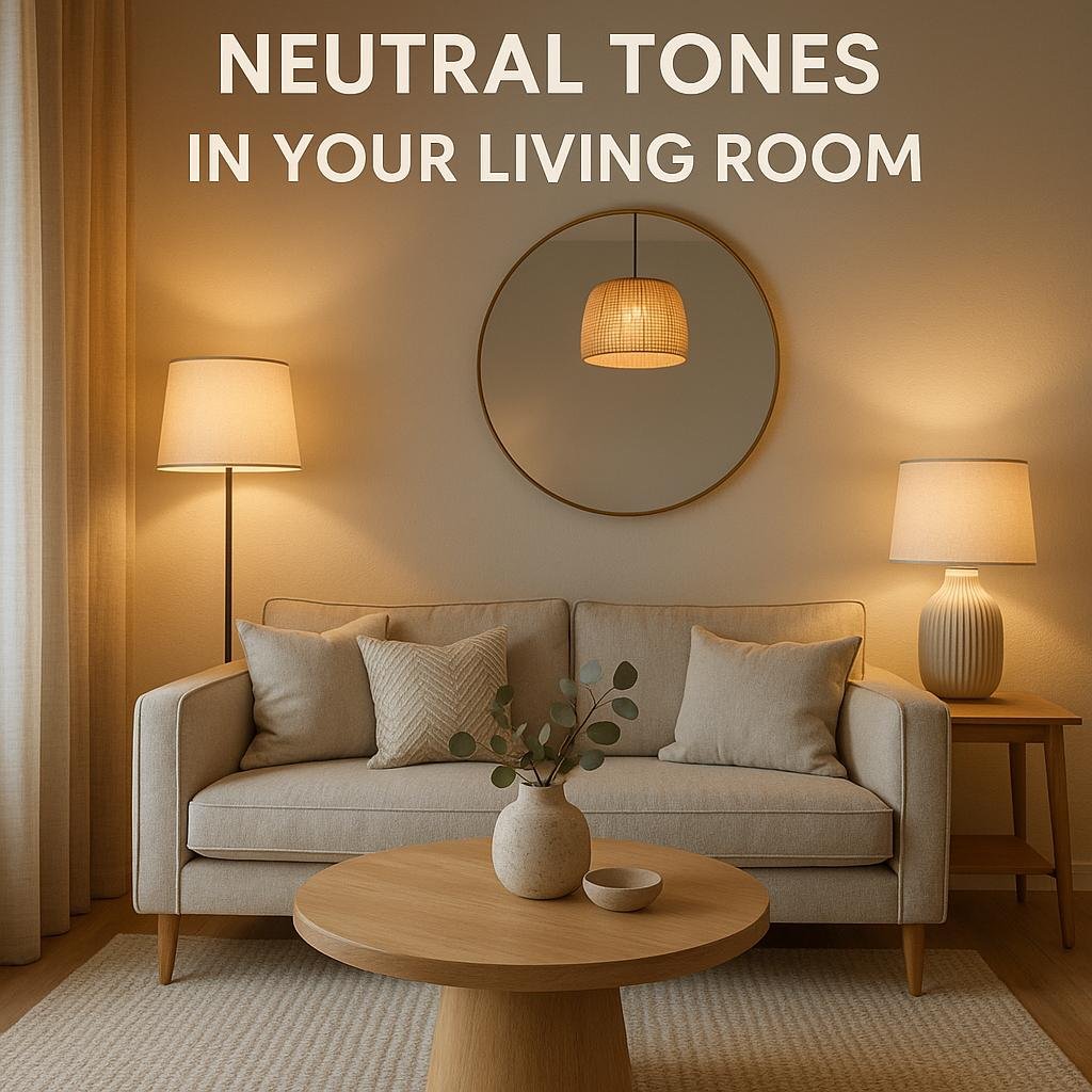
Lighting Tips to Elevate Neutral Tones in Your Living Room
Lighting plays a pivotal role in enhancing the subtle beauty of neutral tones within your living room. To avoid a flat or dull appearance, incorporate layered lighting such as ambient, task, and accent lights. Warm white bulbs (2700K - 3000K) can add a cozy glow that complements beige, taupe, and soft gray walls, enriching the room’s natural warmth. Consider installing dimmers to adjust the intensity based on the time of day or activity, making your neutral space feel adaptable and dynamic.
Additionally, use lighting to highlight textures and focal points.spotlights or directional lamps can emphasize the soft weaves of linen cushions or the natural grain of wooden furniture,creating depth and interest in a neutral palette. Here’s a quick guide on selecting lighting types for different purposes:
| Lighting type | Purpose | Recommended Bulb Color |
|---|---|---|
| Ambient | General Illumination | Warm White (2700K – 3000K) |
| Task | Reading & Focused Work | Neutral White (3500K - 4100K) |
| Accent | Highlighting Art & Textures | Adjustable Warm/Cool |
To Wrap It Up
while neutral color palettes offer a versatile and timeless foundation for living room design, following certain design principles can elevate the space and keep it from feeling bland. Balancing different shades and textures, incorporating layers of lighting, and adding carefully chosen accent pieces are key strategies to create warmth and visual interest. By thoughtfully applying these guidelines, you can craft a living room that feels inviting, stylish, and perfectly tailored to your personal taste-all while enjoying the calm and sophistication that neutrals naturally bring.