How can I choose a color palette that complements my furniture in the living room?

Choosing the right color palette to complement your living room furniture can transform your space from merely functional to truly inviting and stylish. Whether you have bold, statement pieces or understated, classic furniture, the colors you select for your walls, accents, and decor play a crucial role in highlighting your room’s personality and creating a harmonious atmosphere. In this article, we’ll explore practical tips and creative ideas to help you pick the perfect colors that enhance your furniture and make your living room feel both cohesive and welcoming.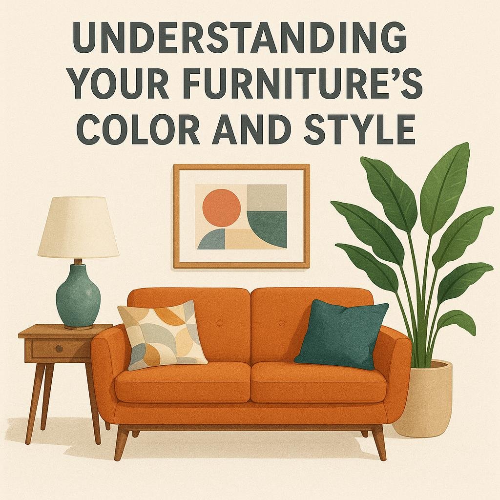
Understanding Your Furniture’s Color and Style
To create a harmonious environment, start by identifying the dominant colors and style of your furniture. The color of your sofa, chairs, and other large pieces frequently enough sets the baseline for your palette. For instance, a deep navy blue couch pairs beautifully with warm neutrals like beige or soft tans, while a bold red chair might invite cooler accents such as gray or muted blues. When it comes to style, furniture with classic lines often benefits from timeless, muted colors, whereas modern or minimalist pieces can handle sharper contrasts and brighter hues.
Consider the following approaches to refine your color scheme effectively:
- Monochromatic: Choose varying shades of the furniture’s main color for a cohesive look.
- Complementary: Use colors opposite on the color wheel to make furniture stand out.
- Analogous: Select colors next to each other on the color wheel for a subtle blend.
- Accent colors: Add pops of color through pillows, rugs, or art based on your furniture’s hue.
| Furniture Color | Suggested wall Palette | Style Tip |
|---|---|---|
| Light Gray | Soft Blue, White, Charcoal | Modern Minimalism with clean lines |
| Rich Brown | Warm Beige, Olive, Cream | Cozy Traditional with natural textures |
| Bold Red | Muted Gray, Soft Gold, Black | Eclectic with dramatic accents |

Exploring Color Harmony Techniques for a Cohesive look
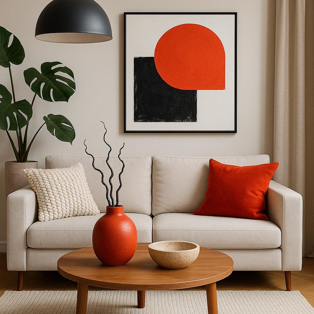
Achieving a unified aesthetic in your living room starts with understanding key color harmony principles. One effective approach is to use the analogous color scheme, which pairs colors adjacent to each other on the color wheel, creating a serene and pleasant atmosphere.For instance, if your furniture is a warm terracotta, incorporating shades of orange, red, and soft yellows in your palette can amplify warmth and promote a cozy vibe. Alternatively, the complementary color scheme involves selecting colors opposite each other on the color wheel, offering rich contrast that makes each element pop without overwhelming the senses.
When planning your palette, consider these simple tips to integrate your furniture seamlessly:
- Base tone matching: Pull a color from your furniture fabric or wood finish to serve as the anchor color for walls or rugs.
- Accent colors: Use cushions, throws, or small décor items in bolder shades to create interest and avoid monotony.
- Neutral buffer: Incorporate neutral colors such as beige, gray, or off-white to balance bold hues and highlight key furniture pieces.
| Harmony Technique | Effect | Best For Furniture Colors |
|---|---|---|
| Analogous | Calm, unified | Warm browns, reds, oranges |
| Complementary | Dynamic contrast | Neutrals with bold accent colors |
| Monochromatic | Elegant and simple | Any single furniture color |
| Triadic | Balanced vibrancy | Radiant primary or secondary colors |
Balancing Neutrals with Bold Accents for Visual Interest
Incorporating a palette of neutrals as your foundation creates a serene and versatile backdrop that highlights your furniture without overwhelming it. Think soft beiges, warm grays, and creamy whites that complement wood tones or upholstered pieces. These colors keep the space feeling open and airy, allowing your furniture to take center stage while setting a soothing ambiance. To prevent the neutral base from appearing bland, consider adding textures such as woven throws, linen cushions, or rug patterns that add subtle depth and richness without clashing.
To inject personality and energy into your living room,strategically placing bold accent colors can make a striking difference. Using vibrant hues like deep teal, mustard yellow, or burnt orange in accessories such as pillows, artwork, or an accent chair can invigorate the room while balancing the calm neutrals.Here’s a simple guide to pairing accents with neutrals effectively:
- Contrast: Choose accent colors that stand out but harmonize with your base tones.
- Repetition: Repeat accent colors in small doses around the room to create cohesion.
- Scale: Use larger bold pieces sparingly to avoid overwhelming the space.
| Neutral Base | Bold Accent | Furniture Style |
|---|---|---|
| Warm Beige | Burnt Orange | Mid-century Modern |
| Light Gray | Deep Teal | Contemporary |
| Soft White | Mustard Yellow | Bohemian |

Tips for Testing and Adjusting Your Palette Before Commitments
Before making any permanent decisions, it’s essential to experiment with your chosen colors in the actual space. Start by collecting small paint samples or swatches and apply them directly to your walls,preferably near your furniture. observe how the colors change throughout the day under natural and artificial lighting. This hands-on approach helps you understand how the shades interact with your textures and materials, ensuring the palette you envision truly harmonizes with your living room’s atmosphere.
Another smart move is to create a simple color testing chart to compare your options at a glance. You can include columns for the name of the color, notes about its mood or effect, and how it pairs with different furniture elements. Here’s a quick idea of how such a chart could look:
| Color | Furniture Pairing | Lighting Impact | Overall Impression |
|---|---|---|---|
| Soft sage | Light wood, linen upholstery | Brightens in daylight | Calming and fresh |
| Warm Taupe | Dark leather, brass accents | Feels cozy in evening light | Elegant and inviting |
| Muted Coral | Rattan furniture, neutral rugs | Softens under dim lighting | Energetic yet subtle |
- Use temporary solutions: Think removable wallpaper, washable paints, or fabric swatches hung alongside your furniture.
- seek feedback: Ask friends or family to share their impressions during different times of day.
- Trust your gut: Beyond rules, your personal comfort with the color palette matters most.
The conclusion
Choosing a color palette that complements your living room furniture doesn’t have to be overwhelming.By considering the tones, textures, and styles of your existing pieces, you can create a harmonious and inviting space that reflects your personal taste. Remember to test colors in your room’s natural light and have fun experimenting with accent shades to add depth and personality. With a thoughtful approach, your living room will not only look cohesive but also become a comfortable haven where you love to spend time. Happy decorating!