What are some popular accent colors for a neutral color palette in a living room?

When designing a living room with a neutral color palette, adding accent colors is a simple yet effective way to bring personality and warmth to the space. neutral tones like beige, grey, and white create a calm and versatile backdrop, but it’s the accent colors that inject life and character into the room. Whether you prefer soft pastels, bold jewel tones, or earthy hues, choosing the right accent colors can complement your neutrals beautifully and elevate the overall ambiance. In this article, we’ll explore some popular accent colors that work wonderfully with neutral living rooms, helping you create a cozy and stylish habitat you’ll love spending time in.
Popular Accent Colors That Bring Warmth to a Neutral Living Room
When aiming to infuse warmth into a neutral living room, selecting the right accent colors is key. soft yet vibrant tones complement neutral shades by adding depth and personality without overwhelming the space. Popular choices include rich terracotta, which echoes the hues of sun-baked clay and evokes a cozy, grounded feel. Warm mustard yellow brings a touch of sunshine indoors, pairing beautifully with creams and beiges to create an inviting ambiance. Additionally, burnt orange and deep coral hues provide a trendy yet timeless enhances the warmth factor while maintaining a balanced palette.
To visually understand the impact of these colors, consider this simple reference table showing popular warm accent colors alongside their ideal neutral companions:
| Accent Color | Description | Best Neutral Pairings |
|---|---|---|
| Terracotta | Earthy, warm reddish-orange | Beige, Taupe, Cream |
| Mustard Yellow | Soft, muted golden yellow | Off-white, Light Gray, Warm Ivory |
| Burnt Orange | Deep, vibrant orange | Sand, Light brown, Soft white |
| Deep Coral | Bright yet warm pink-orange | Warm Gray, Cream, Stone |
Using throw pillows, artwork, or even rugs in these warm accent colors can dramatically change the perception of a neutral living room, transforming it from bland to awe-inspiring while retaining a welcoming and soothing environment.

Cool Tone Accents to refresh a Neutral Palette
Introducing cool tone accents into a neutral living room can dramatically enhance the space without overpowering its calm foundation. Shades like soft blues, muted teals, and gentle lavenders bring a refreshing touch that complements beige, gray, and off-white bases effortlessly. These colors evoke a serene atmosphere, making your living room feel both inviting and modern. Incorporate them through throw pillows, area rugs, or delicate ceramics to achieve a subtle but impactful update.
For those looking to experiment with texture and depth, combining these cool accents with metallic finishes in silver or brushed nickel is an excellent strategy. This blend adds a sleek edge while maintaining a harmonious balance. Consider the following popular cool tones and their ideal uses in your neutral setting:
| Accent Color | Ideal Submission | Effect |
|---|---|---|
| soft Blue | Throw pillows, curtains | Soothing calmness |
| Muted Teal | Accent walls, vases | Refreshing sophistication |
| Lavender | Blankets, artwork | Subtle warmth |
| silver Metallic | Picture frames, lamps | Modern elegance |
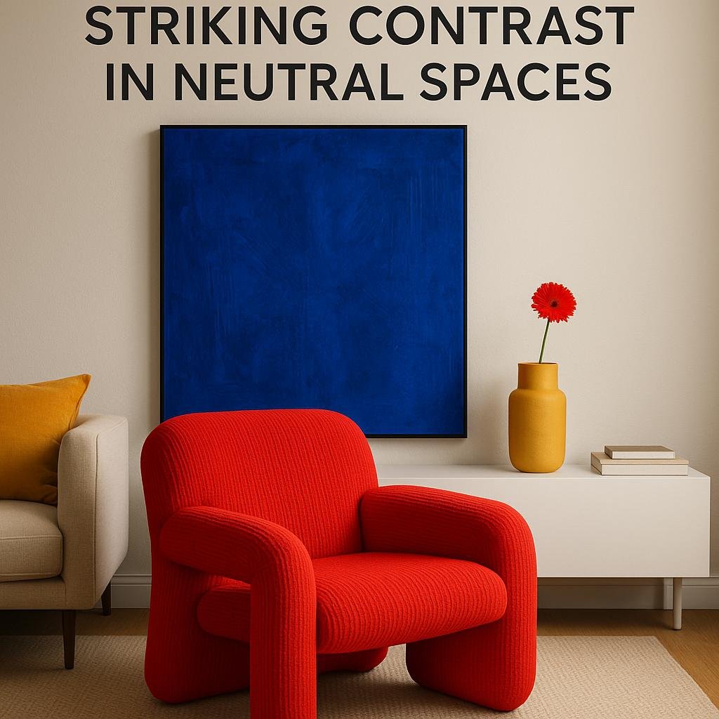
Using Bold Colors to Create Striking Contrast in Neutral Spaces
Injecting bold colors into a neutral living room can instantly transform the ambiance, creating a dynamic yet balanced space. Colors such as deep navy, vibrant mustard, emerald green, and rich terracotta disrupt the calmness of beiges, greys, and whites, producing an eye-catching contrast that feels both modern and inviting. These striking accent hues draw attention to focal points like sofas, throw pillows, or artwork without overwhelming the subtlety of the neutral base.
When choosing accent colors, consider the mood you want to evoke and how the colors interact with natural and artificial lighting. A few standout options include:
- Cobalt Blue: Adds a crisp, refreshing vibe and works well with grey tones.
- Burnt orange: Creates warmth and complements earthy neutrals nicely.
- Chartreuse: Brings energy and a fresh botanical feel when paired with creams.
- Magenta: offers a playful pop that contrasts beautifully with beige or taupe.
| Accent Color | Best Neutral Pairing | Effect |
|---|---|---|
| Emerald Green | Light Grey | Fresh & Luxurious |
| Mustard Yellow | Warm Beige | Cozy & Inviting |
| Terracotta | Off-White | Earthy & Grounded |
| Royal Blue | Soft Grey | Elegant & Bold |
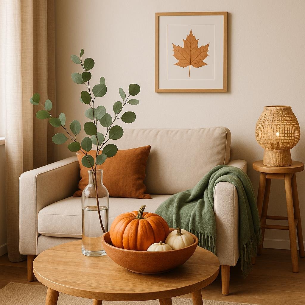
Incorporating Natural Elements as Subtle Accent Colors
Natural elements bring a refreshing and grounded touch to neutral living room palettes without overwhelming the subtlety. Think of soft sage greens echoing the serenity of leaves, dusty terracotta reminiscent of warm earth, or muted stone grays that mirror natural rock formations. These tones work gracefully as accents through cushions, vases, or artwork, infusing life and texture while maintaining a calm, cohesive atmosphere. Their inherently organic vibe makes them perfect for spaces aiming to blend modern elegance with nature-inspired calmness.
Incorporating these gentle hues can be as simple as adding a few thoughtful touches throughout the room.Here’s how to introduce natural accent colors effectively:
- Use cushions or throws in soft olive or moss green to complement beige or ivory sofas.
- Add terracotta pots or lampshades for warmth amid cool neutral walls.
- Display driftwood or stone-inspired decor pieces to echo muted gray undertones.
- Choose artwork featuring botanical or landscape themes to subtly pull the room together.
| Natural Accent Color | Suggested Usage | Impact |
|---|---|---|
| Sage Green | Throw pillows, plant pots | Creates calm and freshness |
| Terracotta | Lampshades, vases | Adds warmth and depth |
| Stone Gray | Decor accessories, frames | Enhances texture and sophistication |
Closing Remarks
Incorporating accent colors into a neutral living room palette is a splendid way to add personality and warmth without overwhelming the space. Whether you prefer the calming touch of soft blues, the vibrant energy of mustard yellow, or the natural feel of earthy greens, these popular accent hues can beautifully complement your neutral base. By thoughtfully selecting and balancing these colors, you can create a living room that feels both inviting and visually dynamic. Remember, the key is to choose accents that resonate with your style while enhancing the overall harmony of your neutral palette.